04.03.21
Arc'teryx Used Gear Campaign Identity | Monday Creative Case Study
Putting product circularity in the spotlight
GO


ReBird needed positioning and an identity that could scale and nest all of Arc’teryx’s circularity efforts. Their goal? That ReBird would permeate every part of the business.
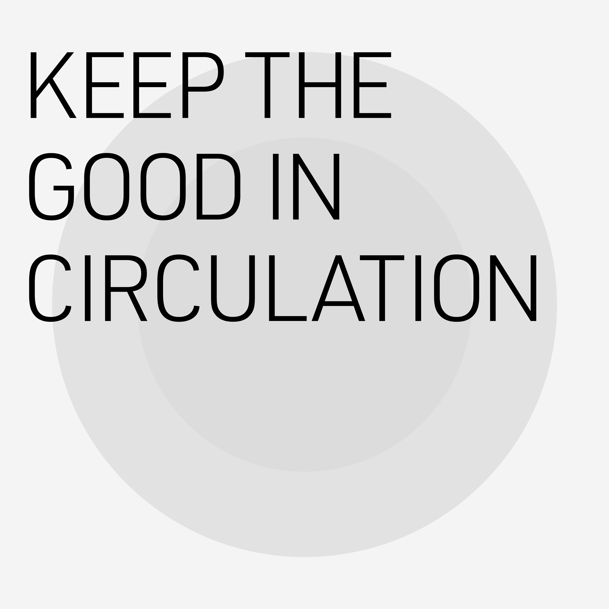
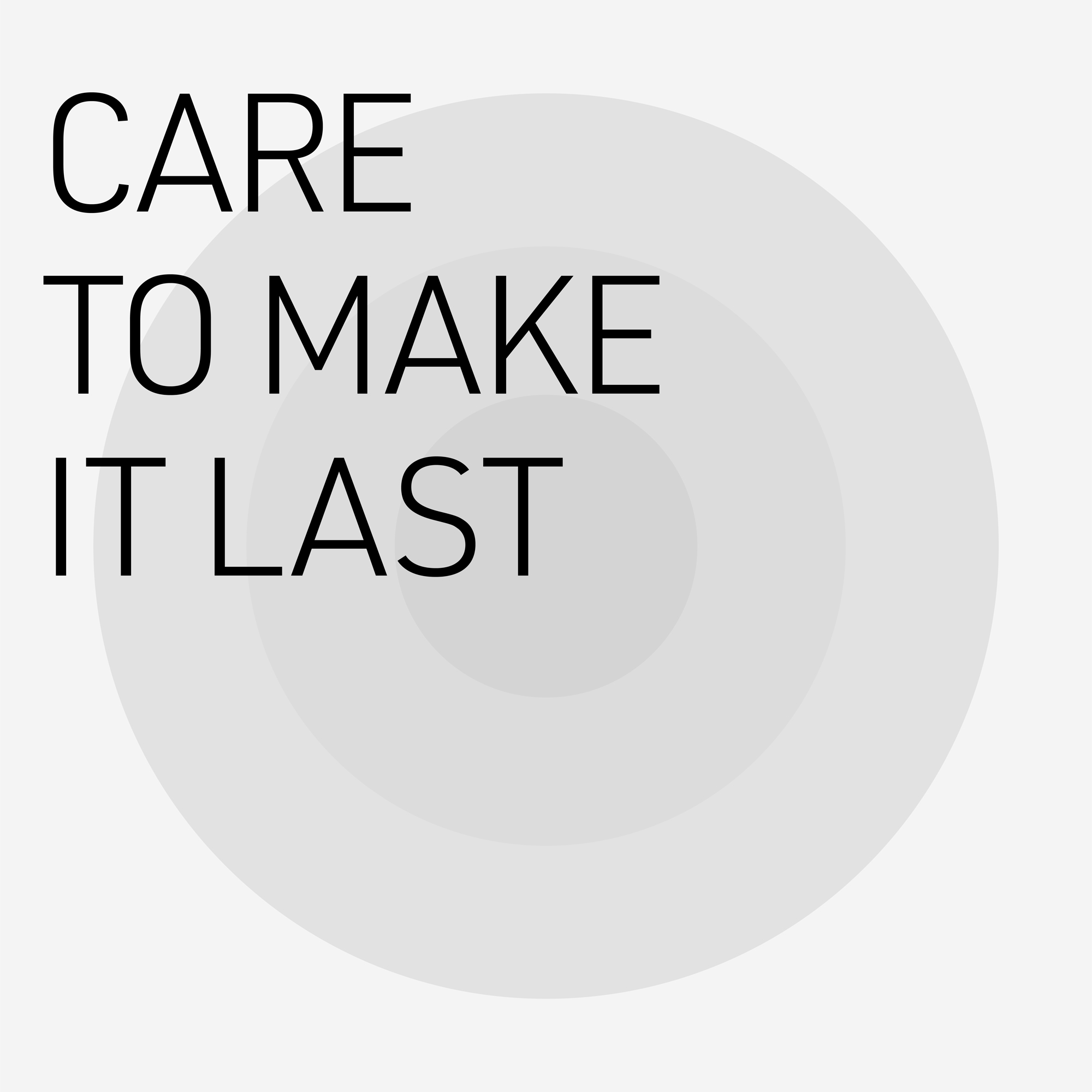
Our challenge was to create a single parent brand to house a growing lineup of initiatives and also fit within the Arc’teryx brand. We created a single story to sum up the brand’s approach to circularity, while nodding to their multiple circularity initiatives. Using standardized language—reduce, reuse, repair—the story helps consumers understand and participate in circularity.
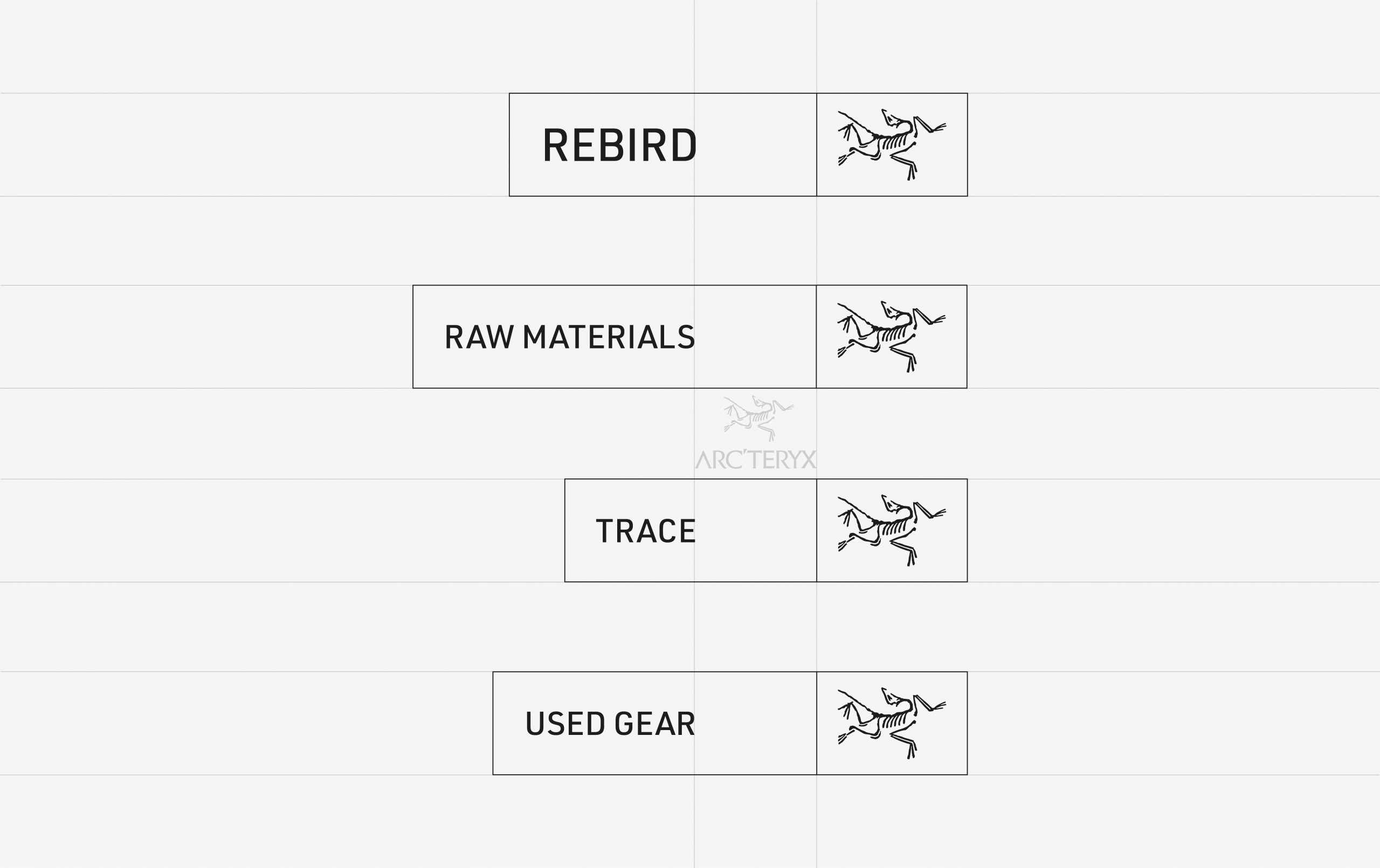
Because ReBird product is designed to the same quality standard as all Arc’teryx product, they wanted iconography that could clearly make ReBird products stand out on ecommerce, social media and store assets.
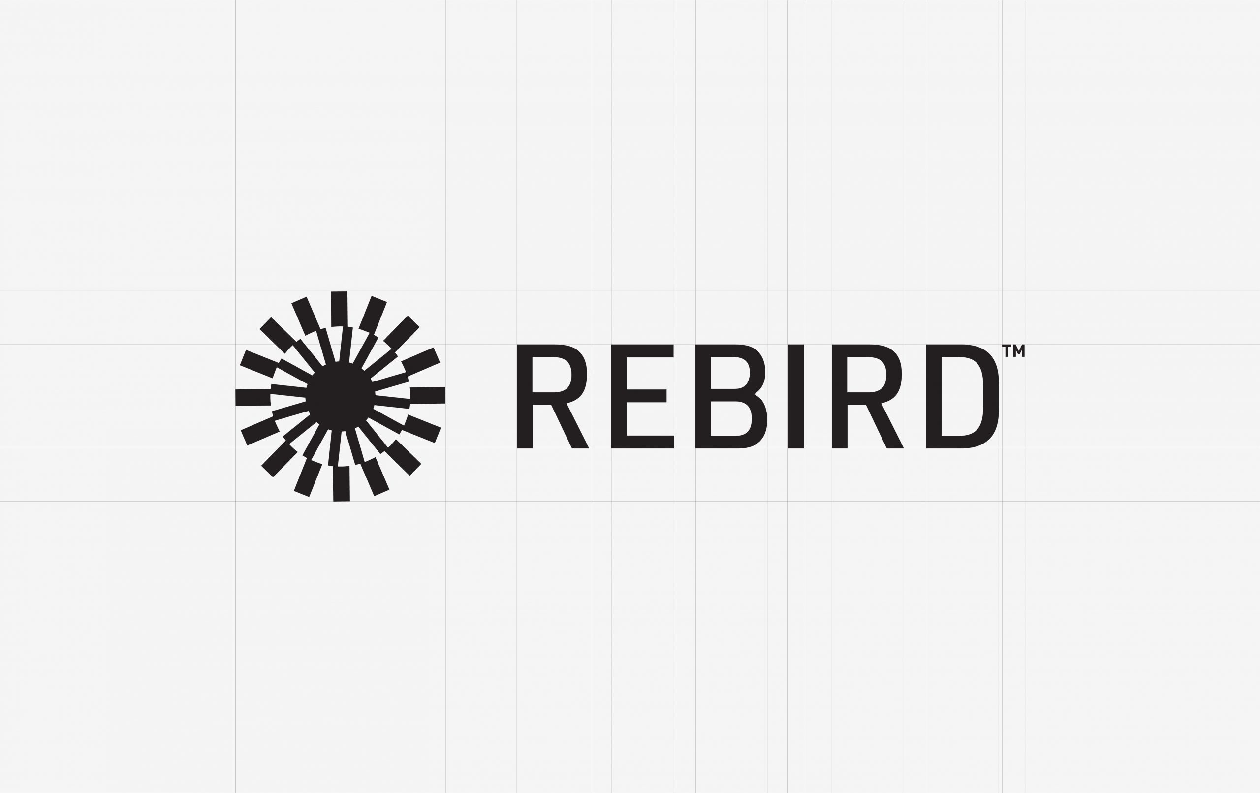
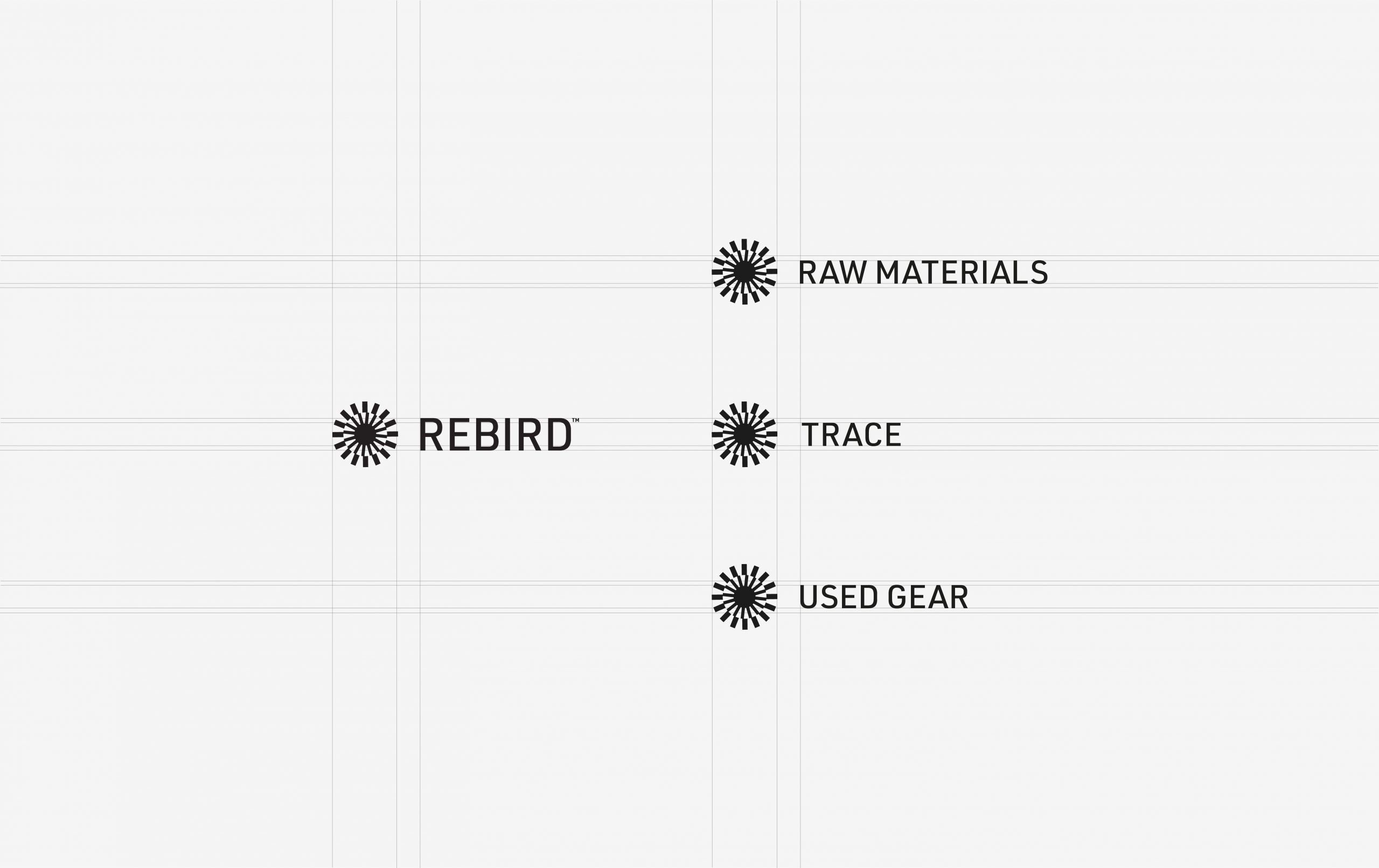
We rooted our “Core” icon in ReBird’s positioning: the idea that circularity permeates from the heart of the business and flows out to every part. The three layers of the Core reflect the three principles of circularity. They also make the Core incredibly dynamic. It is imbued with movement and can take new forms to represent new initiatives within the ReBird program.


Animation was key when we brought this to life—creating a series of assets that would translate to ads, video and the web. By imagining different crops and rotations, this becomes a pattern that can bring visual interest to old photography or video content.
For the web, our goal was to pull you deep into the world of ReBird through story. Working in partnership with the Arc’teryx team and the all-star development team at Pound and Grain, Monday provided the design and IA. Beautiful type sets the tone and the Core is introduced as a signifier that stays with you through the journey. As you scroll, the Core rotates and expands with the unfolding vision of a future with zero waste.
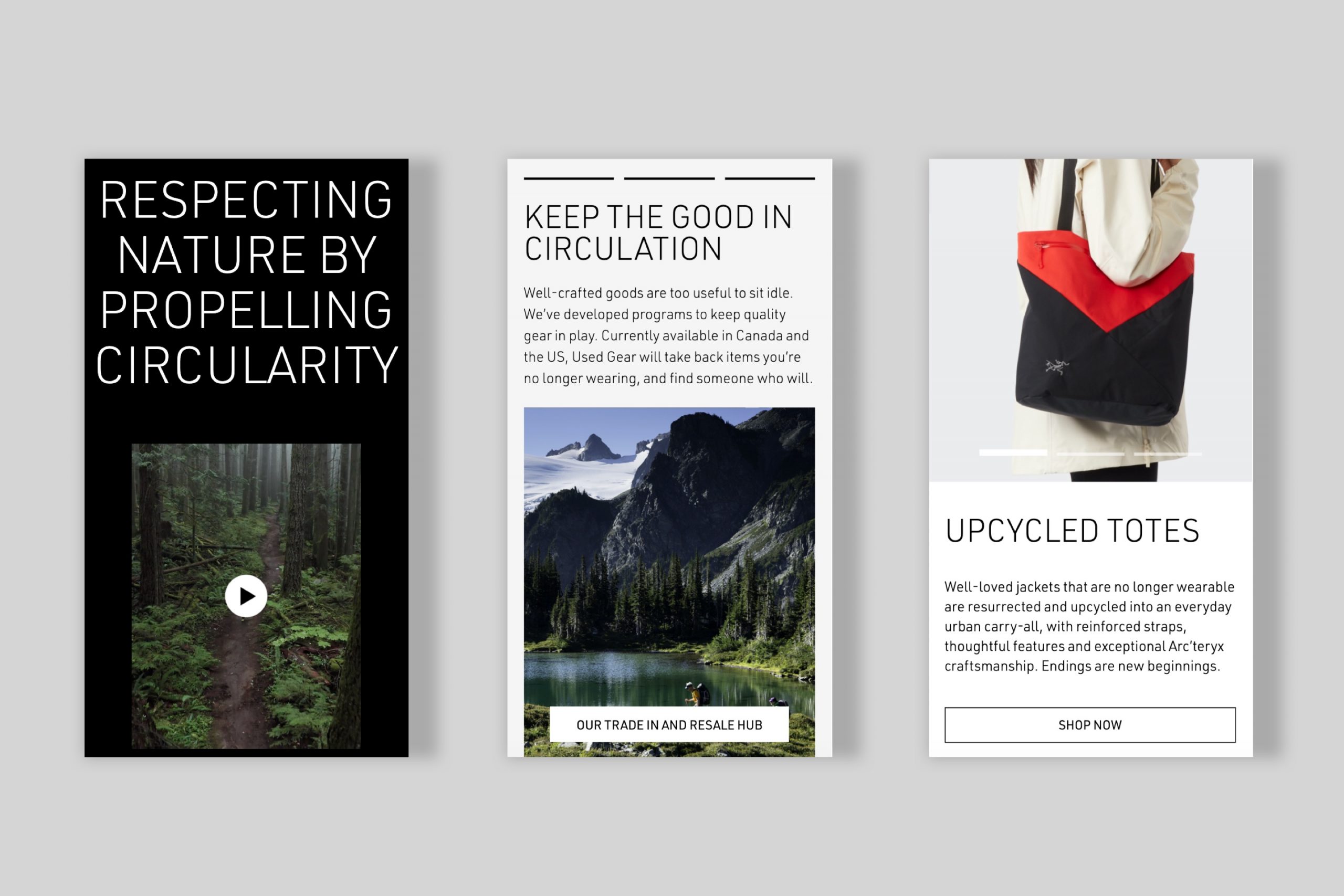
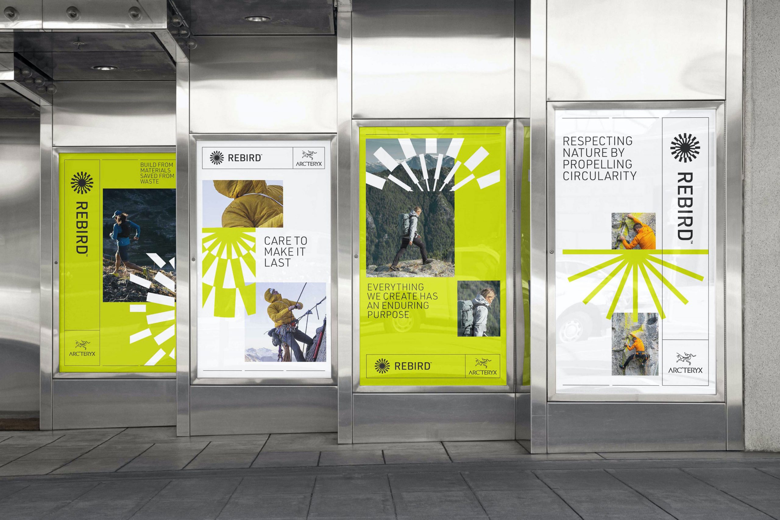
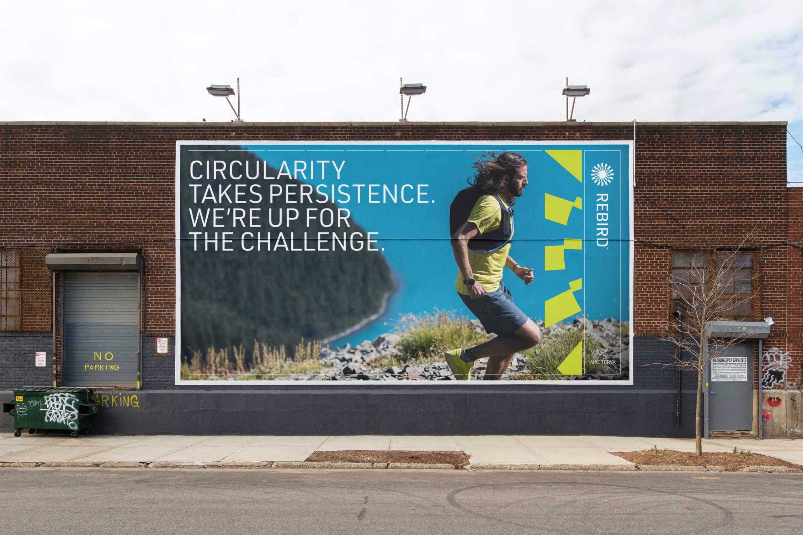
Launch campaign assets brought all the pieces together. We leaned into our visual toolkit for ReBird, using the animated Core paired with simple product photography and video. The result is very “Arc’teryx” but at the same time fresh and full of new purpose. A launch strategy sees these assets living within the brand’s existing channels in well-paced social posts, dedicated emails and email secondaries and forthcoming in-store assets.

04.03.21
Putting product circularity in the spotlight

05.28.21
How can the outdoor and active industry solve the challenge of making old into “newness”?

12.14.20
The hot new technology next year? Mushrooms, algae, farm waste and pollution