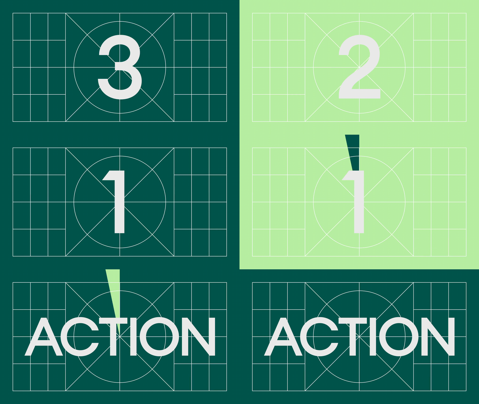
We hate to break it to you, but the days when you could rely solely on a static brand identity to amp up your brand presence are long gone. With the prevalence of video through all channels (yes social, but we also have those expectations of web too) it’s not enough to just have a beautiful identity that sits still. It needs to be dynamic, it needs to be animated, it needs to move—and that’s the power behind a kinetic identity.
“When it comes to Instagram, organic video posts and video ads get 38% more engagement than images. Over 50 percent of consumers say that they want to see more video content from brands they like.”—promo.com
So ready to reflect on your current identity through an active lens? Let’s start by digging into the what, why and how behind an animated brand identity.
What is this kinetic identity that you speak of?
Imagine a logo that swirls into life, a font that slowly sweeps across the page, a video that captures your purpose without saying a word—at a high level, a kinetic identity is a system of visual elements that brings a brand to life through motion. Now that’s not to say it’s simply about taking a static piece of content and making it move, it’s twofold. It starts by taking your current brand identity and conceptually extending it to consider movement. And a kinetic toolkit allows you to get moving in the right direction, stat.
For example, let’s take a look at the logo that Mucho designed for investment company Lux Capital. As an investment company they make and grow money. The logo takes this idea of addition, multiplication and profit and translates it into movement by rotating the “X” in “Lux”. Additionally, after the “X” rotates, it rises upwards and to the right—a nod to their purpose which is profit.

Why should you have a kinetic identity built into your creative arsenal?
Well, as Mr. Bob Dylan is known to say, times they are a-changin’. It’s safe to say that 2022 is taking the digital-first marketing approach and setting it to hyperspeed—just give our latest Crystal Baller article a read for more on trends like this. And if you want to be at the forefront of these spaces, you need to start thinking about the adaptability of your brand—how it can move and flex into new territories like these.
With increased flexibility comes increased engagement. Because your kinetic toolkit is a natural evolution of your brand, it allows you to further connect and tell your story across a wide variety of channels. By crafting a dynamic narrative that’s driven by motion—whether that concept involves animated GIFs, a 15-second pre-roll or a digital billboard—you’re reinforcing why you exist in the most compelling way. You’ll be ready to press play and watch those engagement metrics soar.
At the end of the day, it’s about understanding that motion is a fundamental part of who you are—and that your audience is eager to see you in action. A kinetic identity toolkit will get you noticed while staying true to your overarching brand identity. Because no matter the concept or medium, your design philosophy is the true north star for everything that you design and share with the world.
How does a kinetic identity get your brand moving?
When we connected with our friends at Arc’teryx to collaborate on bringing their ReBird program to life, it was clear from the hopper that circularity permeated from the heart of the business. It was this insight that drove the need for us to build out a kinetic toolkit for the program—movement was the answer to telling the ReBird story in a visually captivating way.
We landed on a “Core” icon that included three layers—each representing one of the three principles of circularity: reimagine, reinvent, respect. Through animation the layers rotate to reflect how these principles are integrated within Arc’teryx’s business lines—and illustrate how they interact in every design decision. It’s this dynamic movement that injects energy into the program. It also opens the doors for future iterations based on expanding initiatives or needs.
We actually break this all down in our case study on the ReBird program—it’s worth the read if you want to fully dig into how we set this initiative in motion.
Another example is the identity we created for the Heart of Burquitlam (HOB), the future of community. Through our brand strategy work with the HOB partners—Concert Properties, the City of Coquitlam and the YMCA—we helped refine the purpose of their vision and landed on connection, diversity and accessibility as the main communication pillars. We leaned into versatile storytelling concepts to reflect a community that adapts, reshapes and evolves with its residents.
Their kinetic toolkit included a library of shapes based on the HOB icon—itself a reference to the shape of a condo development being built in the community. We then added a layer of movement so the shapes could be put into action in a compelling way. This allowed their marketing team to communicate with greater flexibility across a variety of channels—while celebrating the sentiment behind what it means to live in an inclusive, evolving community.
So what’s the moral of this action-packed story? In 2022, motion cannot be an afterthought. Instead, it will be the lens through which designers start viewing the infinite possibilities of crafting a brand story. It will become the centrepiece of a project—one that’s warps and shifts with your audience, connecting with them in a far more dynamic way than static images ever could.


