Let’s talk brand toolkits. As a loyal reader of Monday Mag (right?), you know by now that you absoltuely need one—but figuring out what actually goes in it? That’s a whole different ballgame. It’s high time we got down to the nitty-gritty of what key components make a successful brand toolkit. From positioning to colour palettes, here are the five fundamental elements that every brand should document to enable serious (and sustainable) brand growth.
Brand Positioning
We’ve said it once (okay, a million times) and we’ll say it again: running a business without brand positioning is like heading out on on a road trip without a map. It’s your north star—the foundation that shapes every part of your brand. Without it in your toolkit, you’re shooting in the dark.
The heart of your brand positioning is your Brand Purpose: a memorable, proprietary statement that succinctly sums up your ‘why.’ Sometimes it becomes your tagline, but sometimes it’s just an internal beacon for every decision. Your brand story brings colour and life to your purpose, while your brand pillars and key messages form the framework that guides all external communication—a mix of your what, how and your ever-important why.
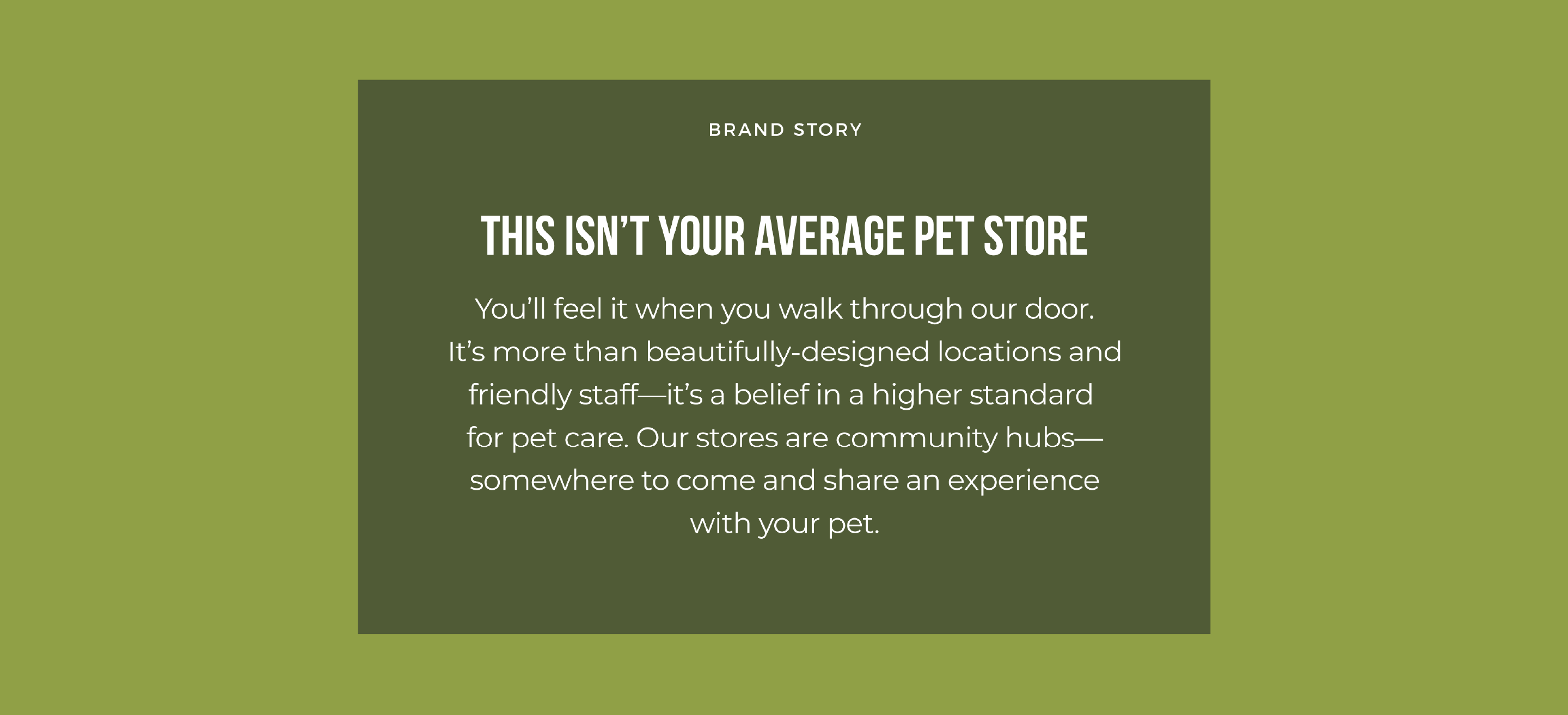
Brand positioning is always our first priority when laying the groundwork for an up-and-coming brand—but it’s not reserved only for those just getting their start. Our work with Homes Alive Pets is a prime example. After 30 years in business, their team all had different versions of who they were and why they existed—which was leading to inconsistencies as they grew. By getting crystal clear on their brand positioning, we helped the HAP team articulate their one-of-a-kind approach to pet parenting with unified messaging that will serve them well today and decades down the line.
Visual Identity + Design System
Whether it’s an iconic logo or a colour palette that just makes you feel something, your visual identity is an invaluable tool that can make or break a brand. From 50-foot billboards to perfect packaging details, every part of your visual identity should map back to a clearly defined design system—which goes well beyond just a logo, colour palette and typography. It includes iconography, patterns, graphic treatments, and art direction—and might even include illustration and animation. Just because you’ve established visual parameters doesn’t mean your creative should feel repetitive or stale. Your design system should work to create a sense of cohesion that feels familiar to audience and helps keep out-of-the-box ideas on-brand when embracing trends or seasonal moments.
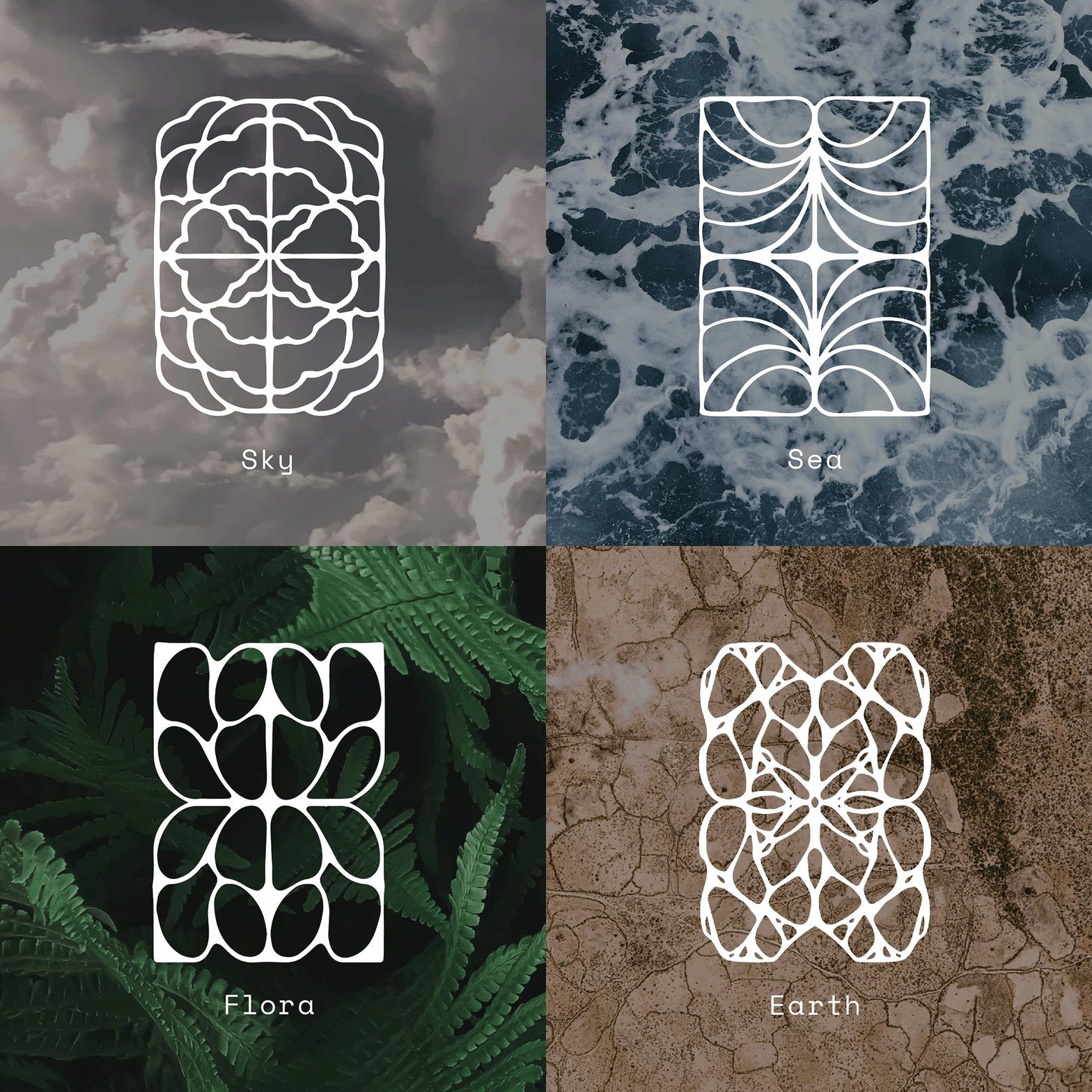
Developing a visual identity for The Museum of Earth highlighted the importance of building brand elements that can lend themselves to a myriad of use cases—from immersive installations to wayfinding touchpoints that guide users through the Museum. By juxtaposing natural and technical elements, we created a robust design system that allows for omnichannel flexibility and sets the Museum up for its future home in Los Angeles.
Brand Voice
That brand whose social posts stop you mid-scroll and whose newsletter you actually read top to bottom? They’ve all got the same thing nailed: their Brand Voice.
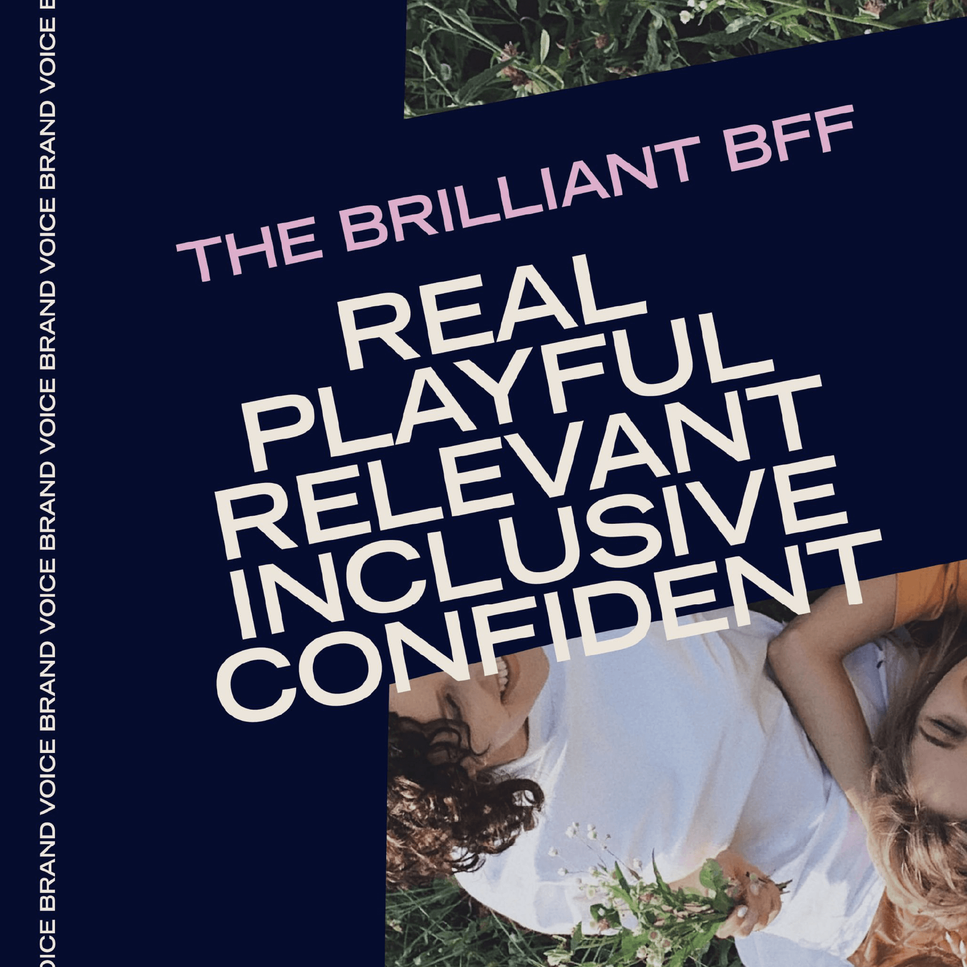
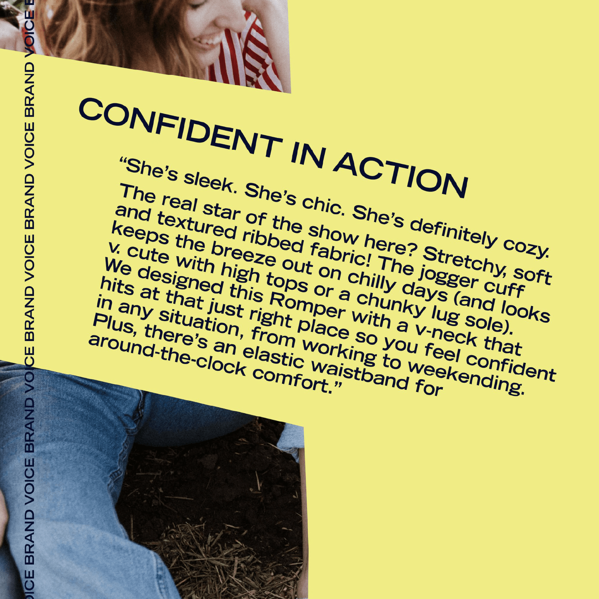
It’s not just about what we say, but how we say it—including word choice, order and pacing. Writing in your Brand Voice creates a consistent brand experience that builds familiarity and trust with your audience—and creates a cohesive image of who you are. A Brand Voice Guide also helps ensure all team members—from your marketing department to external contractors—are writing about your brand in a unified way.
Start by thinking about your brand as a person. If you met them at a party, what are some words you’d use to describe them? Maybe they’re playful and confident like Smash + Tess, or empowering and curious like The Museum of Earth. Once you’ve landed on a list of attributes that feel true to your brand, think about how they show up in practice. While not every trait will show up in each piece of copy you write, at least one should at all times.
Audience Personas or Muse
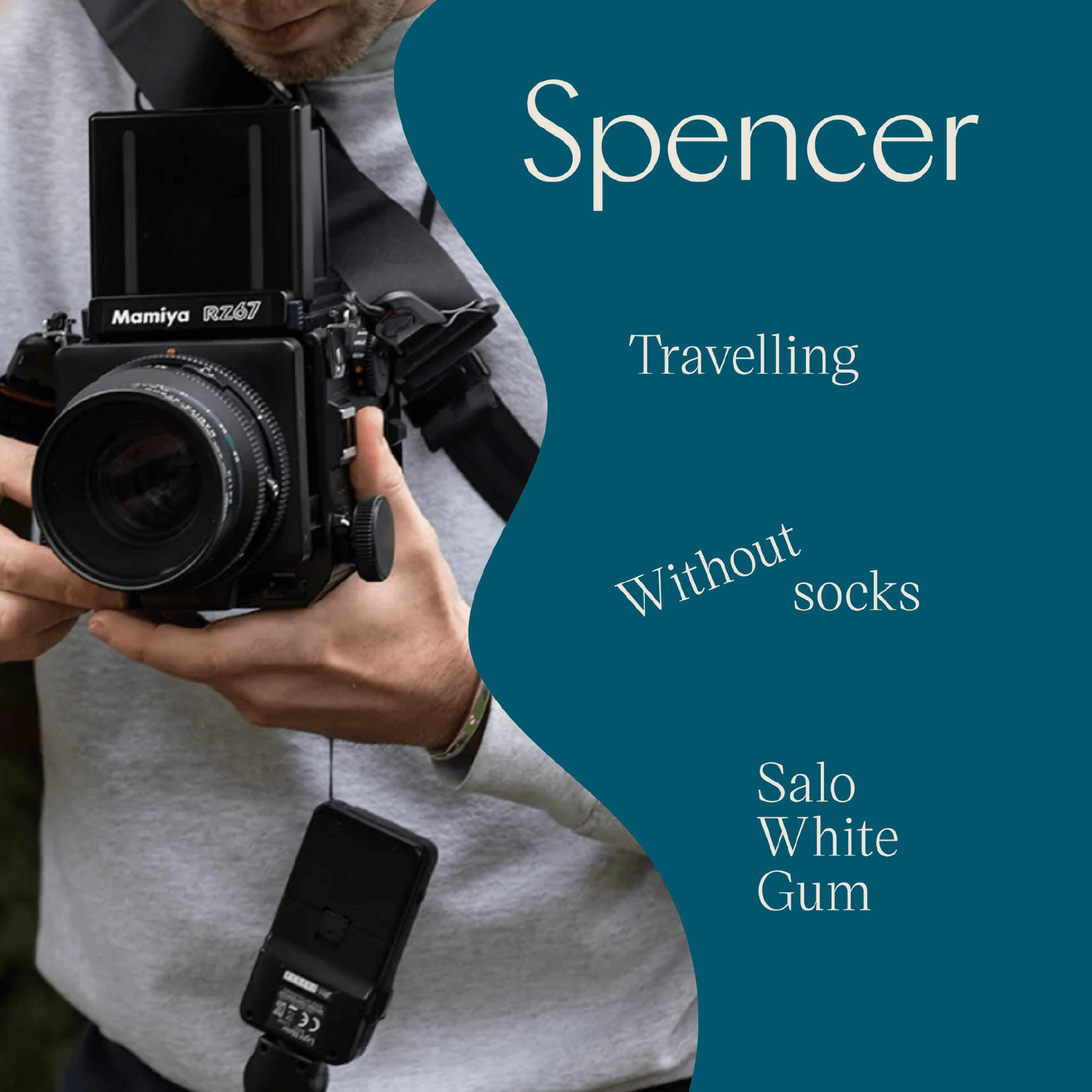
The secret to creating meaningful content your audience will really connect with? Get to know your customer like you’re getting to know a friend.
What do they value? What keeps them up at night? What brands are they coveting? Who are they turning to for tips, tricks and the latest TikTok trends?
Defining and prioritizing Audience Personas helps create a tangible image of who you’re connecting with—and makes it easy to tailor your marketing efforts to match your audience’s motivations. When it comes to bringing your Persona to life, be realistic. Paint an honest picture of your best customer, their shopping patterns and behaviours—not how you wish they interacted with your brand.
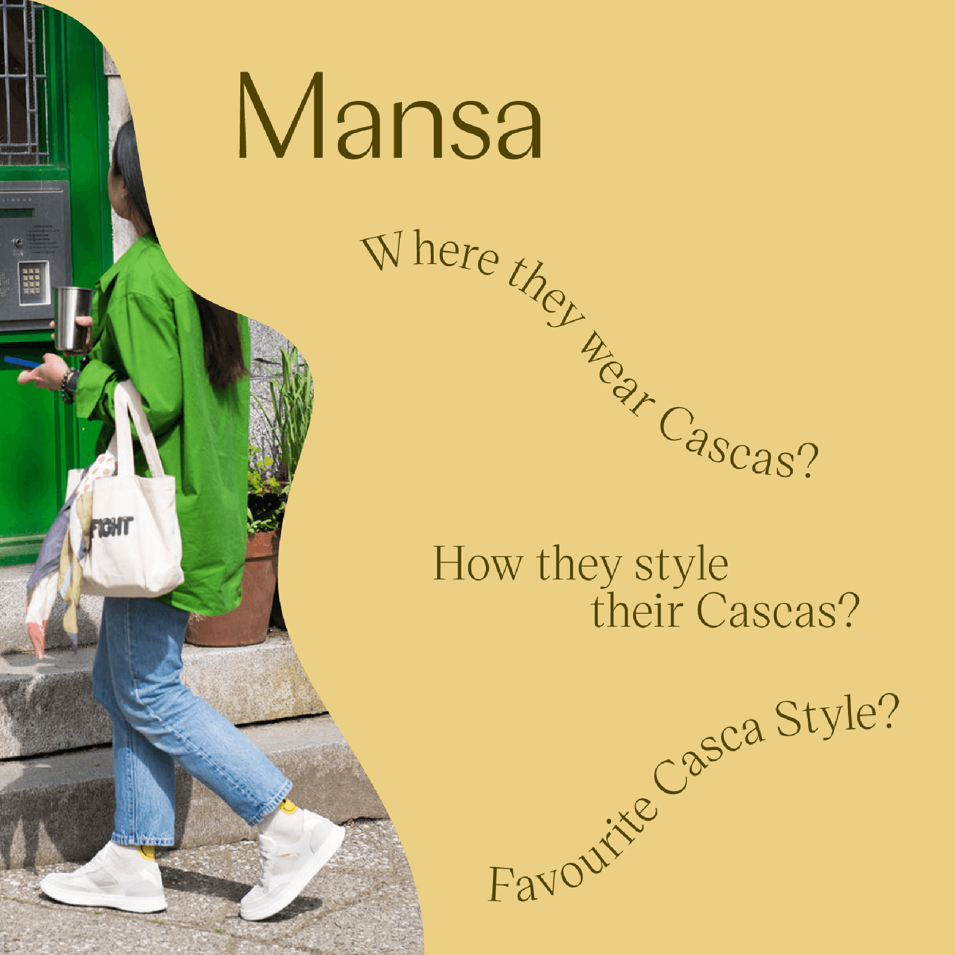
Once you’ve got your Personas dialled, go one level further and define your Muse: a super-niche segment of your target audience that you’d consider your dream customer. This is also a good starting place if you’re a new brand without existing customers. Our Muse work for Casca, a wellness-focused footwear brand, served as an invaluable compass as we reshaped their messaging and identity—ultimately helping us align their purpose with the needs and goals of their most aspirational audience.
Content Marketing Toolkit
Positioning? Done and dusted. Visual identity and art direction? On lock. You’ve laid the groundwork. Now it’s time to bring it all together and keep the momentum going.
Setting up your channels to thrive starts with a fully-stocked marketing toolkit. Our must-haves? A set of interchangeable email templates that help your weekly marketing emails come together in a snap, ready-to-run digital ad templates that can be customized depending on the campaign or season, and core evergreen email flows like your welcome series, re-engagement emails and other e-commerce automations. We helped Dometic Outdoor make the shift to a digital-first DTC presence with help from custom interchangeable email modules. The result? New customers in the (virtual) door and more folks enjoying Dometic in the great outdoors.
Looking to build your brand toolkit from the ground up or just in need of a quick refresh? You know what to do.


