07.22.22
The Museum of Earth
Immersive branding for a museum that’s about to rock your world
GO
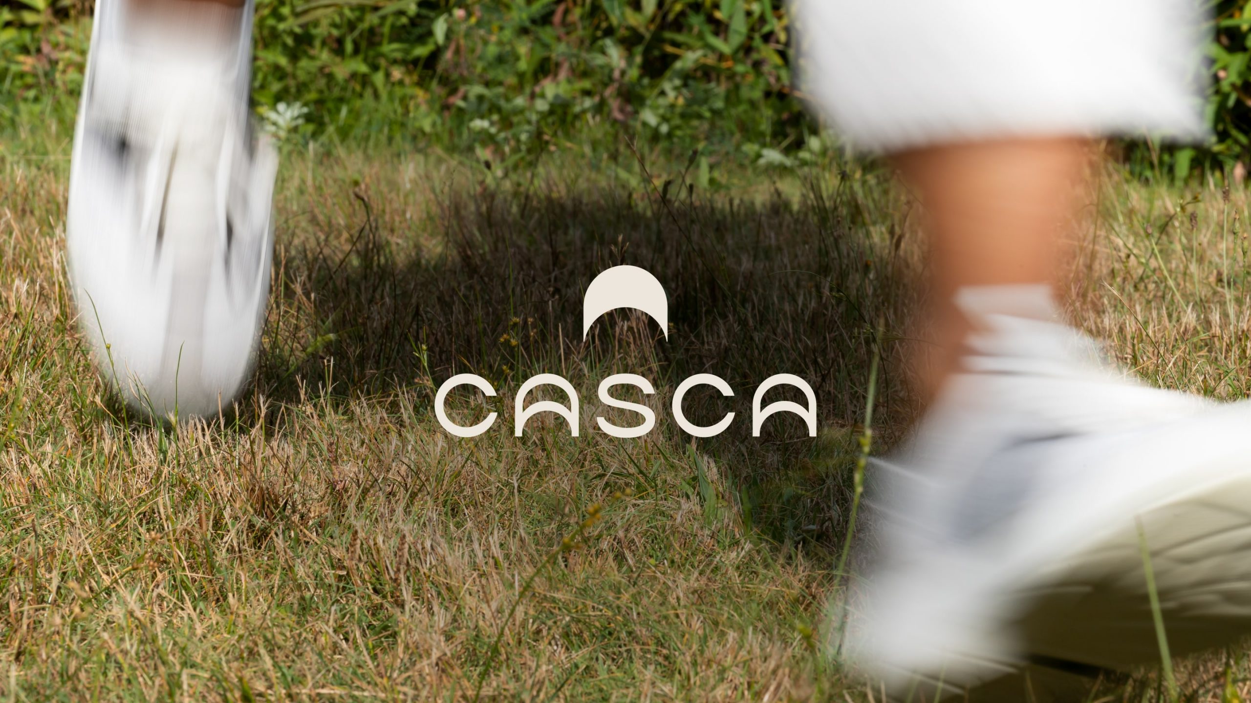
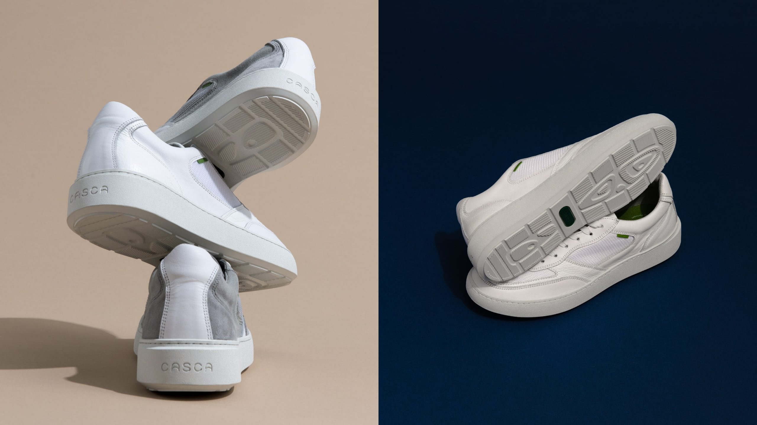
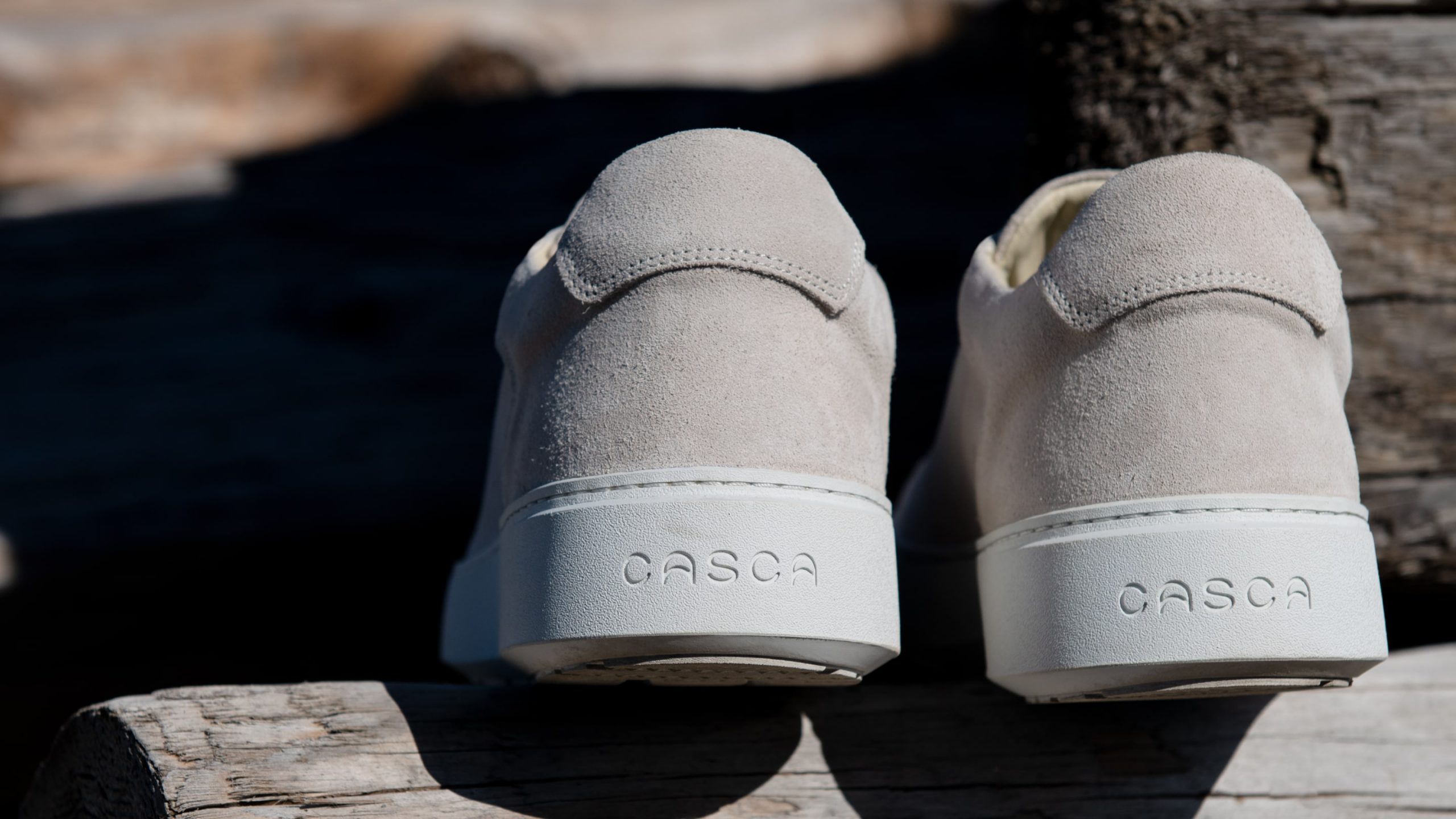
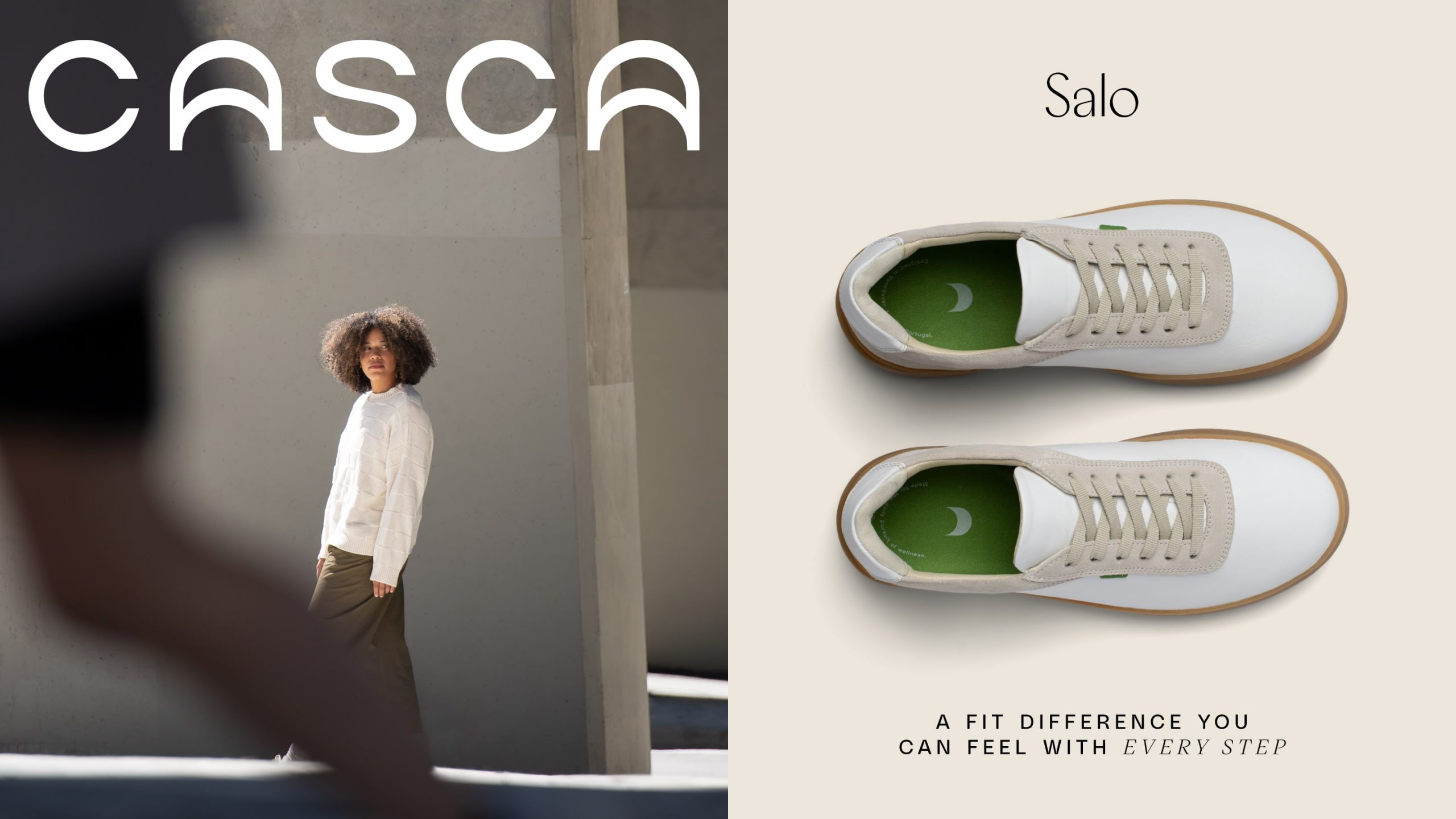
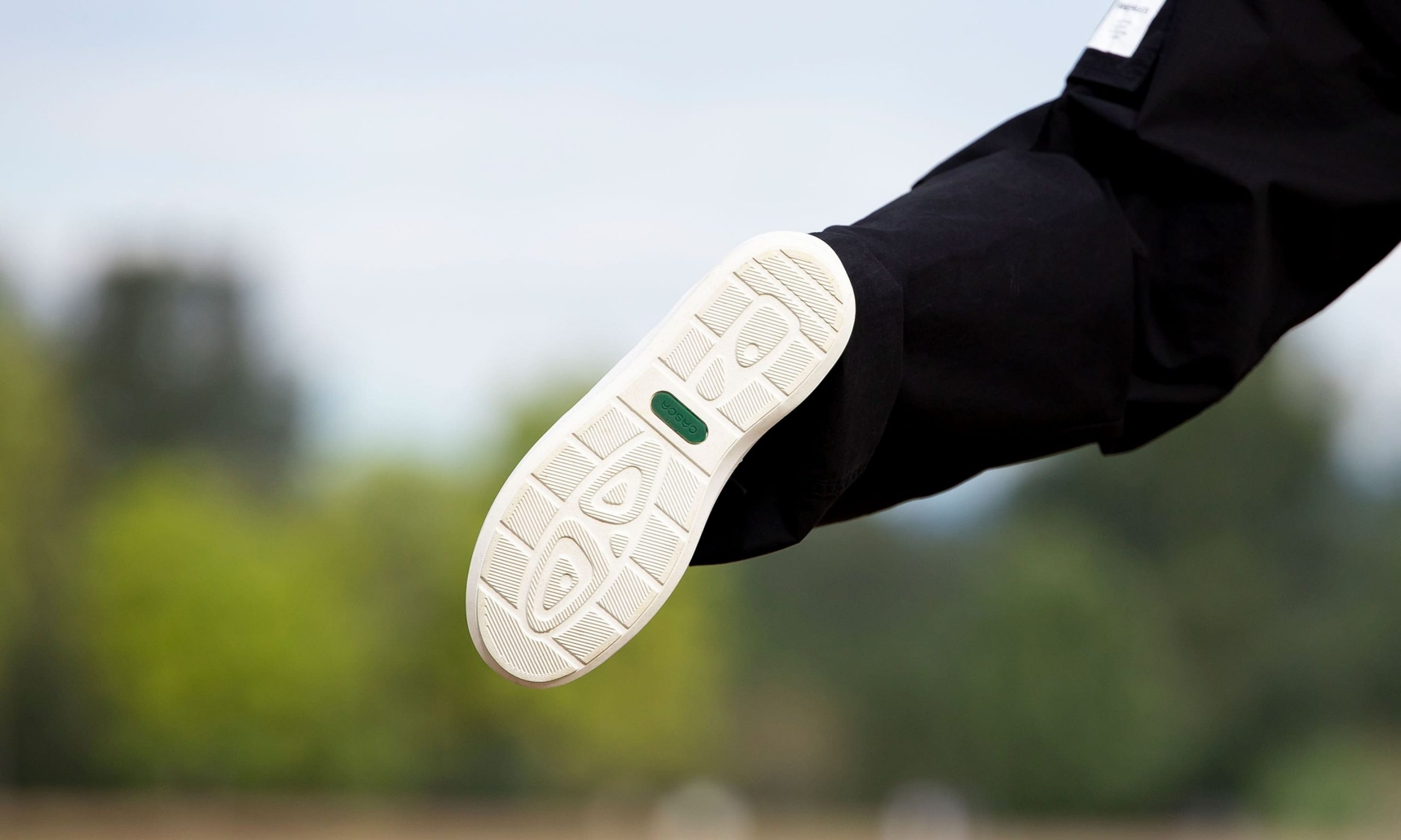
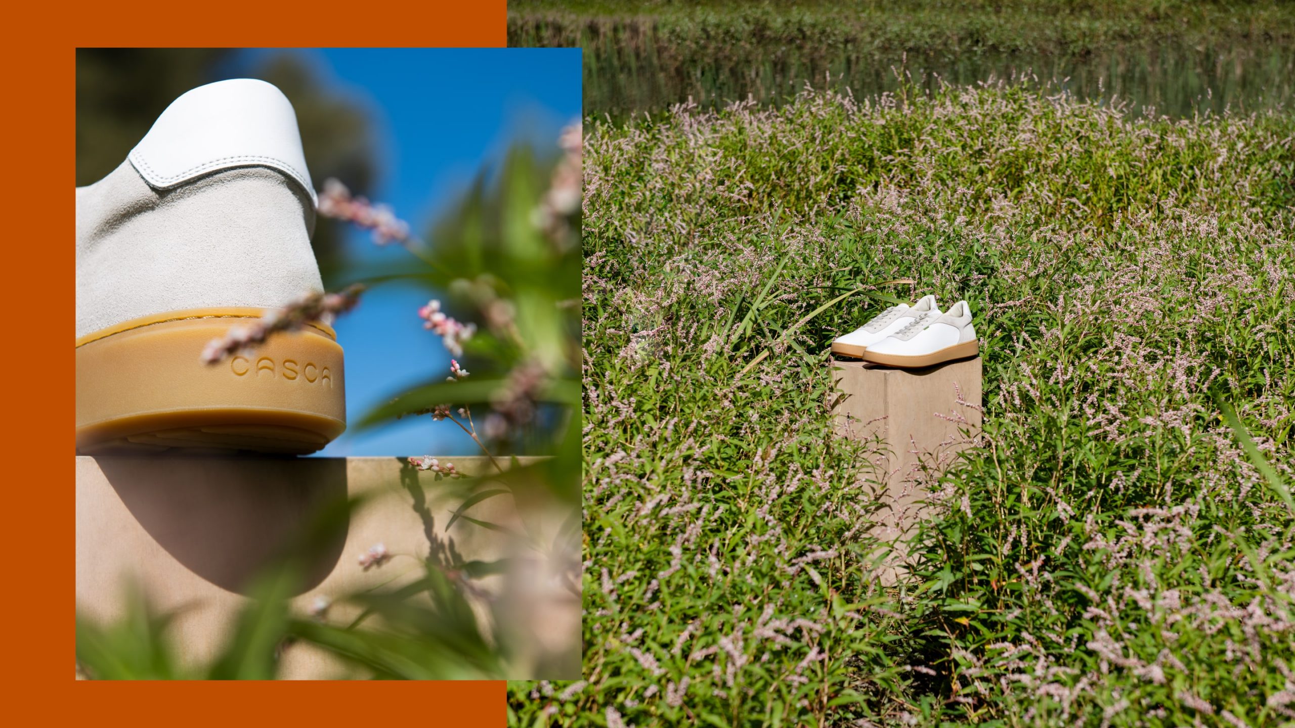
Most shoes are designed for an ‘average’ foot—but what’s average? Stepping into a pair of custom-fit Cascas immediately feels different. Casca 3D prints custom insoles for each foot, giving you a completely unique pair of shoes that supports your entire body.
When Casca initially launched, the tech behind this first-of-its-kind footwear took centre stage—but it soon became clear that the brand was becoming a pillar of their community’s daily health and wellness routines. Meanwhile, the Casca team was fulfilling their sustainability commitments by moving production to a solar-powered, low-emissions factory in Portugal.
As the long-term health of people and planet became the brand’s primary focus, we helped Casca capture the evolution of their vision. Their new brand positioning and visual identity stem from the world’s natural frequencies—keeping everyone attuned to their body and surroundings.
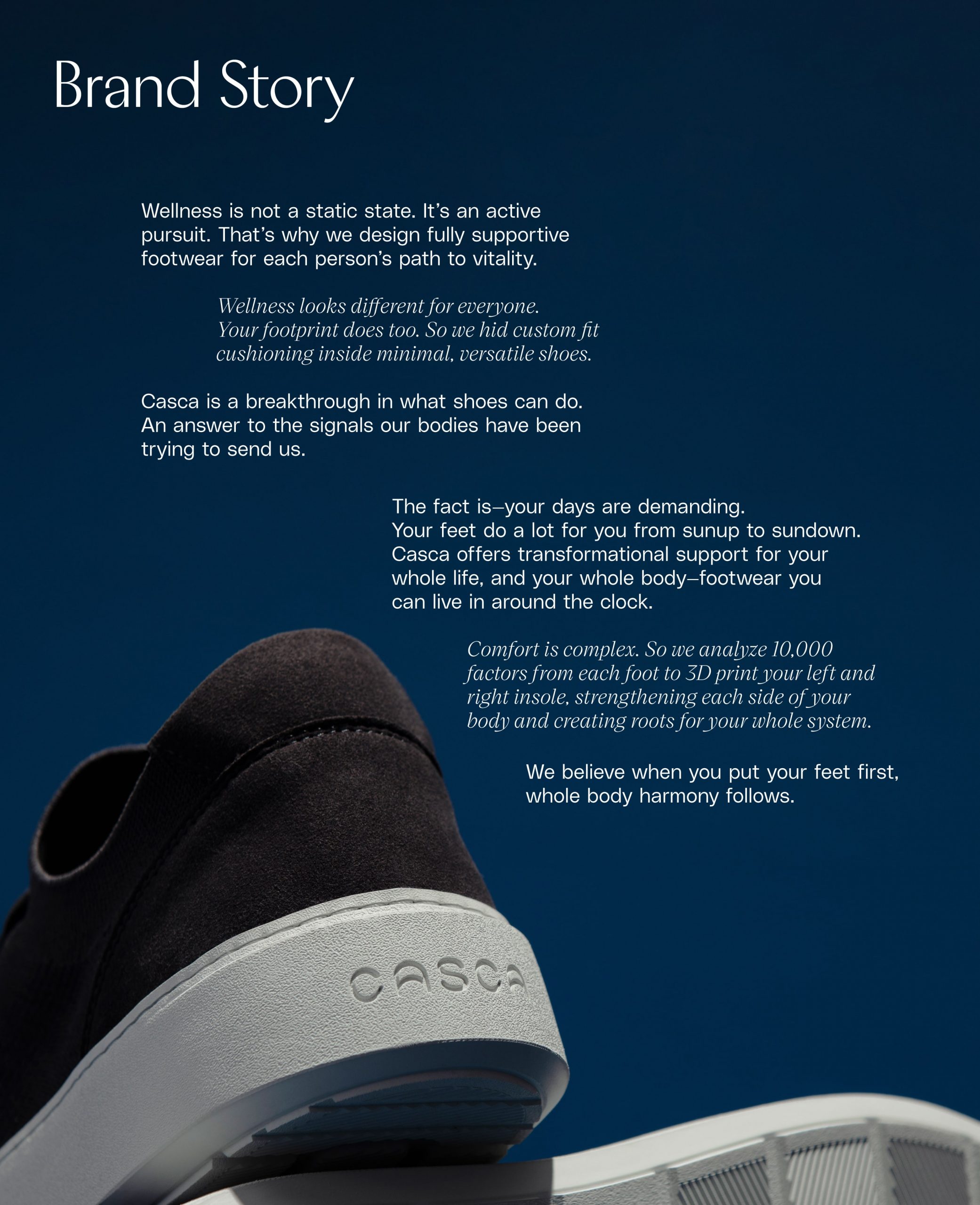
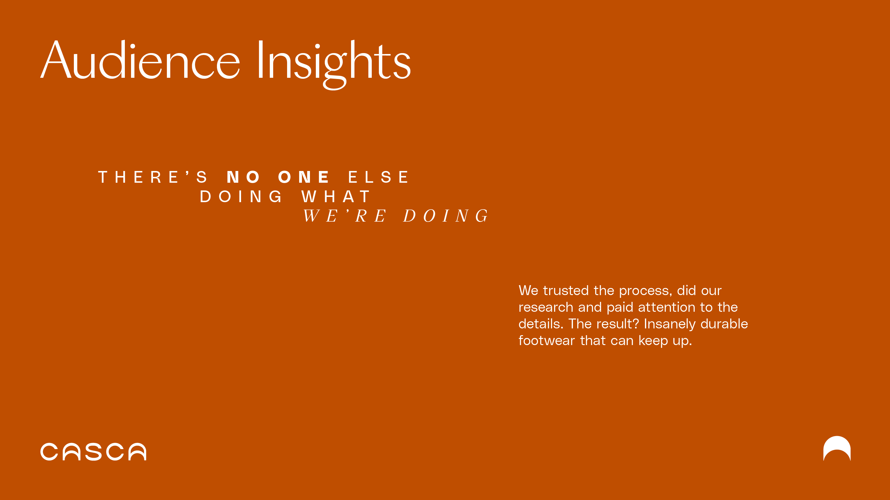
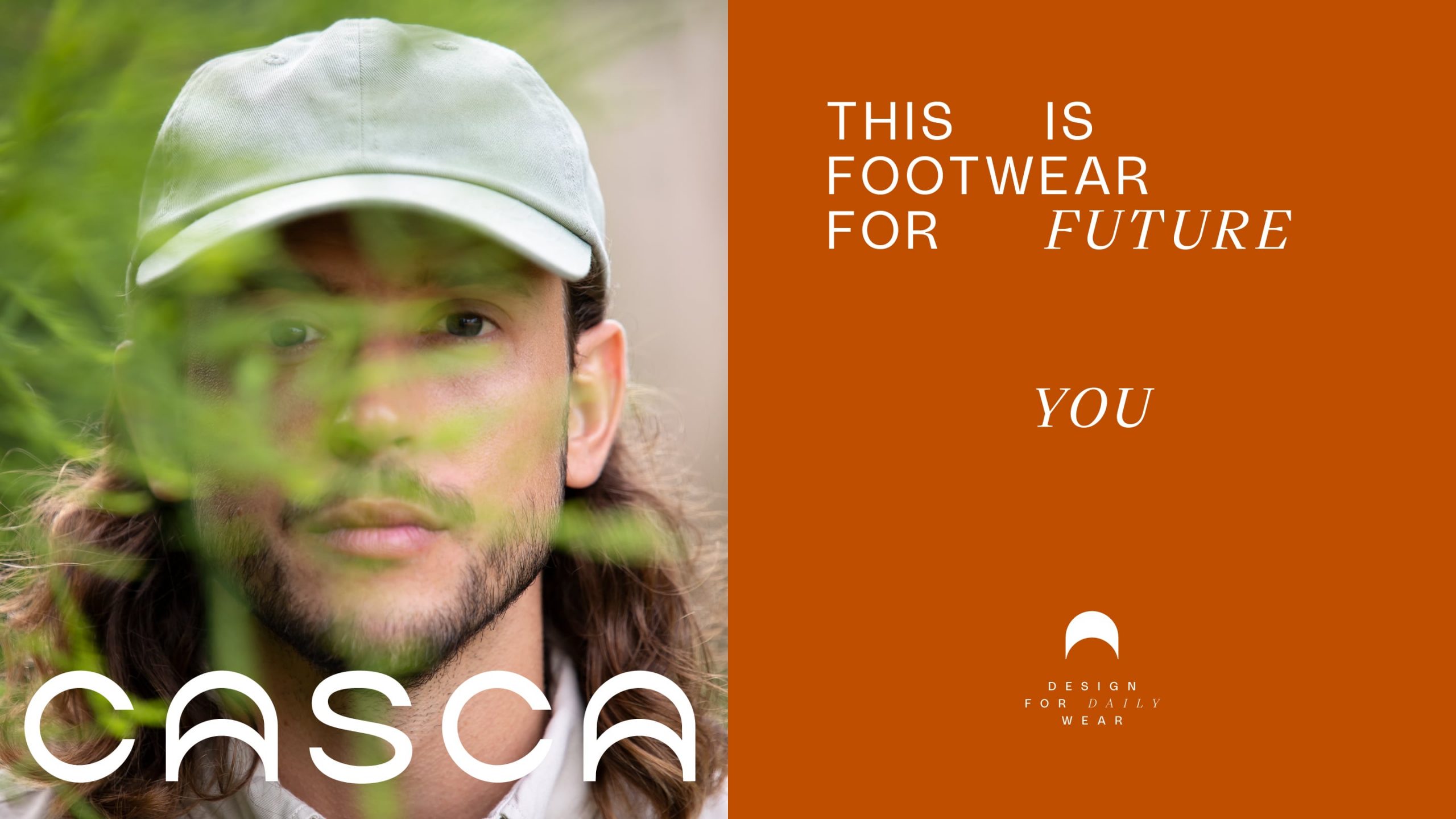
To help Casca reveal the pivotal role feet play in overall wellness, we spoke to the brand’s loyal fans and early adopters. We uncovered how the brand fits into their community’s lives and what their daily routines look like. With this foundation, we zeroed in on two aspirational audience groups. These muses became our compass as we reshaped Casca’s messaging and identity.
We audited existing messaging to hone in on the biggest opportunities to evolve their voice. No cumbersome tech terms here—Casca’s new tone makes the deep science behind their design process both digestible and interesting.
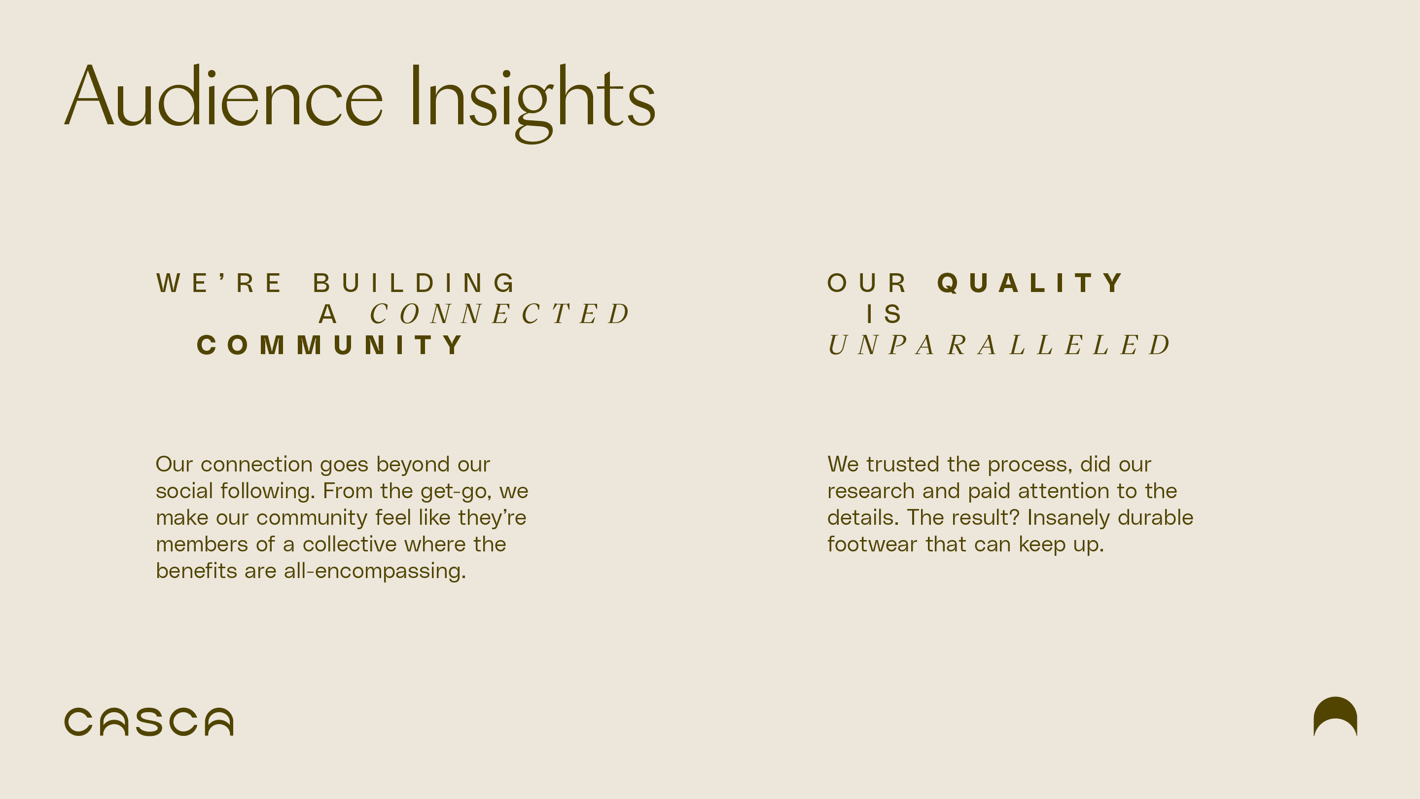
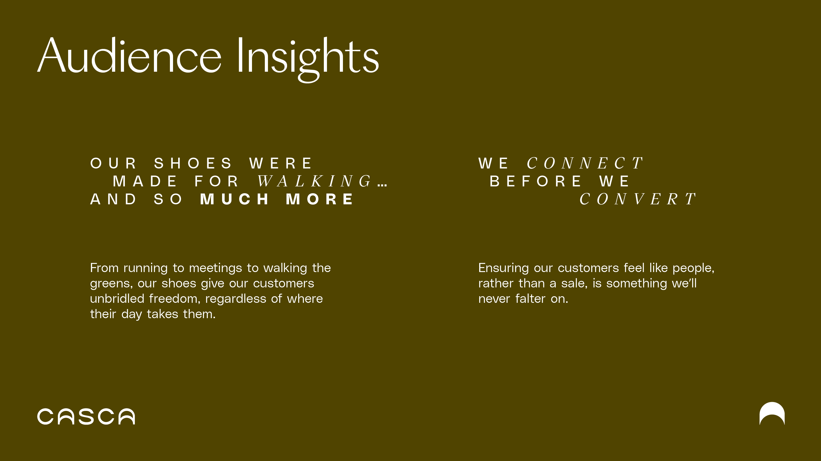
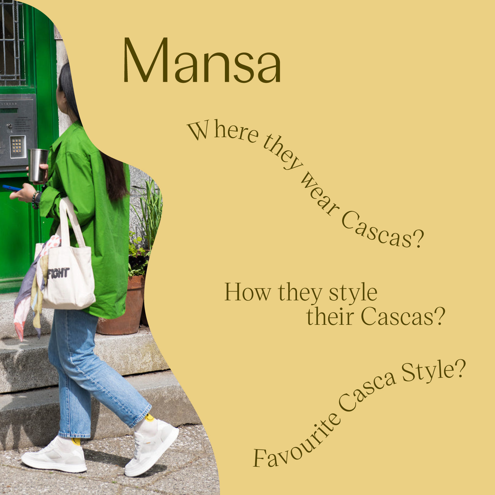
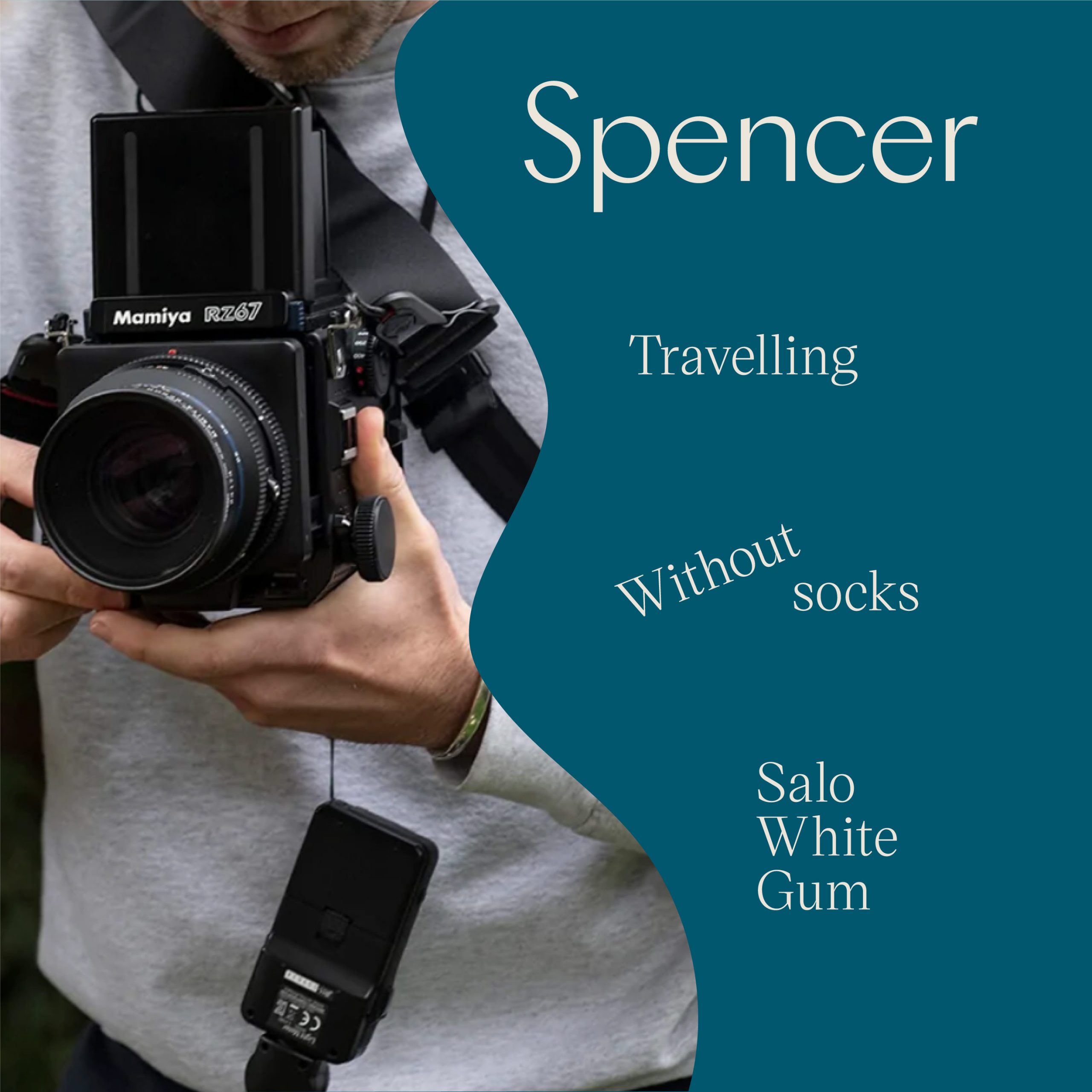
You’ll take 240 million steps in your lifetime—your shoes play a huge role in your balance, posture, pain and endurance. Our next challenge? Get people from all walks of life to recognize that wellness starts at ground level.
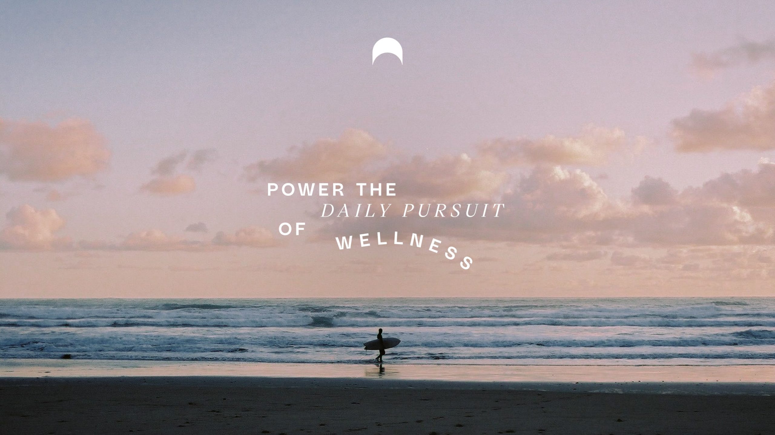
We landed on a brand purpose that captures how Casca’s footwear stands out from the pack: “powering the daily pursuit of wellness”. From here, we rounded out a set of brand pillars that drive that purpose home.
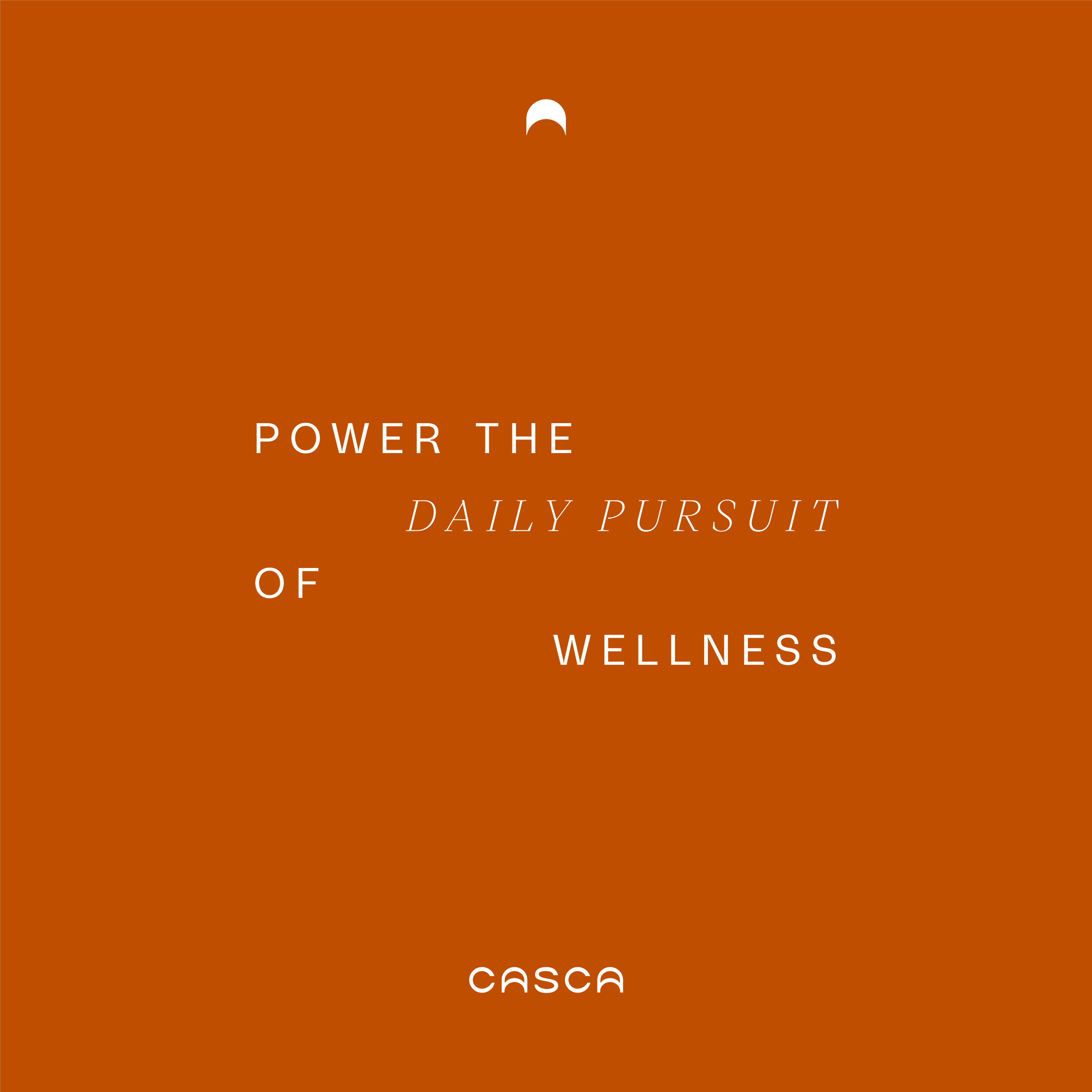

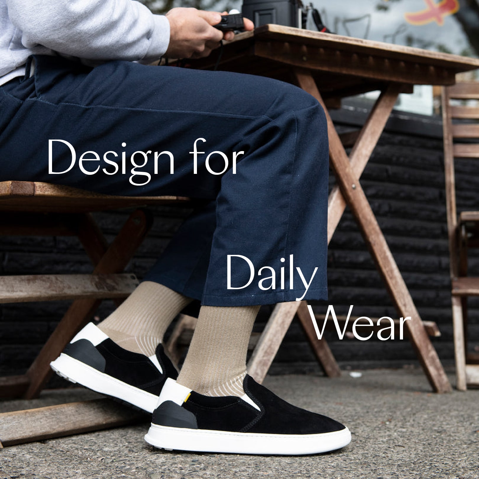
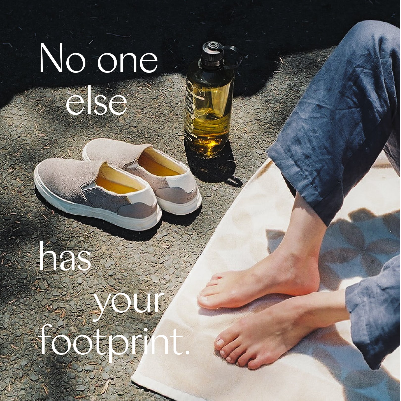
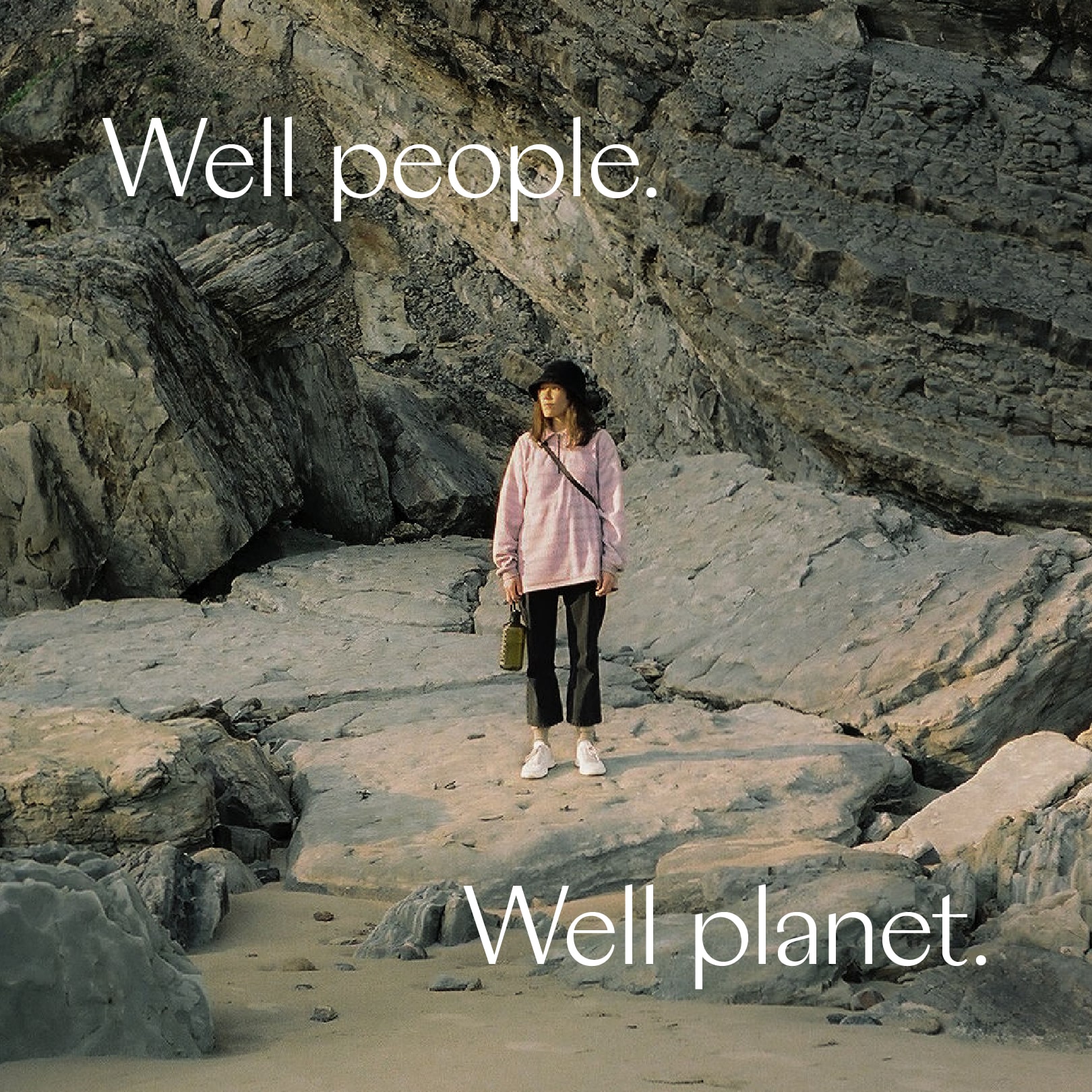
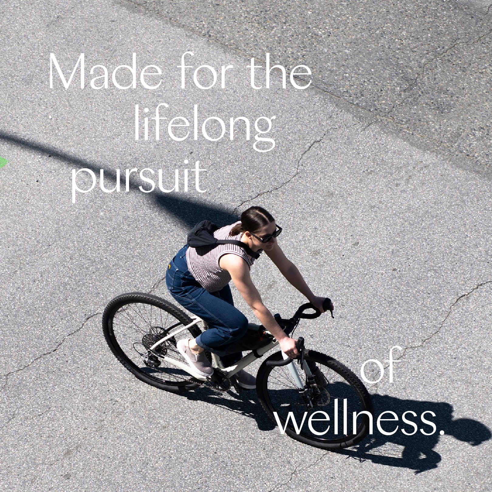
To distill everything Casca represents, we created a brand identity inspired by the rhythms of nature and everyday life. The intimate image cropping and movement within copy all reflect the frequencies of the world and how we move through it.
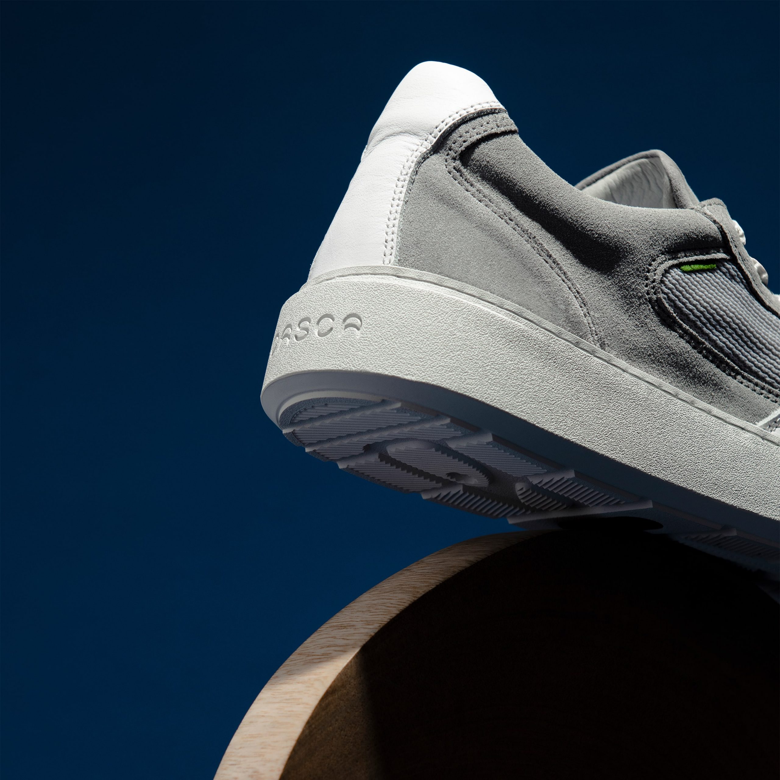
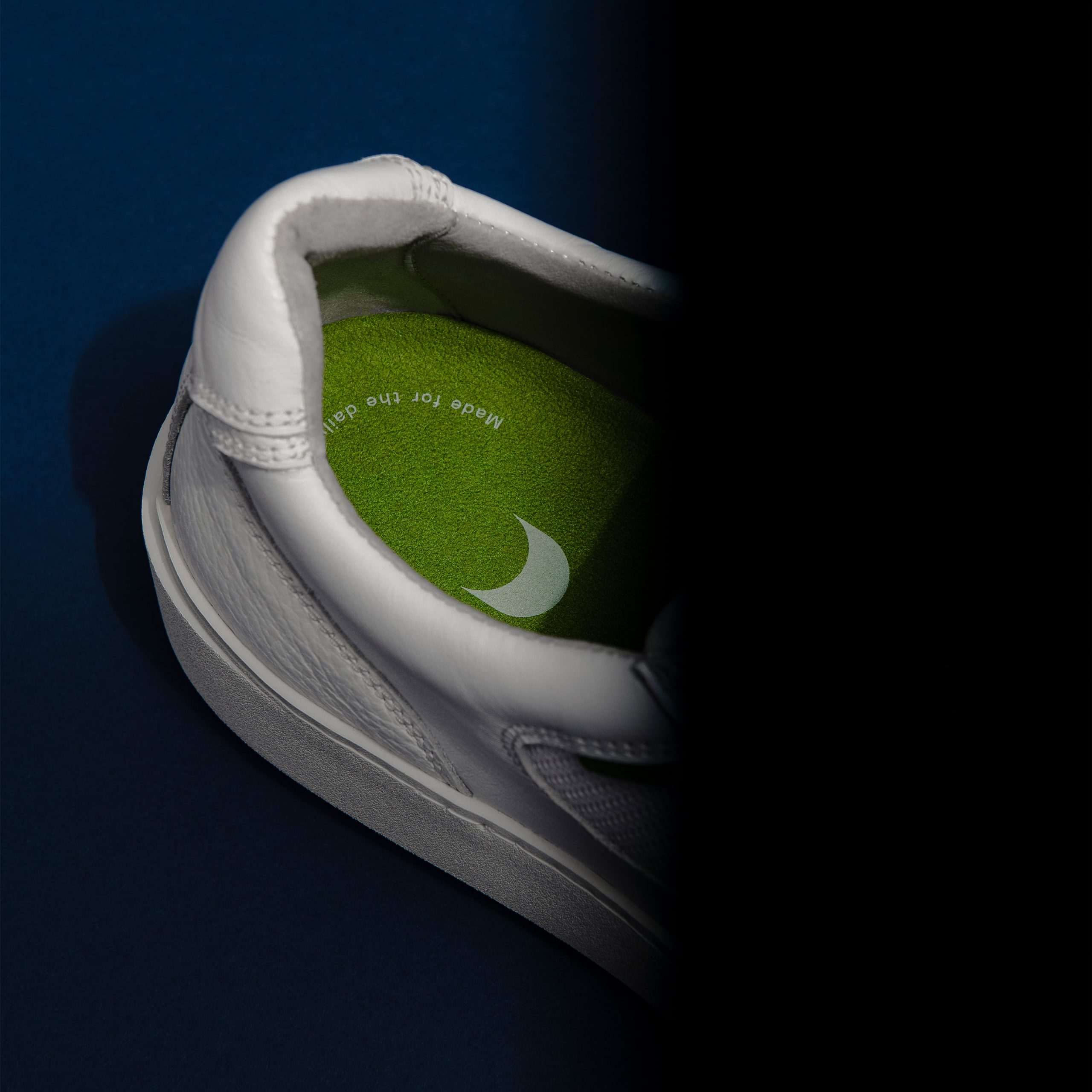
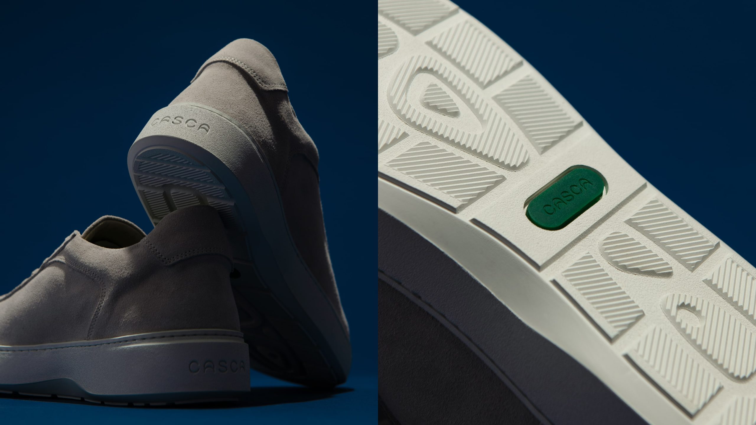
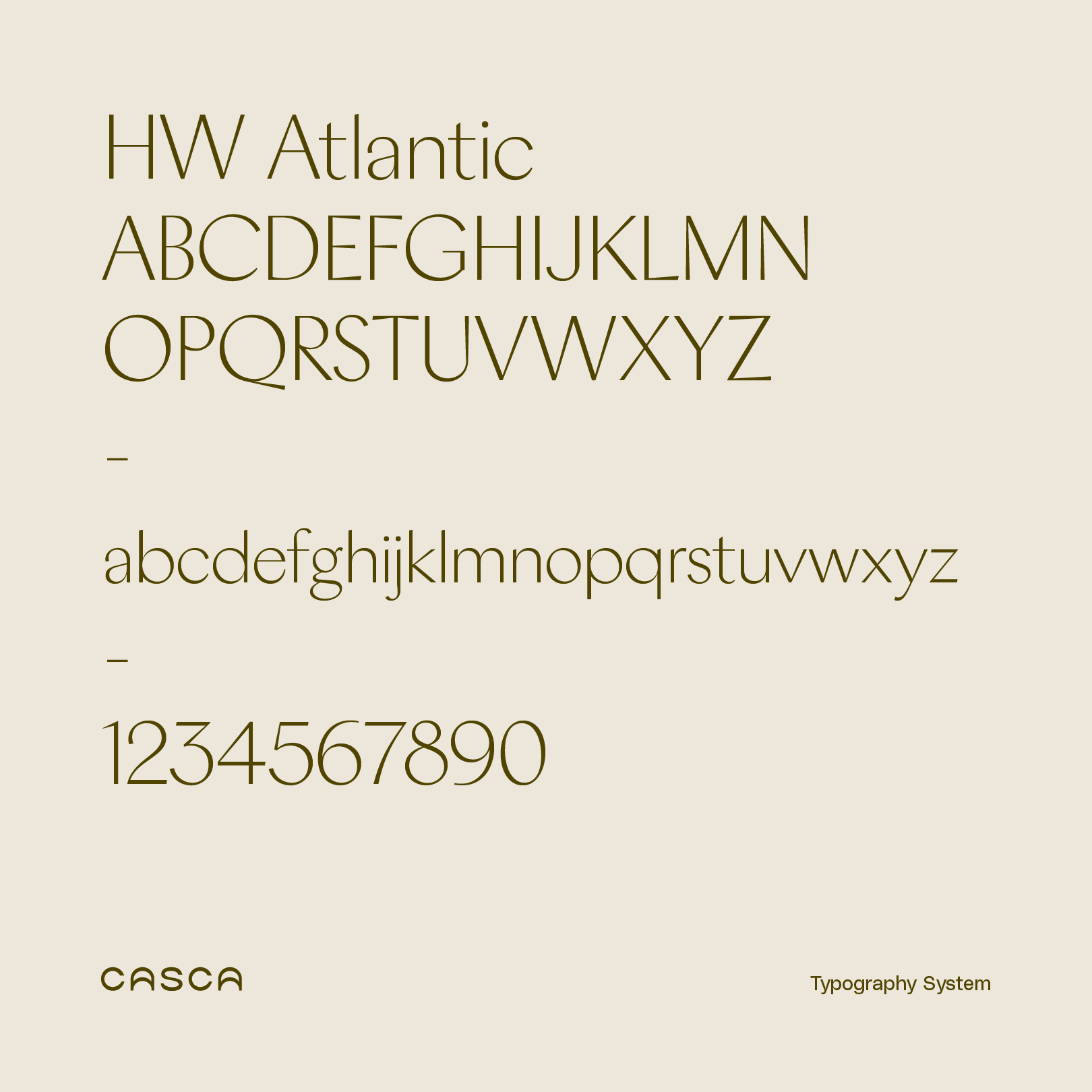
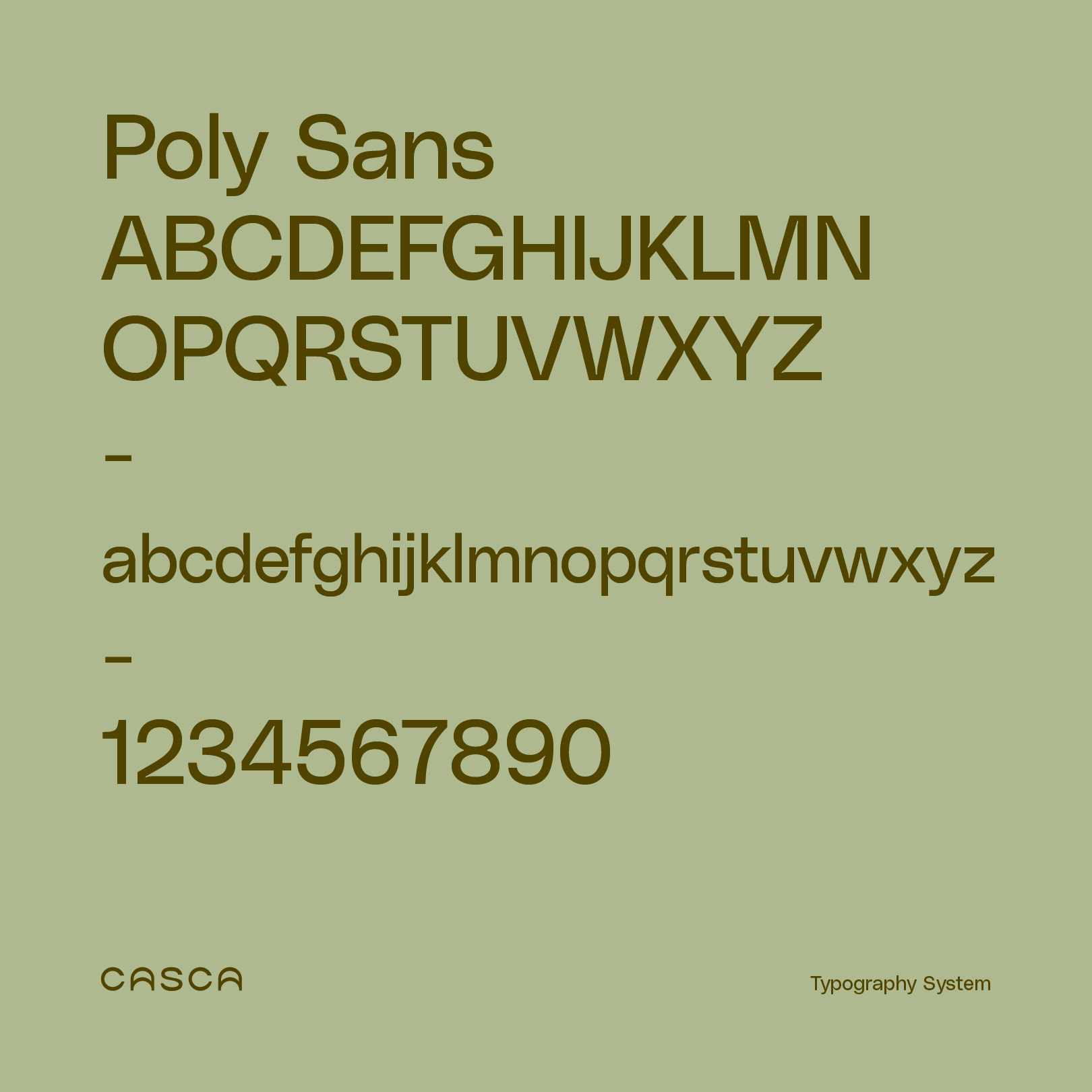
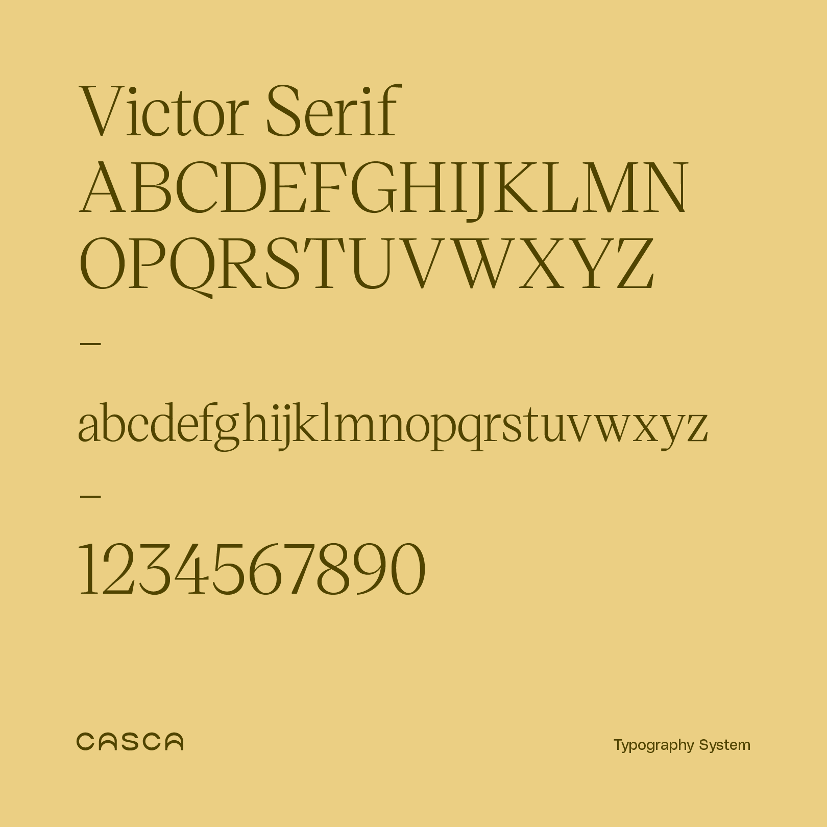
We used cues from the photography to form unexpected crops that reflect the subject’s organic frequencies. The typography balances geometric precision and calligraphic forms, allowing copy to be stylized in expressive kinetic structures. The colour palette is a sophisticated, understated nod to Casca’s home in the Pacific Northwest.
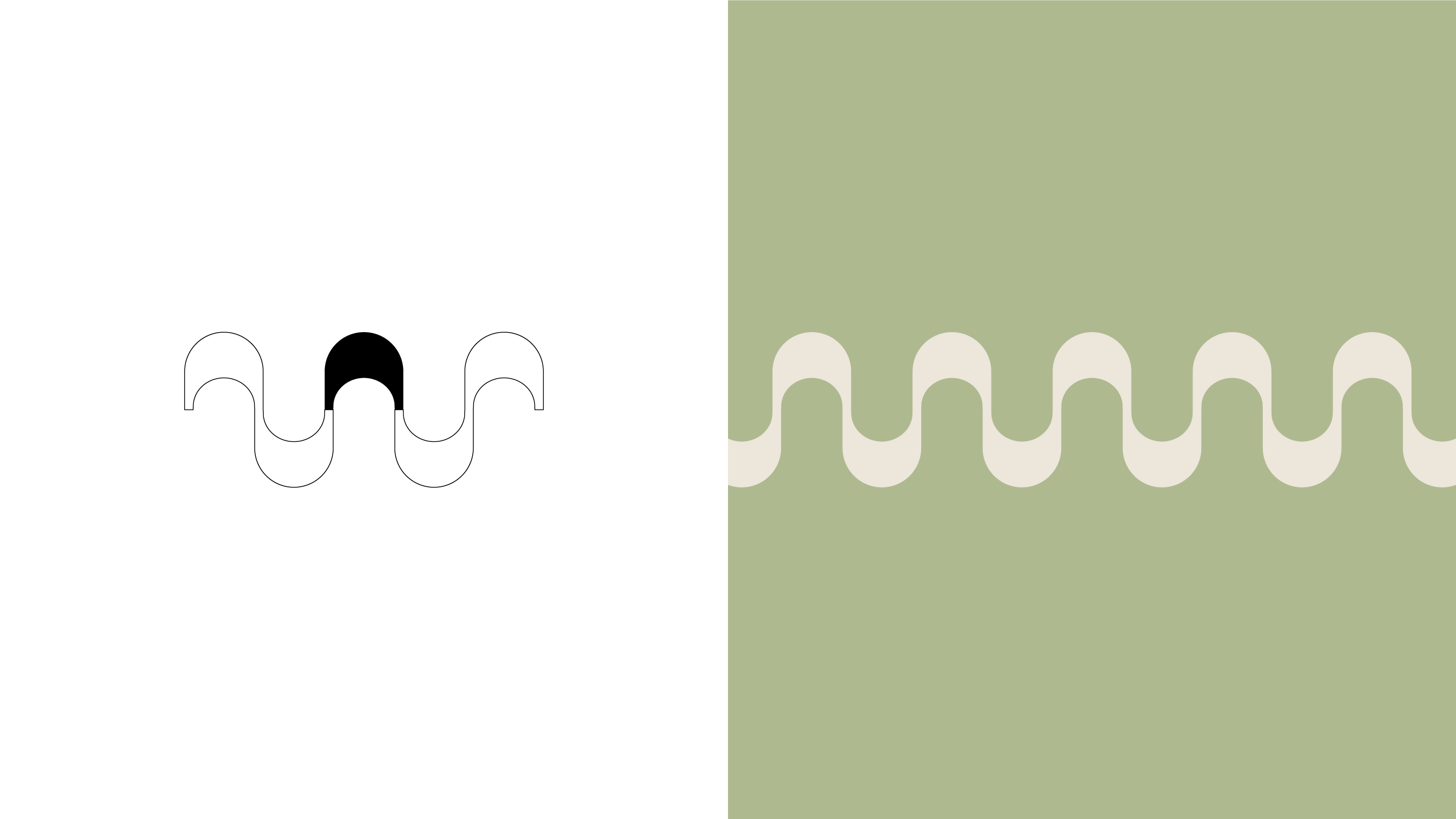
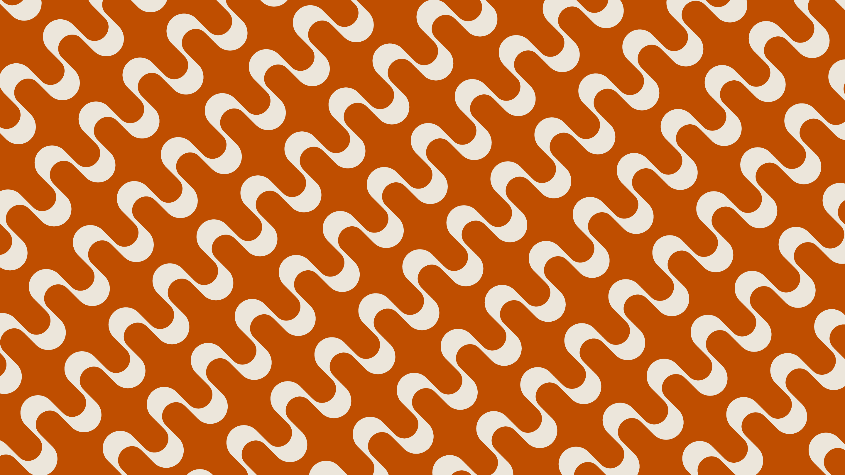
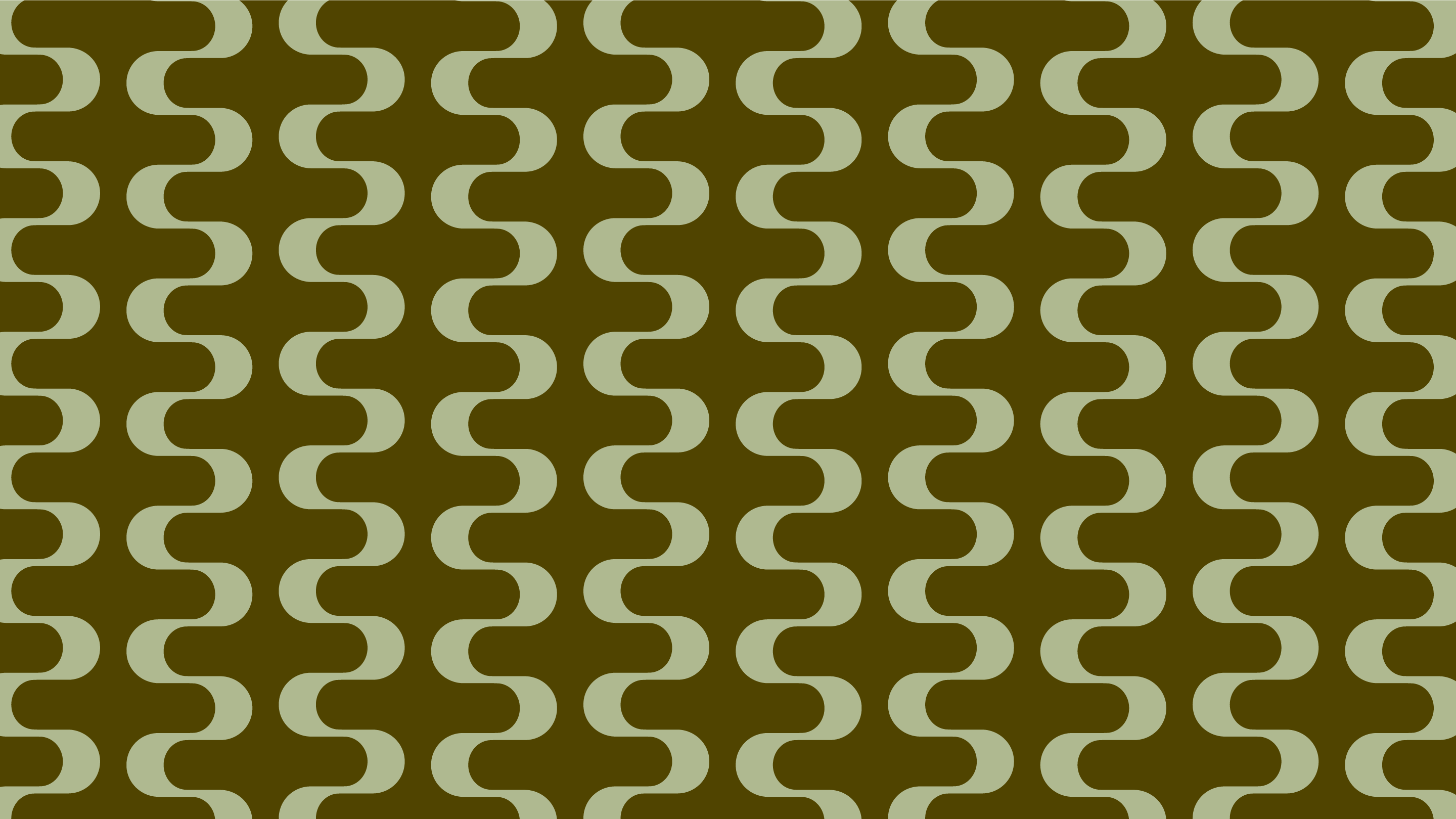
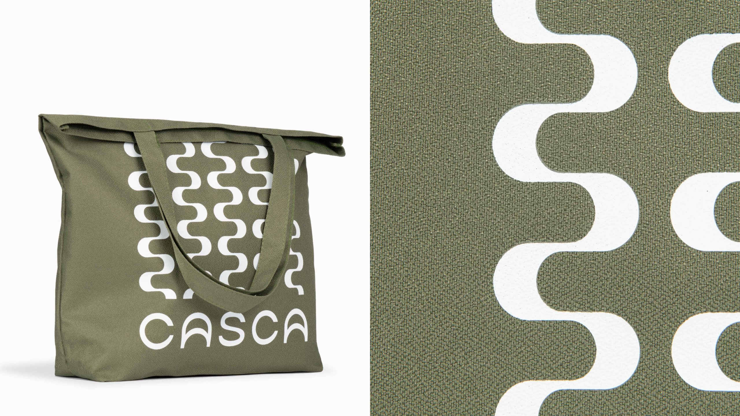
Casca’s custom wordmark is built from a circular grid, while fluid letterforms suggest an ebbing and flowing movement. We designed an icon drawn from the letter ‘A’ that reflects each person’s two unique touchpoints on the ground footprints—and to the brand’s role as a bridge to your healthiest self. The same shape is the basis of a brand pattern that lends texture and echoes the unique frequencies in our daily lives.


10.06.22
What’s the difference between a rebrand, a repositioning, and a brand refresh—and which direction is right for your brand?
07.29.22
We sat down with art directors at On Running, lululemon and Arc’teryx and uncovered these key industry-shaping trends
