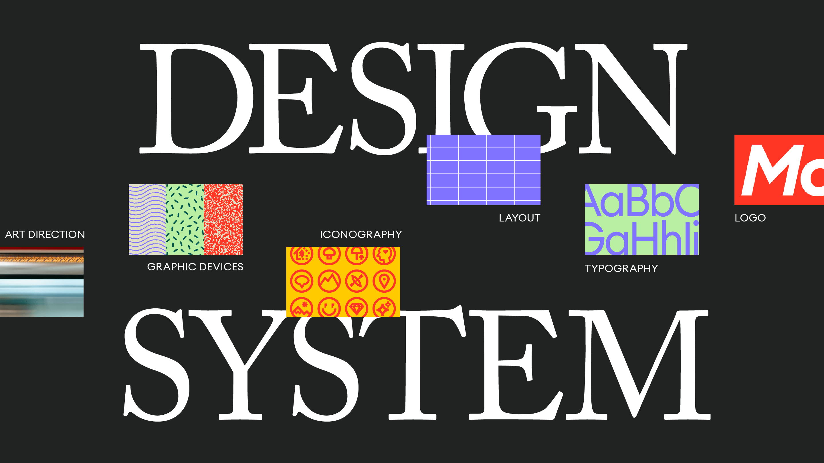
What is a brand, visually? You might think of a logo or wordmark, and the slightly-more-marketing-savvy might have typography, colour, and art direction on your mind—and you’d be right. But in a world with a million places a brand can show up—from social platforms, to out-of-home advertising, to bespoke websites—those basic elements get stale in no time.
That’s where the design system comes in: a thoughtful brand toolkit that digs deeper into visual elements like graphics, patterns, grids and layouts, and establishes how they work together with the rest of your brand across all platforms and media. A great design system has the answers to all your questions, before you ask them.
Take our recent work with Small Business BC (SBBC). Their team is passionate about what they provide for small businesses across British Columbia, but they were struggling to align on how their brand needed to show up for their clients. These differing visions were leading to inconsistencies in their brand experience. It was the perfect opportunity to take a hard look at their brand, make some necessary changes, and create a system for everyone to work from as they expanded their footprint and services. Here’s why a design system worked for them, and could work for you too:
1. Design systems create clarity
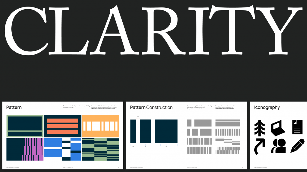
New or refreshed branding can be super intimidating for the designers who then need to work with it. A design system helps seamlessly integrate new design rules—and also explains why the brand follows them.
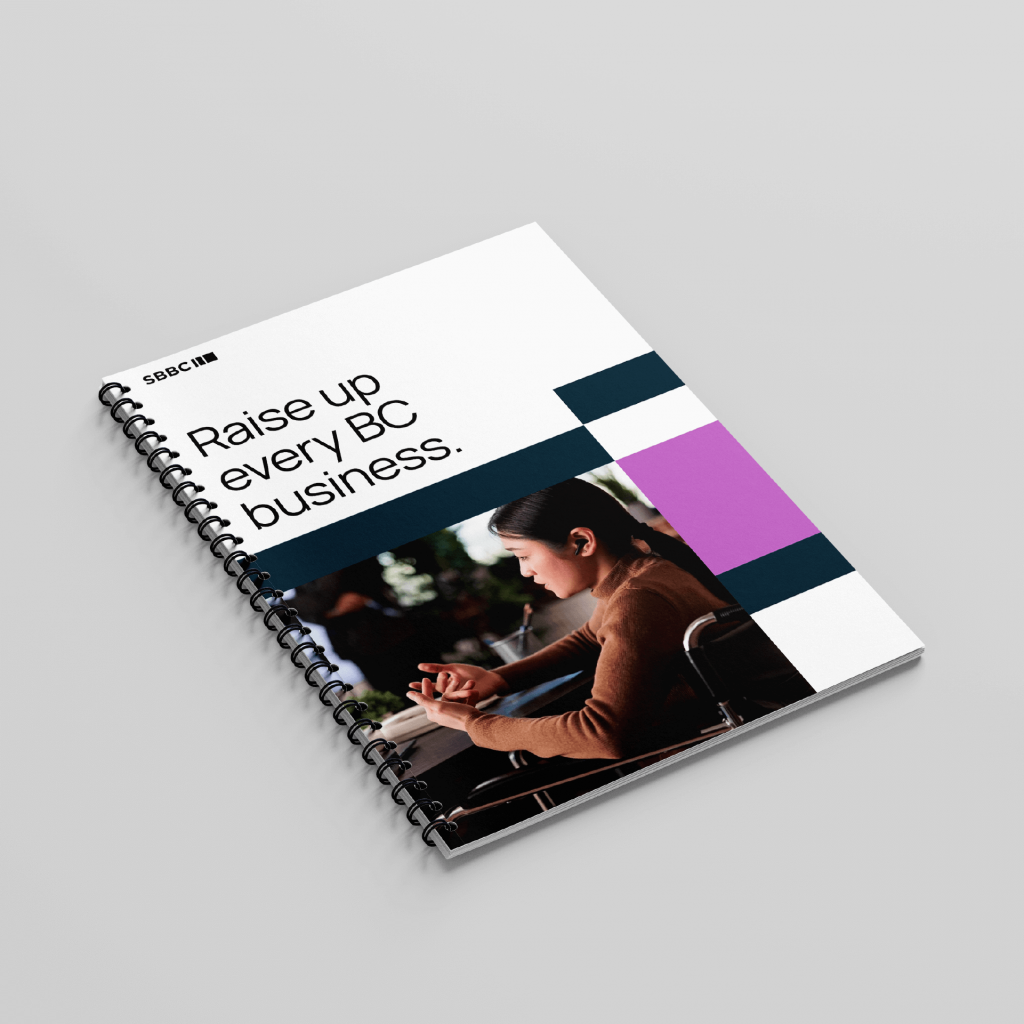
In the case of SBBC, we built out their “building blocks” pattern as a visual metaphor for the support they give their audience. The brand also includes a set of icons that help their clientele navigate their different content offerings. It was important not only to establish the look and feel of these graphic elements, but to showcase the details of construction so that the SBBC in-house team could replicate it with ease.
2. Design systems foster consistency and cohesion
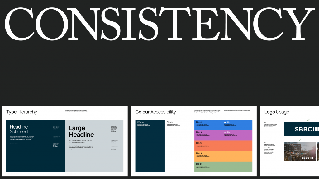
Have you noticed your graphics shifting in look and feel from deliverable to deliverable? If that’s the case, it’s likely your audience has noticed too. It’s time to take the guesswork out of your design process by building your brand’s design system. When done right, it’s a surefire way to become more recognizable and build trust with your audience.
We helped SBBC remove subjectivity and inconsistencies by establishing rules for typography, logo use, colour and more. This created structure for the team to work within, keeping things tight even as assets shift hands across team members. Following these guidelines also means that their digital and web assets are always within WCAG accessibility recommendations—in our opinion, a non-negotiable for any consumer-facing brand.
3. Design systems help everyone work faster
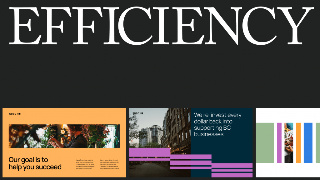
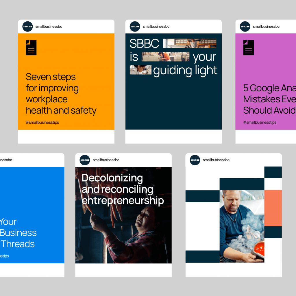
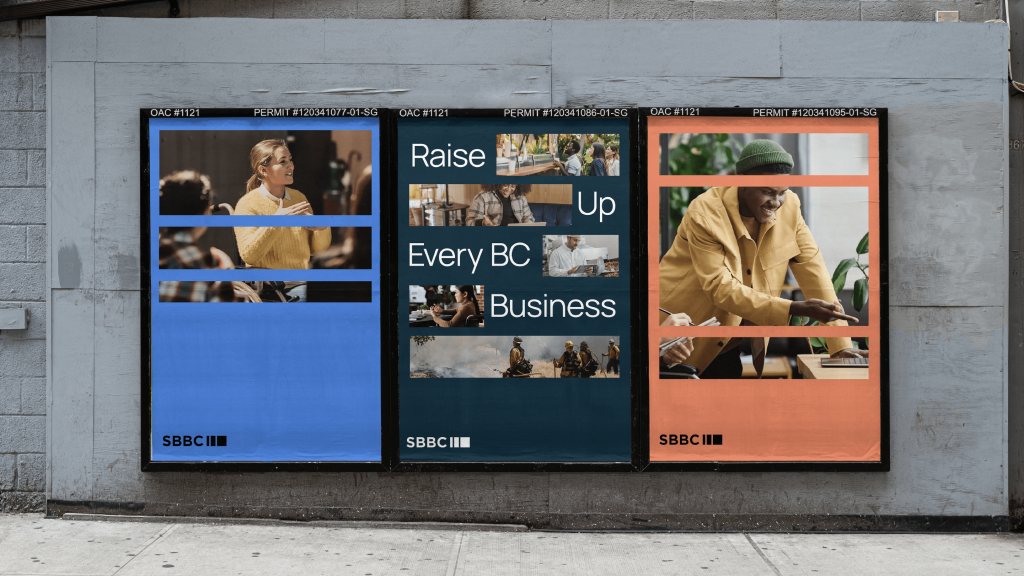
Now that you have rules, you also have jumping-off points for visual assets. No more starting from scratch. This means you can dive deeper—explore more creative themes for your monthly email, get a higher output of sales-driving assets for social, or creatively iterate on new banners to hang outside the building.
Adding templates to your design system can really push the efficiencies—cut down the turnaround times for consistent deliverables like monthly emails or weekly Instagram stories. There’s no easier way to onboard a new contractor or team member than having them work within a beautiful predetermined template.
For SBBC, we made sure to explore the band system in multiple forms of media, and looked at layouts for all different asset types and sizes. This included edge case scenarios—whether they want to go big and loud, or keep it refined and simple. These examples gave their team a strong reference for how the design system could come to life incredibly efficiently.
So what’s next?
SBBC has been using their design system successfully since launch. Check out their social channels or drive by their Vancouver office at 12th and Cambie to see their flags flying.
And, if you’re curious about more design system work, keep an eye on Emily Carr University as they roll out the design system we created together earlier this year.
If you’re resonating with this, it might be time for you to take your brand to the next level. Evolving a design system is also a great time to re-evaluate existing brand assets: there’s no better pairing to a design system than a rebrand or refresh.
Want to be our next brand success story? Drop us a line.


