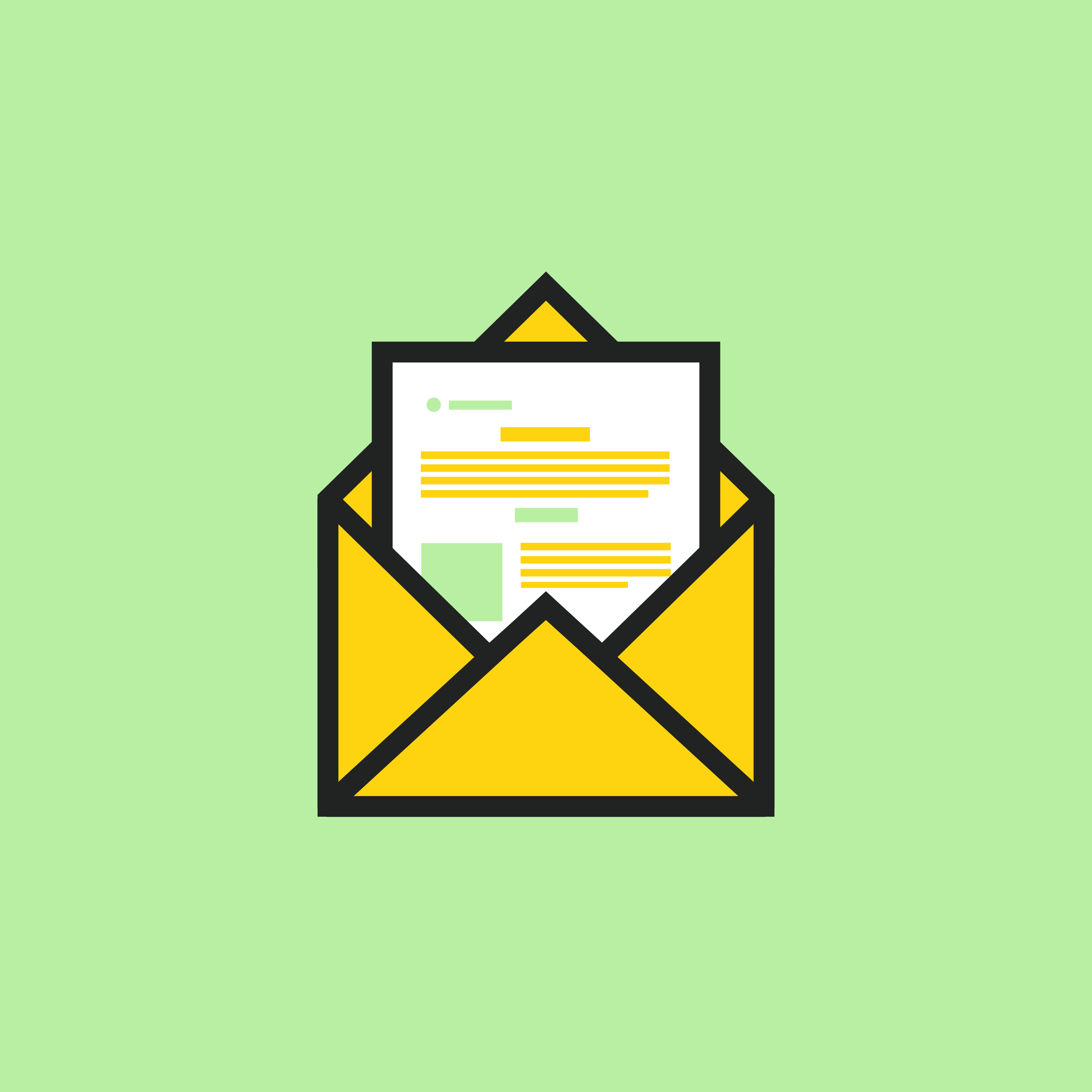
What do Lego, puzzle pieces, and email modules all have in common? Individually their presence is minimal, but when paired together, they take on a whole new form. Lego can become a scene from Lord of the Rings, puzzle pieces morph into a replica of your favourite Van Gogh painting, and email modules form a full-fledged newsletter that engages and educates your audience.
Below we explain how email modules can unlock more creativity, flexibility and customization when developing your marketing emails.
Templates vs. Modules
Before we jump into it, we’re going to do a quick primer on the different terms for email components.
If you unpack it, a template is a series of modules brought together to create an email. For example, a “review template” will likely consist of a header image, body copy, pull quote blocks and a footer—all of which are individual modules.
Developing your module library and using them as drag-and-drop components to develop your email templates will make your email marketing initiatives a more manageable creative process, rather than a draining one.
Why All the Hype?
Ongoing email creation has a reputation for being a resource suck. However, email modules save time and provide creative guidance for your marketing team. When your team starts to produce email content, they’ll have a baseline for how information can be visually organized, rather than reinventing the email wheel each time.
Modules also come in handy If you’re practicing personalization or segmentation (which you should be 🙂). You can easily create different secondary message modules that are targeted at specific audiences either based on the readers’ preferences.
For example, if you are an outdoor apparel brand geared towards specific activities, you can create different product detail blocks based on what your segments are interested in.
Where to Start
Based on your email strategy (don’t have one yet? Check out the 5 W’s of an Email Marketing Strategy), create a list of information you want to share through email. For example, product releases, pop-up shop info, sales, or testimonials.
Once you have a full list, decide how you’ll visually tell those stories with different modules. Here are some common modules to get you started:
Hero Block with Primary Headline
Found at the very top of your emails, this module introduces your primary message in a visually impactful way. The headline copy can be overlaid on the image, placed above as a standalone, or paired alongside a body copy module.

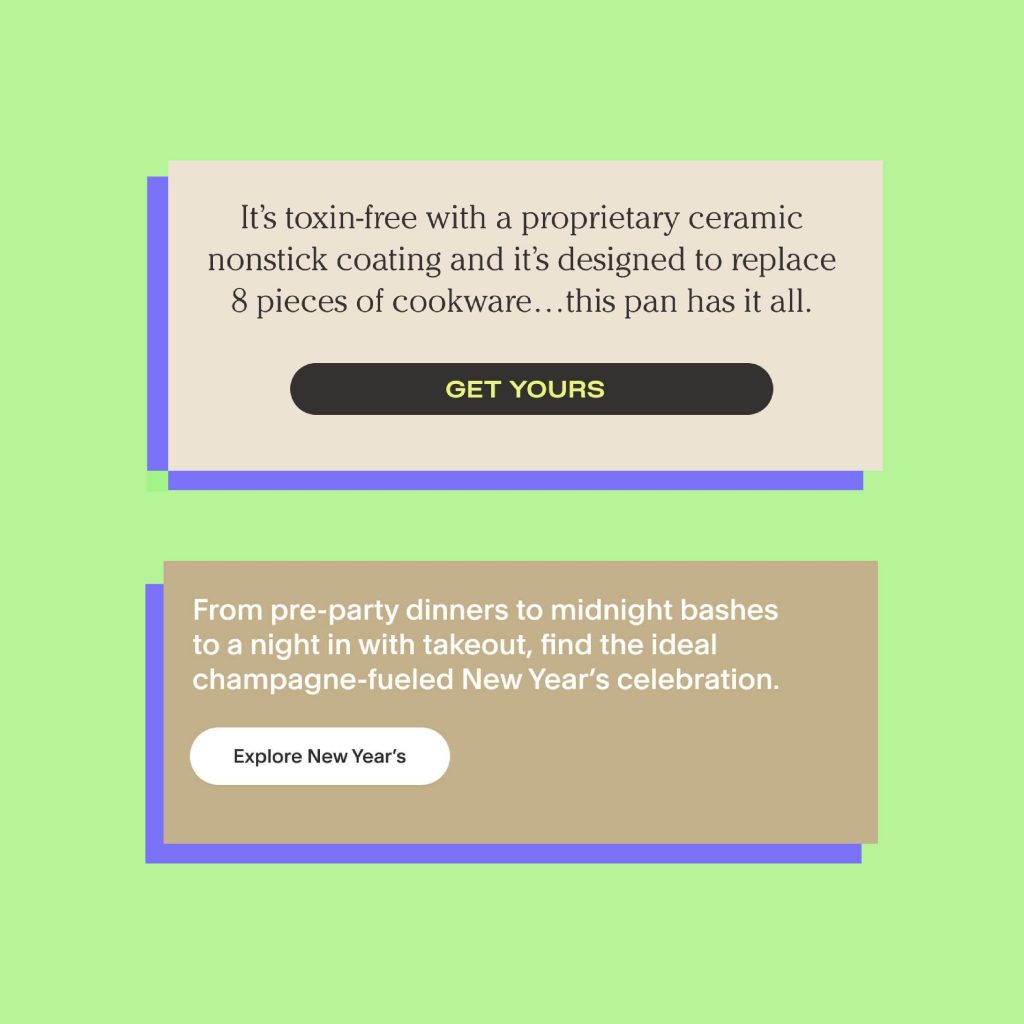
Body Copy + CTA Module
These versatile blocks are essential and provide a space for you to go a little deeper into your primary message. We recommend keeping copy to 2-3 lines max. And don’t forget that magical CTA Button which guides the user towards the exact direction you want them to take.
Product Details Module
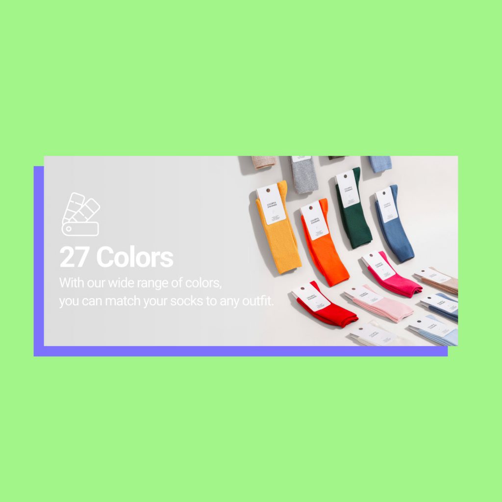
A creative format for product education, we recommend 3-4 product features paired with a product image.
Testimonials and Press
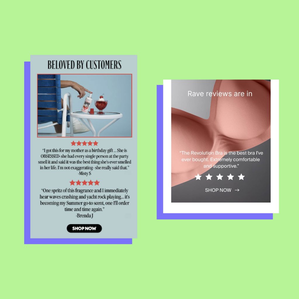
Whether it’s a press quote or a customer review, including other voices will validate your claims.
Footer
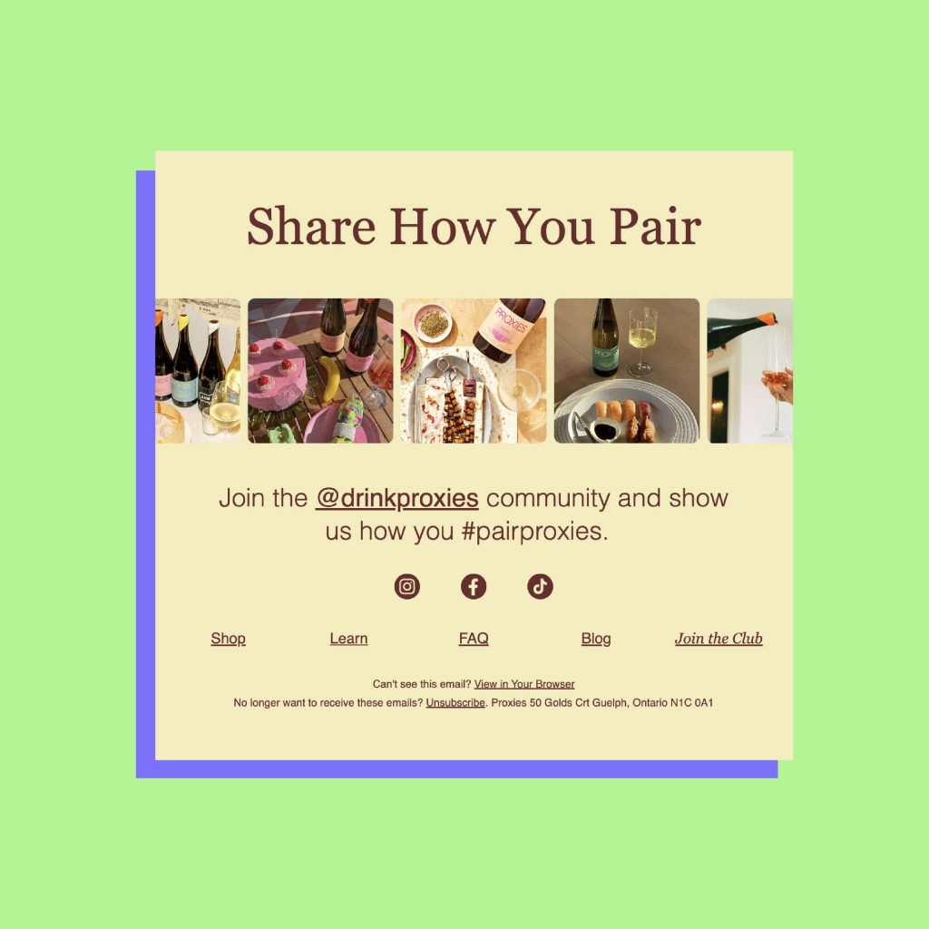
This little piece of overlooked email real estate is a great place to promote your other marketing channels, such as social media or to remind readers of an evergreen initiative, such as a loyalty program or charitable partner.
Keep on Building
Once you’ve mastered the basic modules above, continue to evolve your library based on your marketing needs. Subscribe to some of your favourite brands’ newsletters to stay inspired. Explore email newsletter search engines like Milled or Really Good Emails. Develop your own inspiration database and reference it regularly. Or, reach out to us to see how we can work together to create a module library.


