So you’ve got a product packed with technical features. You spent years developing it, perfecting it, and testing it. Now it’s time to convey the 3-dimensional magic of how your gear performs on a 2-dimensional screen. It’s a tall order, but there’s a science and soul to capturing functionality in technical product copy without making eyes glaze over.
If your brand is also dabbling in sustainable and environmentally-friendly materials, then there’s even more heavy-lifting your copy needs to do to drive home the value and impact of each carefully selected fabric.
What your audience can’t see? The research and consideration you’ve put into sourcing these materials and choosing better options for the planet—so failing to fully break down their benefits is doing all of your hard work a disservice, and possibly making the difference between customers converting or not quite grasping the true value of your offering.
So! We made you a checklist. Print this puppy out. Keep it on your desk. Before you press publish or hit send, vet your copy by asking yourself these four things…
Your technical product copy checklist
1. Is it clear?
Read your copy out loud. Pretend you know nothing about the product and this is the first time you’re seeing it. Do the words you’ve chosen paint a vivid mental picture? Have you told the reader why you made this and how it will function in their life?
2. Is it digestible?
Are there any words that could cause confusion? Could anything be replaced with simpler language? Can you say it in fewer words? Have you gone a little overboard with the jargon? Are there any features you’ve listed without breaking down how it performs or functions?
3. Is it entertaining?
We don’t want to strip away all the fun. You’ll lose people and possibly sound like a robot if you don’t have some relatable, real life examples, anecdotes or observations that help your readers see themselves with this product, in the wild. At Monday, we often physically put on the product or start tinkering with it to get in the mindset of where we’d be and what we’d be doing while using it or wearing it.
4. Can you compare and contrast?
Where does this product sit in comparison to others in the category? Is it the most lightweight? Is it the warmest? Is it more insulated than jacket “X” but less than jacket “Y”? Helping your reader gauge the difference between similar products is a big role your product copy needs to play, so don’t skip this step, okay?
How does it all come together?
Whether you’re an elite performance brand, an environmentally-minded one, or both—we’ve gathered some top notch product pages for you to reference.

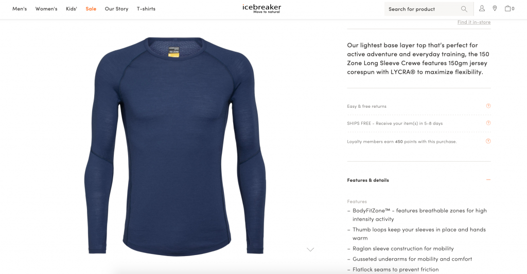
Icebreaker
Why this works
- Even when Icebreaker uses a branded name—like “BodyFitZone”—for their features, they explain what that feature is in plain language that creates a clear mental picture.
- Beyond just listing each feature, Icebreaker describes why it’s valuable and how it’ll come in handy when you’re wearing the shirt—words like “to” and “for” are excellent when naming a feature and then sharing its design intent.
- It reads succinctly, but also sounds like how someone would describe the product in person—it’s just the right amount of information without going overboard.

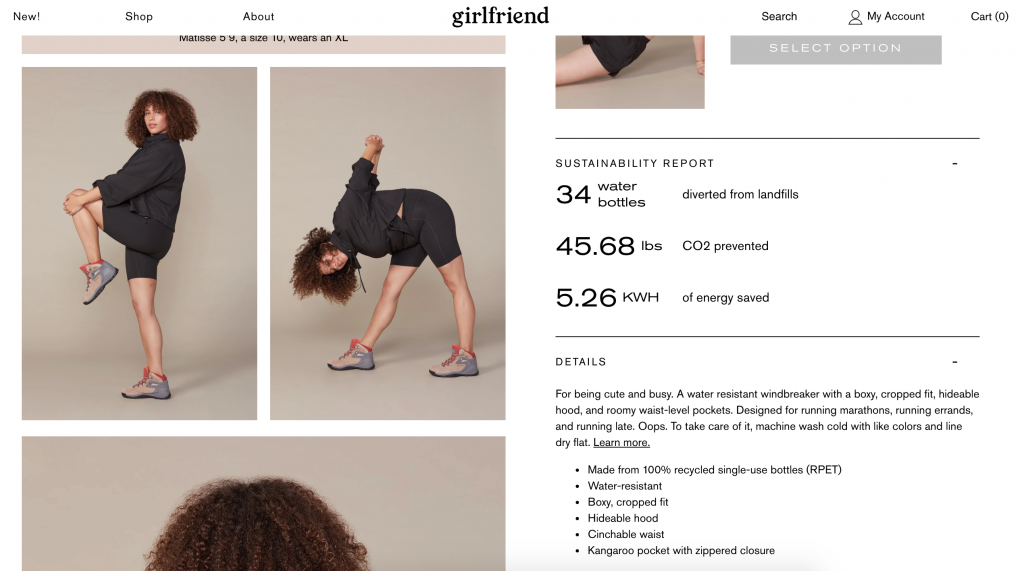
Girlfriend Collective
WHY THIS WORKS
- By starting with a few short sentences before getting into a list of the features, Girlfriend Collective tells an engaging story of where you can wear this style in conversational language that feels friendly, warm and memorable.
- They provide a really quick, succinct snapshot of where the recycled materials come from and a precise amount of energy and CO2 saved, getting across the value of the product in a couple of seconds flat.
- Offering both a paragraph and a bulleted list allows your audience to dig in deeper if they want, or to skim the details quickly if they already feel they have enough information to make a decision.

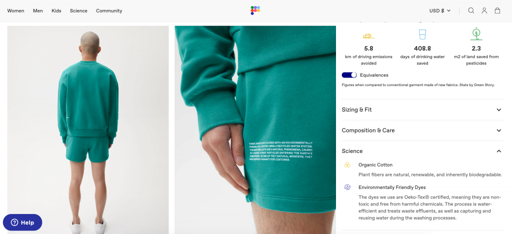
Pangaia
WHY THIS WORKS
- Rather than just list the fabric and expect their audience to know the value of organic cotton, Pangaia distills its benefits down into three keywords that the fabric delivers on.
- They go one step further and explain the certification of their environmentally-friendly dyes—rather than just saying they’re better for the planet, they explain how it’s made and why it’s a better option.
- Pangaia also uses infographics and relatable equivalences to make the benefits of their sustainable fabrics crystal clear.
Final tip: it’s really helpful to warm up your brain before sitting down to write product copy. It’s kind of like stretching before a hike. You can do this by going to check out some of the brands who are knocking it out of the park. Read a couple of product pages to get your mind primed and ready to dive into this very particular mode of writing.


