Sure, we had to temporarily say goodbye to our shiny new office in March and get creative with our Zoom happy hours, but even at a distance, we managed to create some work we’re really proud of. We also welcomed five new creatives to the team—get to know them here.
Without further ado, here are some highlights from the year.
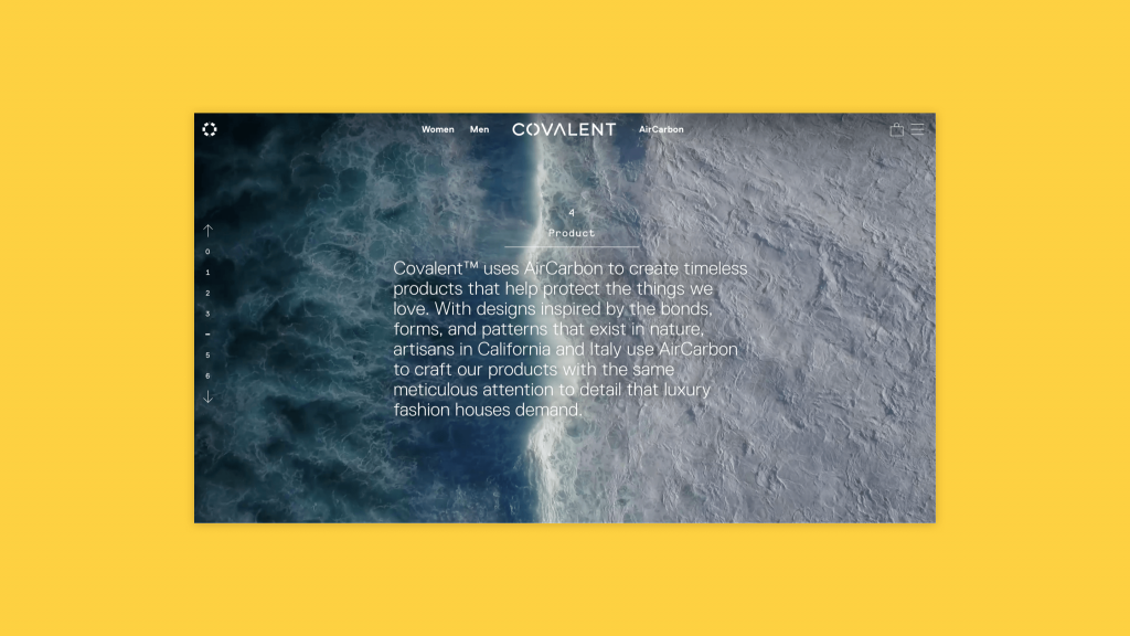
Covalent: Launching a revolutionary carbon-negative and blockchain-backed fashion brand
Brand Voice / Brand Identity / Web Copy / Engagement Strategy
For 17 years the California-based team behind Covalent has been trying to figure out how to harvest carbon from greenhouse gases and turn it into something beautiful. Spoiler alert: they did it.
Capturing the complex story and technology behind their first carbon-negative accessories line took us down many paths. We developed a wordmark that felt high fashion but also at home beside other revolutionary tech innovations. We were also tasked with distilling the process to create AirCarbon—the building block for all Covalent products—and making it easy to understand for consumers.
This project was particularly meaningful for us because it opened our eyes to new products and brands that are not only carbon-neutral, but carbon-negative—reversing some of the damage we’ve done to our planet.
Bangor University: Writing workshops across the pond
Messaging Framework / Brand Voice / Writing for the Web: Workshops & Takeaway Guide / Web Copy
Late last year our work took us to new shores. A few members of the Monday team travelled to North Wales to conduct a series of workshops with the team at Bangor University:
- A discovery session—to help define their messaging framework and student value proposition
- An interactive brand voice workshop—to land on four key attributes that define the written voice of the university
- A series of ‘Writing for the Web’ workshops—to teach key members of the team the fundamentals of writing clear, engaging and consistent web copy
Additionally, we developed a takeaway companion guide and training video. This comprehensive document outlines the principles of our web writing workshop in greater detail. With this document, the Bangor team can onboard new colleagues with best practices for writing for the web. We also drafted copy for 50 key landing pages across their new website giving them a jumping start so they could see the messaging framework in action.
Better Basics: Making it fun, beautiful and achievable to eliminate plastic
Brand identity / brand positioning / taglines
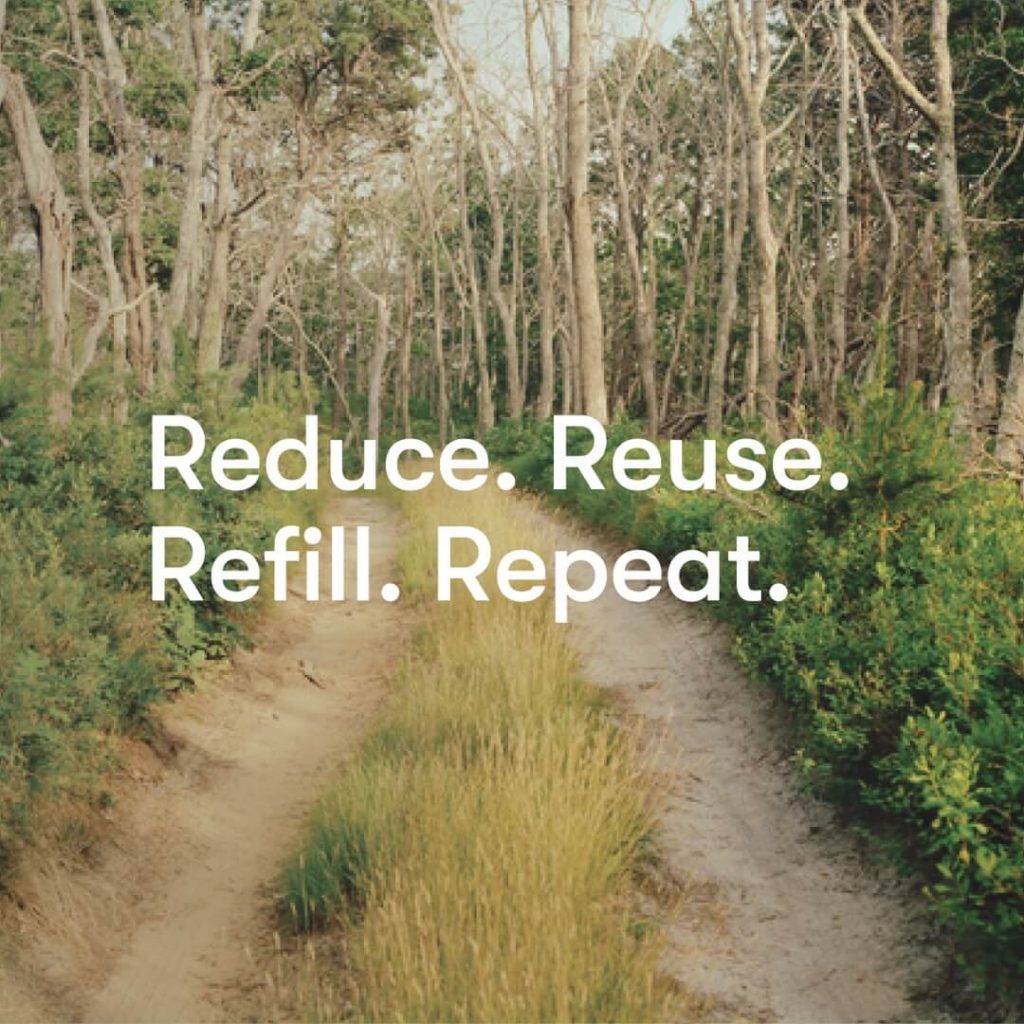
Eight-million tonnes of plastic end up in the ocean every year—a big barrier to reducing this behemoth pile of single-use bottles and containers rests in convenience. Enter: Better Basics.
Founders Caitlin Rushton and Samantha Rayner built their business on one belief: eliminating plastic shouldn’t be so complicated. So they set out to make it ridiculously easy to eliminate plastic from your home and day-to-day habits.
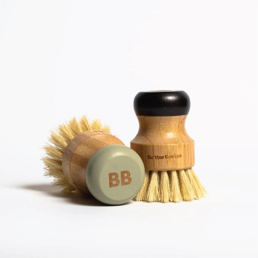
We worked with their team to create a beautiful brand that people would be proud to display on their kitchen counters and bathroom shelves. This included neutral, reusable or biodegradable packaging that fits into modern, minimalist decor with a colour-coded refill system making it easy to find the refill you’re looking for in your cupboard. We landed on a friendly peach hue and bold, but welcoming, wordmark to invite people in. Finally, we developed positive and encouraging messaging and taglines to make eliminating plastic feel totally doable and truly satisfying.

lululemon: Producing a socially-distanced photoshoot at the height of COVID
Art Direction / Photoshoot Production / visual assets / creative ad copy
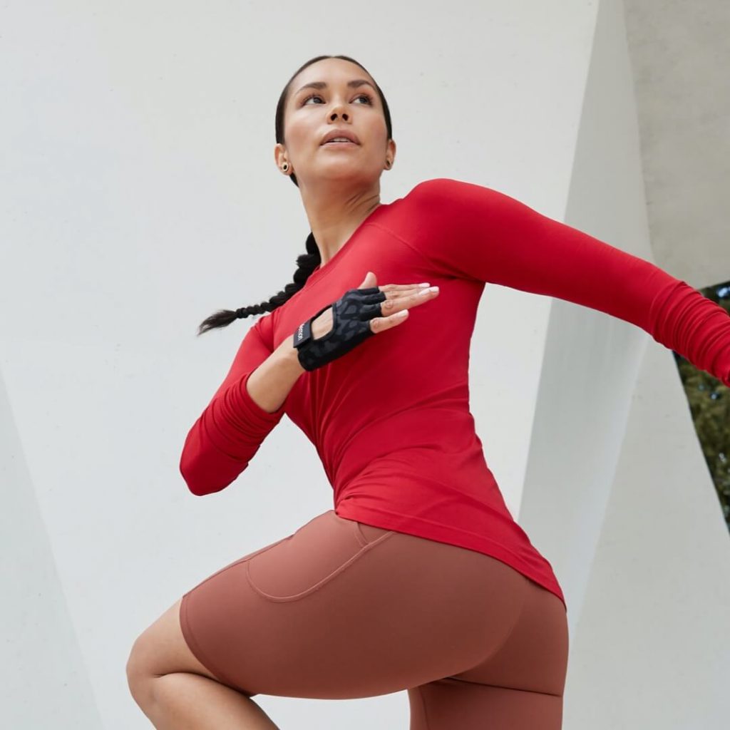
In four weeks, we planned four shoot days to capture lululemon’s Fall 2020 Collection with a narrative that felt relevant in this strange new reality. Production was completely different than a typical shoot—models were shot alone, outside, from a distance and limited teams were on set. Though the hoops to jump through were considerable, we were able to deliver hundreds of ecommerce, in-store and digital assets for their run, yoga, OTM and train categories that touched almost every single lululemon channel throughout the fall season.
This project allowed us to tap into a shared experience with the whole world, and to remind everyone of the truly important role movement plays in maintaining mental and physical wellness.
Concert Properties: Unifying storytelling for a large-scale organization
brand perception audit / brand positioning / brand architecture / voice guide
Concert Properties has been a fixture of the Canadian real estate market for over 30 years. In a market as saturated as real estate, Concert recognized it was time for a rebrand to capture the spirit of what makes their approach to the industry unique. They came to us with two key marketing initiatives:
- Create a story-first messaging framework for the overall Concert Properties brand
- Create distinct messaging frameworks for each of Concert’s five business lines
The Concert team has always been about making a difference in the communities where they develop and manage properties, focusing on their long-term vision for the future versus how to make a quick buck. You could see this in the hearts and souls of the people who work there. It was just a matter of figuring out a way to translate that message into their marketing strategy.
Guiding their executive leadership team through a series of discovery sessions, we helped them land on messaging for the overarching Concert brand. Next, we met with the leader of each distinct business line. After learning more about their audience and the needs, wants, and desires that drive their decisions—we demonstrated how each business line could take the general Concert messaging framework and refine it in a way that would speak to their audience while still laddering back to the core Concert brand.
Soon that messaging will show up on Concert’s new website, digital brand book and countless other assets we were happy to have a hand in.
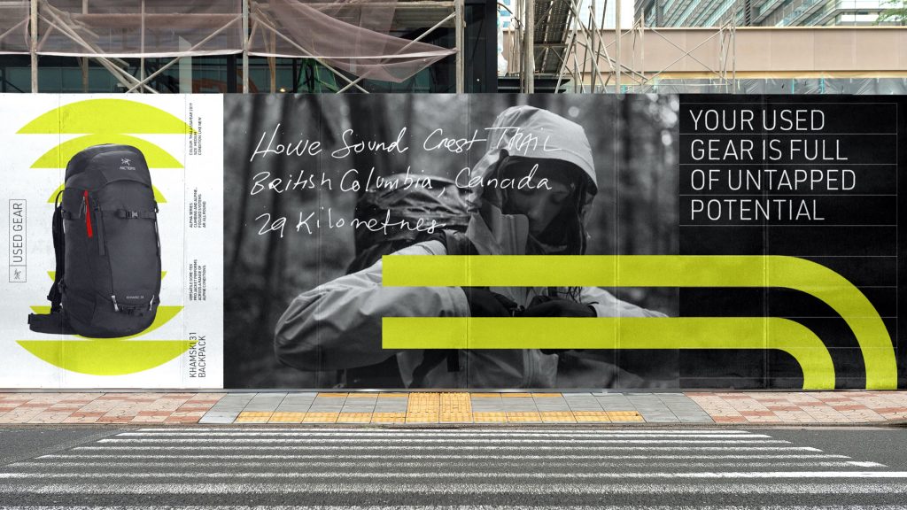
Arc’teryx Used Gear: Keeping good gear in the wild and out of the landfill
brand positioning / visual identity / campaign assets
Sixty-five percent of the environmental impact of one Arc’teryx jacket is caused by its creation—from the production of the raw materials to the making of the garment. So, when Arc’teryx publicly committed to reducing their greenhouse gas emissions by 65% by 2030, it was time to put some fresh energy into existing programs that were created to tackle product circularity head-on.
In 2018, Arc’teryx launched their Used Gear program, but needed some fresh energy behind it to drive more trade-ins and get new and existing buyers and sellers spreading the word about the program. So, we created a distinct identity for the Used Gear program that fit effortlessly into the wider Arc’teryx brand. The identity needed to be flexible and versatile, creating synergy between seasons of gear in a wide array of old and new colours, while clearly communicating the Used Gear program on their global ecommerce site and social channels.
We developed an adaptable grid system that can become the pages in a field notebook, a topographic map, or sound waves telling the story held within each piece of used gear. From there the U logo took shape—it’s a signifier for “used” but also an icon that represents a magnet drawing in the next owner, a track showing the cyclical nature of the program, and a timeline that captures the storied past of each item.
To share the history of each piece of apparel, we also created a timeline and handwritten elements to illustrate the peaks, milestones and attempts that make every garment one-of-a-kind.
In November, a month typically marked by heavy consumption, we developed a Used Gear Month campaign to drive trade-ins, encouraging their community to reduce waste, save space, and protect our winters. For every item traded in, Arc’teryx donated $10 to Protect Our Winters, with a total donation of $25,000. The campaign drove three times more trade-ins in one month than the entire year prior.
UBC Vancouver Summer Program: Taking marketing strategy digital
messaging framework / personas / journey map / engagement strategy
Every year UBC runs two sessions of their signature Vancouver Summer Program—providing international university students a chance to experience what it’s like to live in Vancouver and study at a world-renowned university. Prior to 2020, the majority of their marketing strategy relied on existing relationships—sending UBC representatives to cities like Hong Kong and Taipei to meet with prospective students.
Safe to say, COVID threw a bit of a spanner into the works. The Vancouver Summer Program team approached us to help rapidly evolve and modernize their marketing strategies. We worked closely with their team to refine their core message, build clearer pictures of their three key personas and their distinct journey maps, and a brand new digital marketing engagement plan to prepare for the 2021 summer cycle.
Well 2020, what a year it’s been
It’s safe to say that the year came with some unexpected twists and turns. From hosting countless virtual client discovery sessions to producing our first ever socially-distanced photoshoot, each and every project required a new way of working and we were up for the challenge.
As a team we always make a point to look back and reflect, what did we learn and how can that further support our team and our partners in the future? And 2020 has certainly shown us the importance of this exercise. Whether guiding large scale rebrand efforts or launching new innovative programs that lighten our footprint on the planet, we couldn’t be more proud of the Monday team and the brands we were able to support this year.


