It’s not news to anyone that brands need a never-ending flow of content to keep up and reach new audiences. Day in and day out, brands are asked to delight, inspire and convert on multiple platforms.
At Monday, we tackle this problem with a maximization lens. How many ways can we leverage and repurpose this content? In other words, how can we stretch the investment we’re making by getting the best results with the longest runway? Below, we share our best-kept secrets to extend the shelf life on your oft-overlooked studio content.
Something important to note before we dive in: studio photography does not perform well on every channel. Typically, we reserve this content for email campaigns and Instagram Stories. Few people will double-tap on ecommerce imagery if it shows up as-is in their feeds because it lacks a real-life feeling or a story. With these tweaks, simple images take on a new life.
1. Get gridding
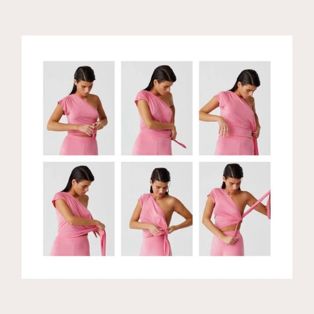
Images become interesting and dynamic when placed in a repeating grid.
In this case, Paloma Wool does a brilliant job of showing how to style a product in a surprising way, using a grid of studio photography to tell the story and guide their customers to recreate the look at home.
2. GIFs: The easiest way to add some polish
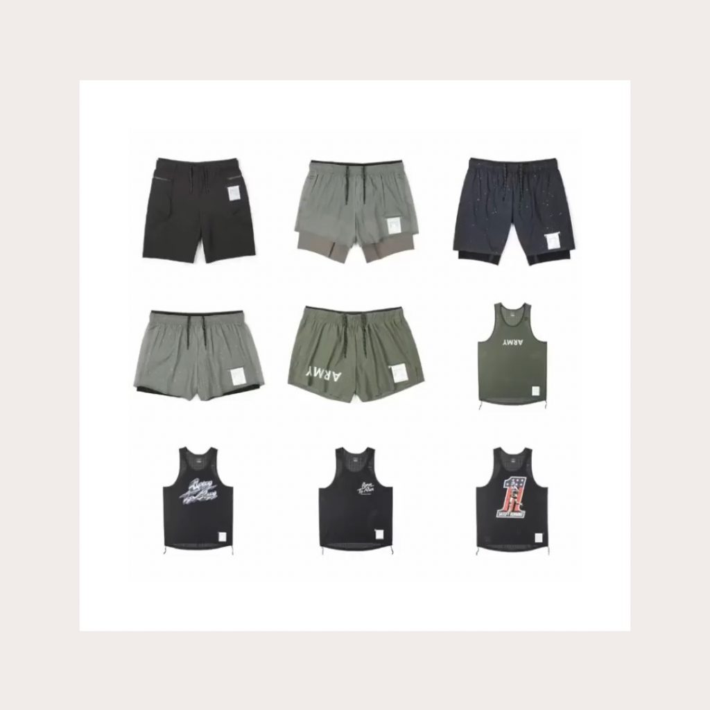
Try it with on-model or off-model shots. Satisfy Running showed off their full product line by creating a simple scroll GIF that feels fun and engaging for social. (Watch the full gif on their Instagram here.)
Not sure how to make one of these? Here’s an easy tutorial that outlines four ways to create GIFs.
3. Get out that rubber stamp tool
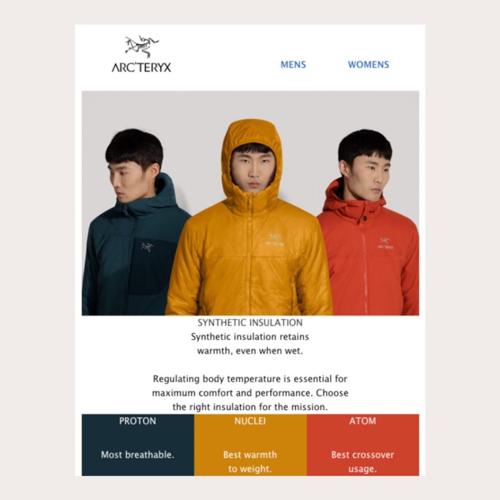
Combining two or more images is a great way to create new perspectives on the same product, or to show off a full product category.
In this case, by cutting out and layering three studio images, Arc’teryx creates a stunning jacket guide that gives a clean side-by-side comparison of different products from the same category.
4. Feature focus
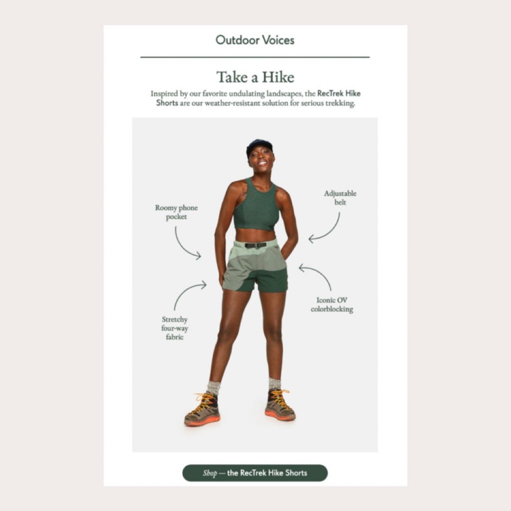
Photography only tells part of the story—often there are technical details or performance features that can’t be easily seen without picking up the product, holding it in your hands and examining it.
Use the clean white space in your studio photography for copy placement. Point out different elements—like a hidden pocket, ventilation or reflectivity—to spell out the full value of the product, beyond aesthetics.
Outdoor Voices expertly executes this technique in this email campaign, educating customers about their RecTrek Hike Shorts.
5. Use your words
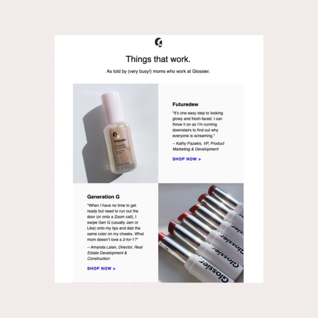
Pair product shots with testimonials to tell your audience more about features, benefits and uses. The third-party validation adds colour and context to imagery that would otherwise fall flat on its own.
Glossier leans into this concept in their newsletter strategy, pairing photography with quotes from employees who are moms on the go to reinforce their value proposition that Glossier products fit into a modern mom’s schedule.
6. Collage o’clock
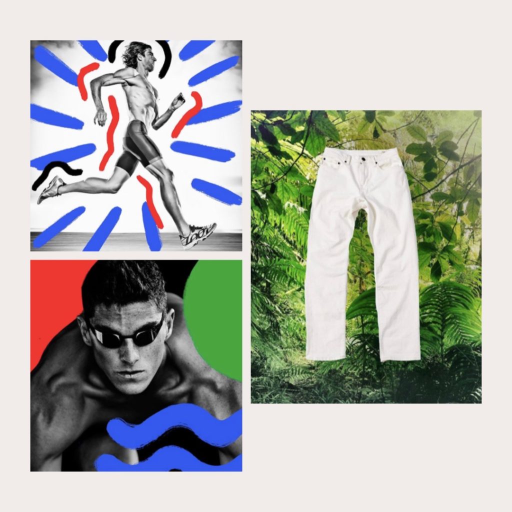
Grab your studio shots and any b-roll you have from your last campaign shoot (or your own personal adventures) and get scrapbooking. Create one-of-a-kind artwork that turns your studio shots into dynamic, campaign-worthy content. Lean on your seasonal direction or brand visuals to select colours, textures and shapes that connect to the wider narrative you’re sharing.
Two standout examples: District Vision added graphics to bring colour and energy to their photography. Assembly NY applied flat lay imagery over a nature shot for an unexpected pop.
No matter what size of brand you are, product photography can eat up a huge chunk of your marketing budget. We hope these tips help you make the most out of your existing content and breathe new life into assets that have more to offer.


