
Dawnie
What We Did
Brand Strategy
Brand Positioning
Brand Voice
Naming
Copywriting
Brand Identity Design
Art Direction
Web
Launch Creative
Asset Production
Industry
Daring to do real estate differently.
Gibson Housing set out to create a rare community in Tofino: resilient, accessible and genuinely affordable homes for locals—within walking distance of their downtown core. The Monday team came on board to support the full execution of their identity—from strategy to naming and visual identity. The brief was bold, hyperlocal and optimistic: giving us free rein to get creative and plug into the rugged nature of Tofino.

A distinct name to set the tone
After our strategy identified the key elements to draw on throughout messaging, voice and identity, it was evident that the right name to say it all would convey the heart behind the project. Made for Tofitians by folks passionate about the local culture, we landed on “Dawnie”: a subtle yet resonant tie to Tofino surf culture that carries dual meaning.
It’s inspired by the folks who have the energy and excitement to hit the water at first dawn, and the feeling of starting the day seeking something new. It held the feeling of curiosity and optimism that everyone in the community shares, and was a gentle nod to the calm and solitude often found at that time of the day.
Given that the project prioritized the needs of locals—outdoor surf storage, durable and resilient materials and easy access to work—Dawnie was the perfect fit.

Shaping a vivid visual direction
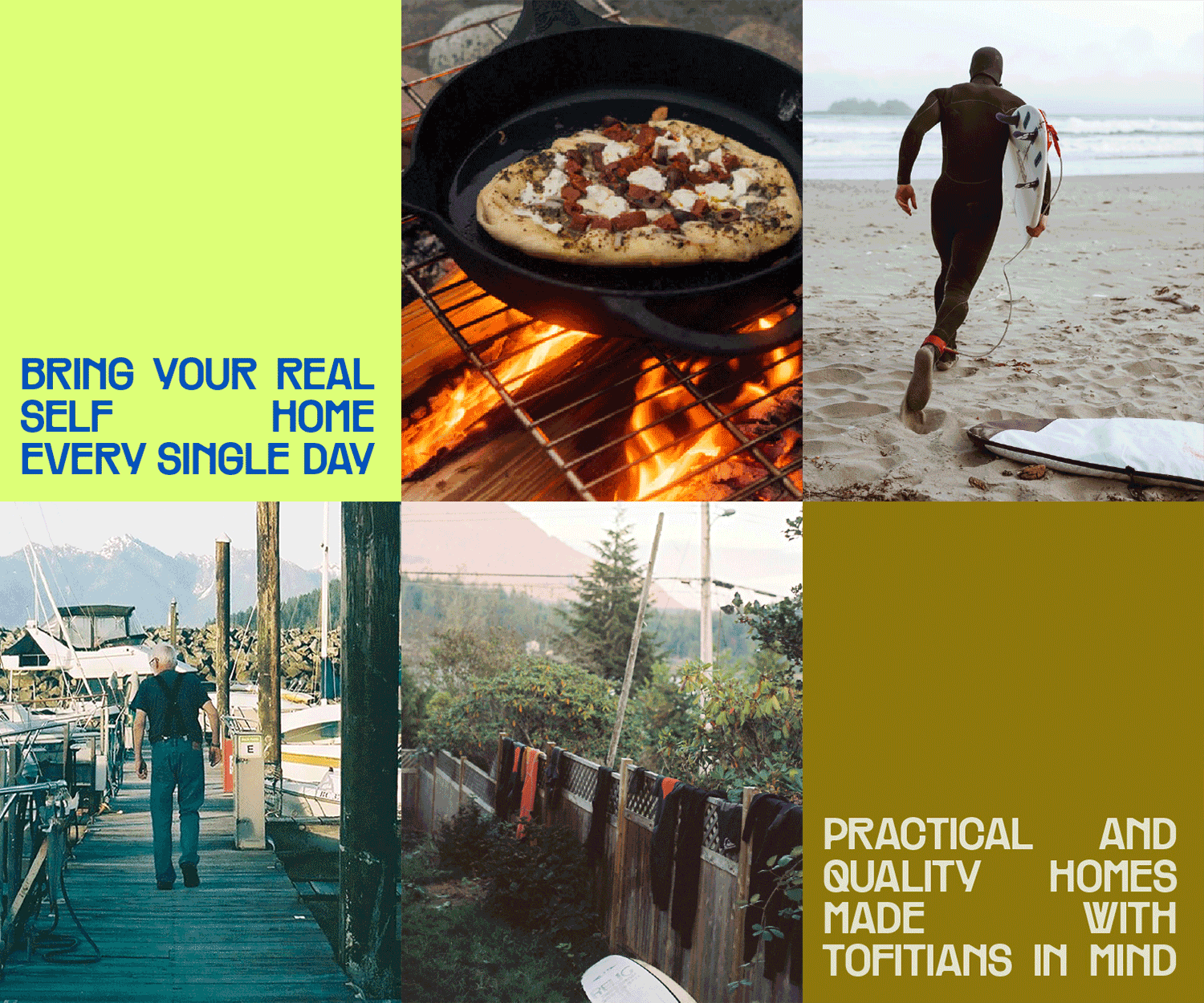
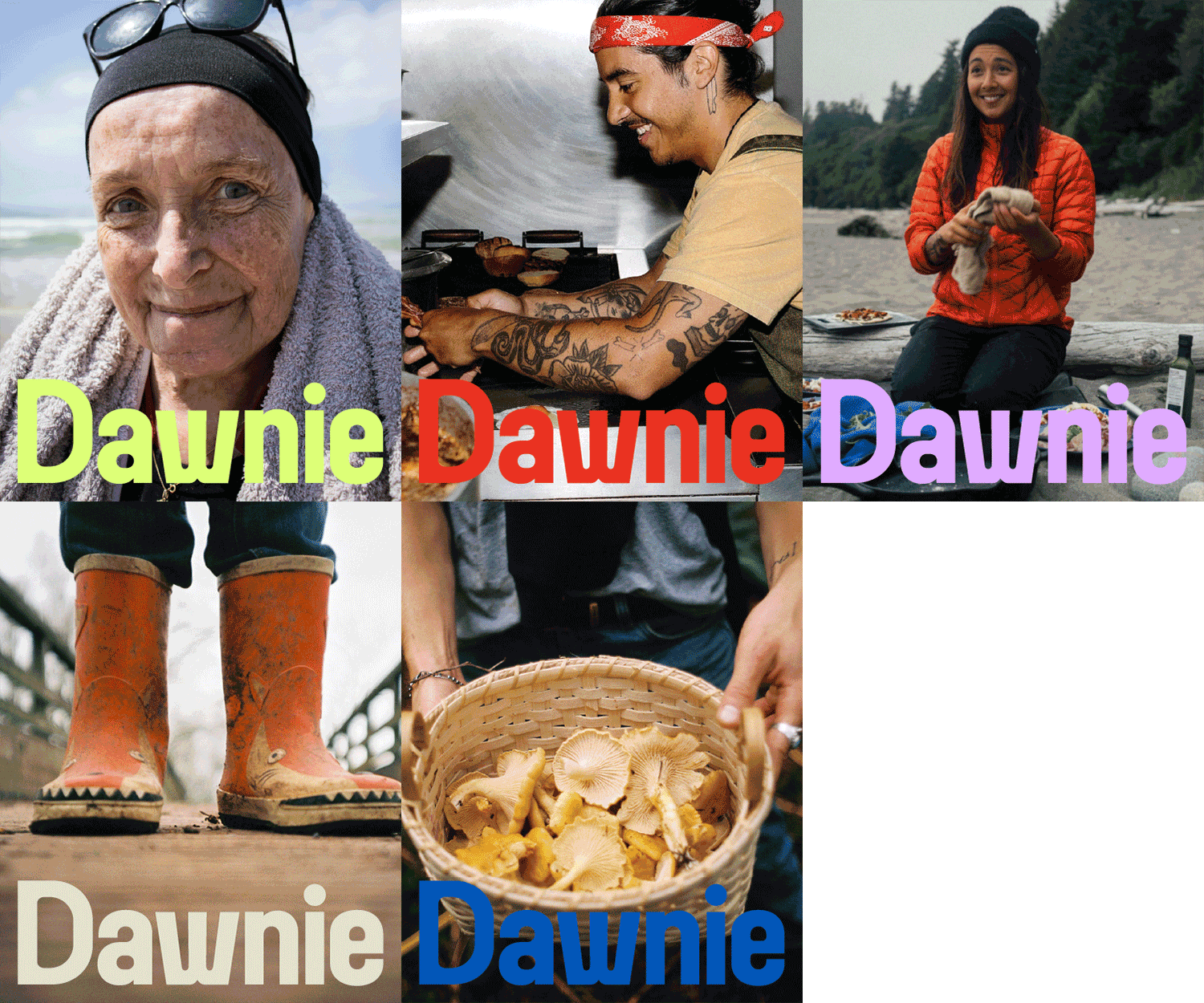
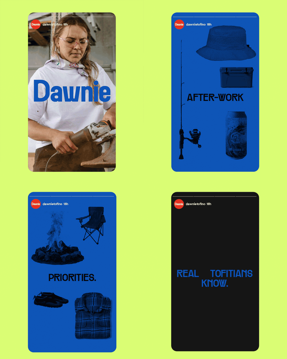
A strategy rooted in honesty and community meant our visuals needed to reflect the lived experiences of Tofitians. Surfers, servers, chefs, hikers, tradespeople, families—people who deliberately choose to live in Tofino in every season. Stormy, soggy, sunny: a community that’s resilient by nature and would want to put roots down in the place they fell in love with ages ago. Our art direction showed Tofino’s subjects within its naturally raw, wild, and joyful nature.


Crafting an identity inspired by surf culture
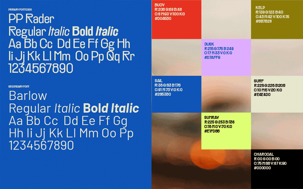
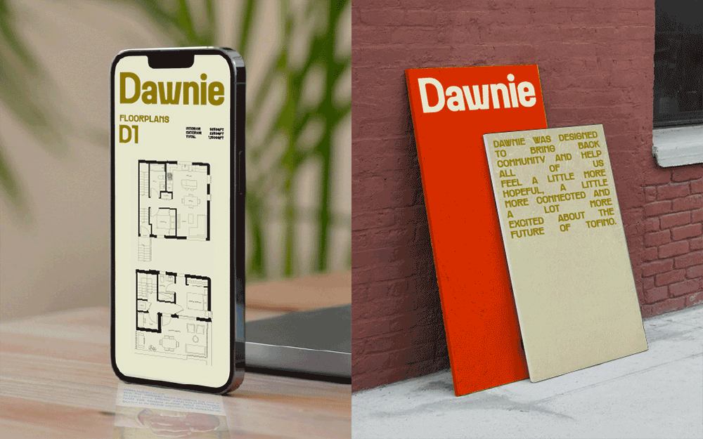
Our wordmark needed to feel like its name—bringing a confident, fun and bold attitude that felt current without leaning too retro or stagnant. We drew on surf brands, magazines and local references to land on unique letterforms and type that mimicked elements in nature. Our usage of color infused the overall direction with the energy and light Tofino embodies, creating an easily recognizable yet refreshing identity in the real estate landscape.



A warm reception—and successful presale
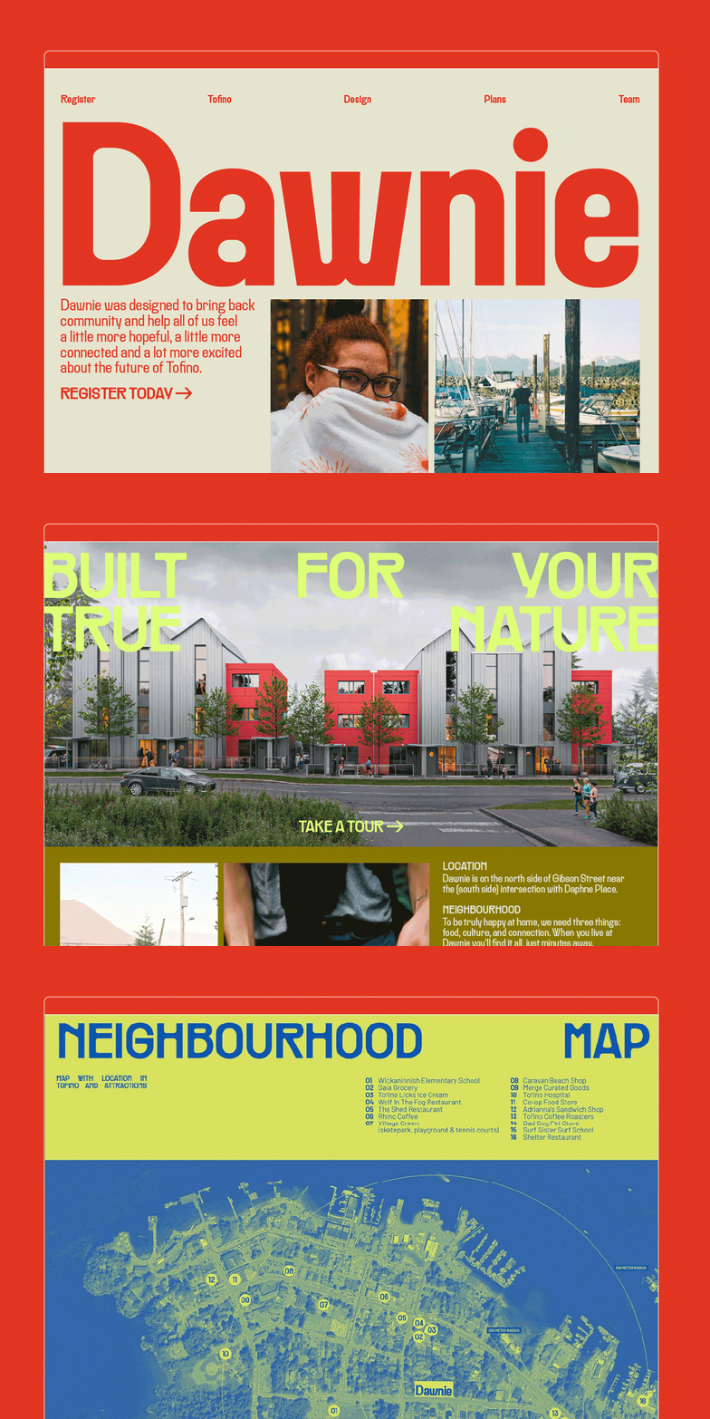
To launch their first round of presales, the Monday team developed Dawnie’s landing page and supplied the creative for a surf-magazine inspired brochure, billboards, newspaper ads, social media ads and assets for their launch event. Within four days of launching, 80% of their one-bedroom units were sold and almost 50% of the total development was snapped up. Consider us stoked.

Credits:
Dawnie
Bryan Pudney
Bruce Hayden
Monday
Project Management: Vanessa Cadena
Strategy Director/Copy Writer: Zafira Rajan
Copy Writer: Amanda Gregory-Jones
Account Director: Hudson Lee
Designer: Cheyenne Manning
Design Lead: Oliver Warman
Creative Director: Ryan Romero