07.11.22
Dometic Outdoor
A Swedish heritage brand prepares to make a HUGE impact on the US Market
GO
Living on Planet Earth is a wild ride these days. There are seemingly endless opportunities for exploration, but there’s also an overwhelming sense of urgency about the climate crisis.
Enter The Museum of Earth—an immersive gathering place poised to bring us back to terra firma. Their goal is to uplift, inspire, and ultimately equip visitors with actionable tools to make a difference.
The MOE team had a clear vision for how the installation would feel IRL and needed a brand with the same stop-you-in-your-tracks impact across multiple applications. Museum may be in the name, but a traditional institution this is not—so how to stand out from the crowd?
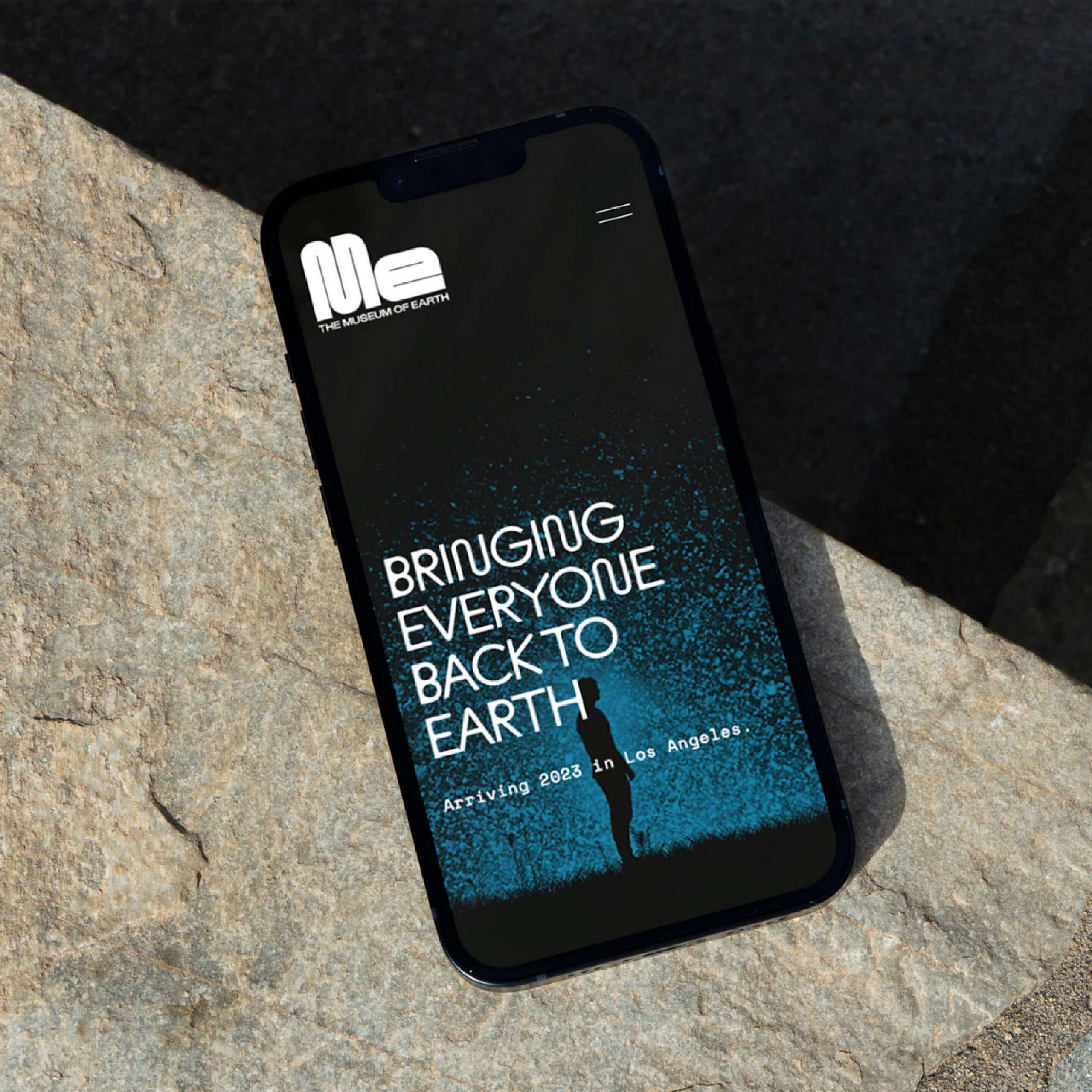
The Museum of Earth’s tactile environments shift perspective by giving users the space to explore their relationship with Earth, creating awe that inspires action. We distilled MOE’s how and why to distinguish a clear brand purpose: to bring everyone back to Earth and empower us to be stewards of our planet.
Museum visitors will be primarily Millennials, Gen Z, and young families—after all, this is the generation who sued the government over climate change. So Monday developed key messaging rooted in the brand pillars of discovery, connection, collaboration, community, and action.
It can be easy to lose sight of how awesome Earth is when monster waves, raging winds, and threatening tides paralyze us with fear. Reframing the overwhelming doom and gloom of ecospeak into open and optimistic dialogue strengthens everyone’s bond with the planet.

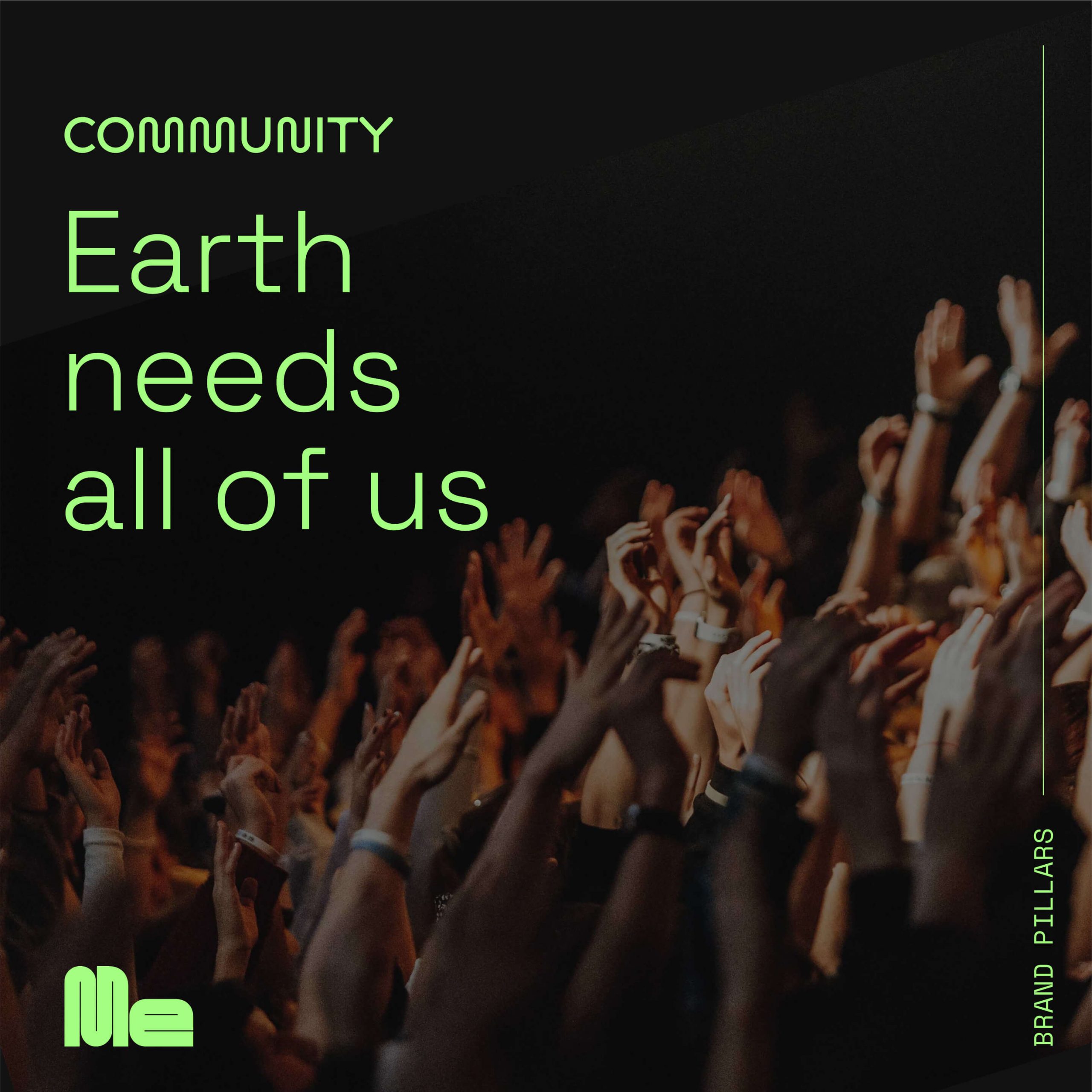
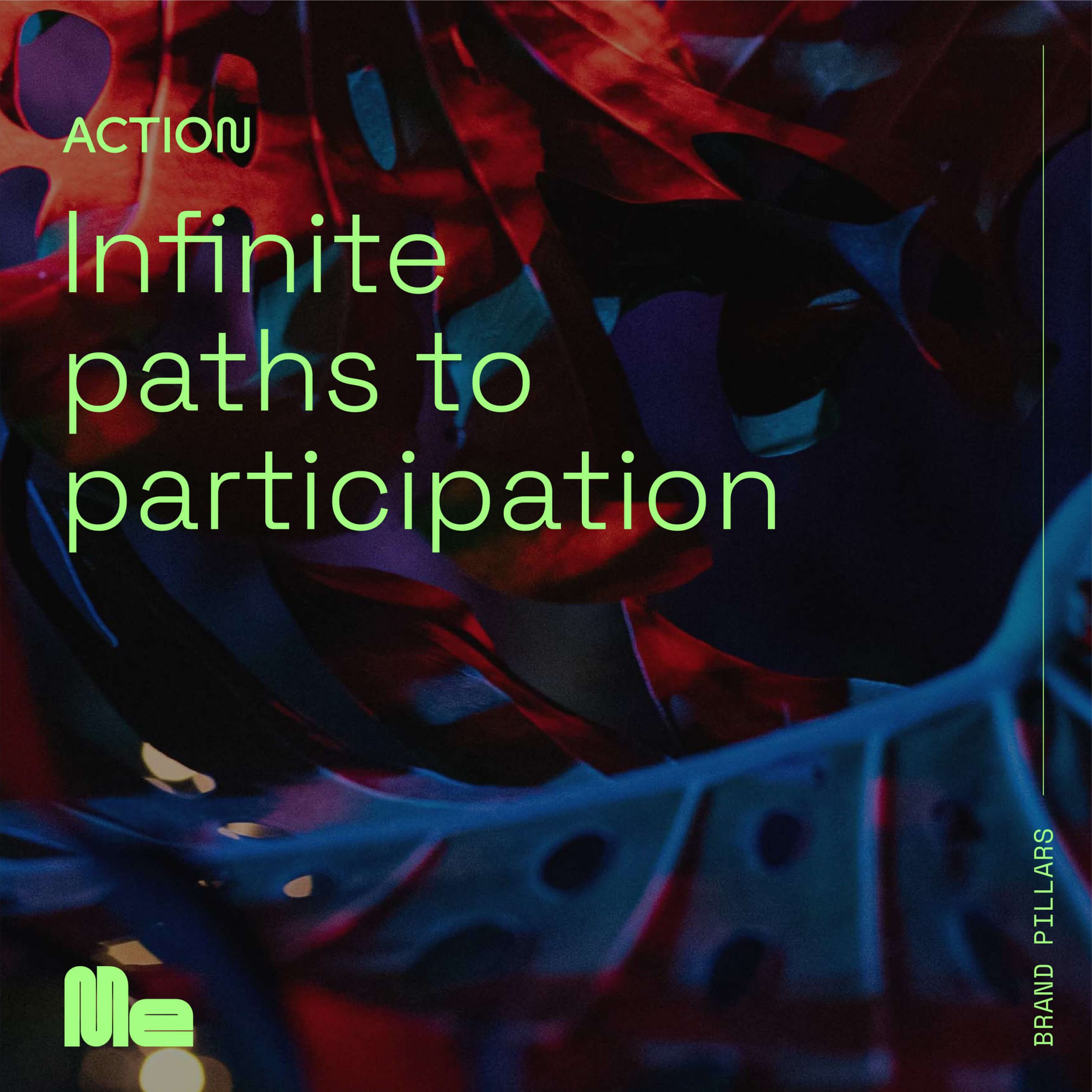
The MOE team made it abundantly clear that their entire concept is about embracing the possible and leaving behind the anxiety and grief that usually comes with climate discussions.
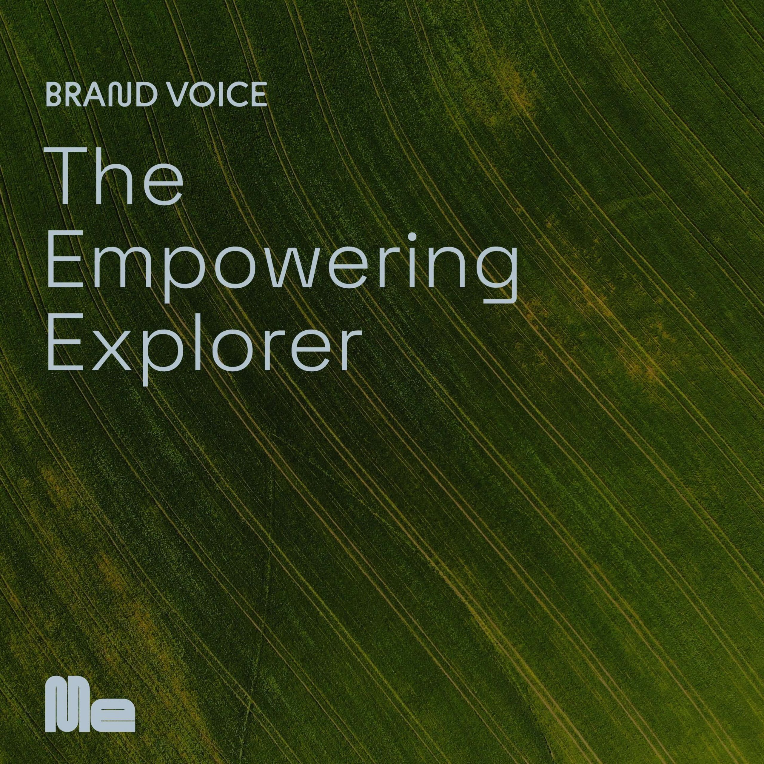
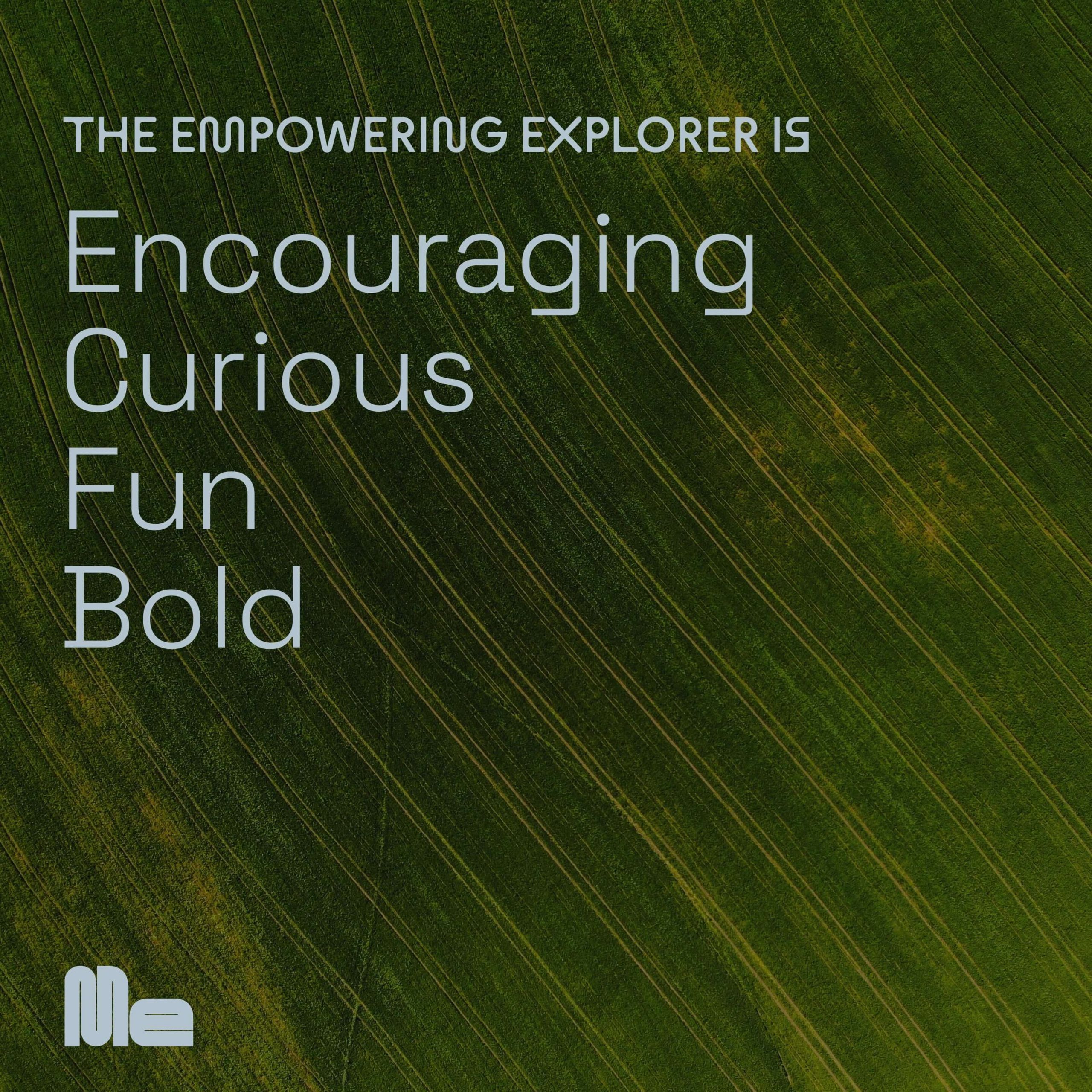
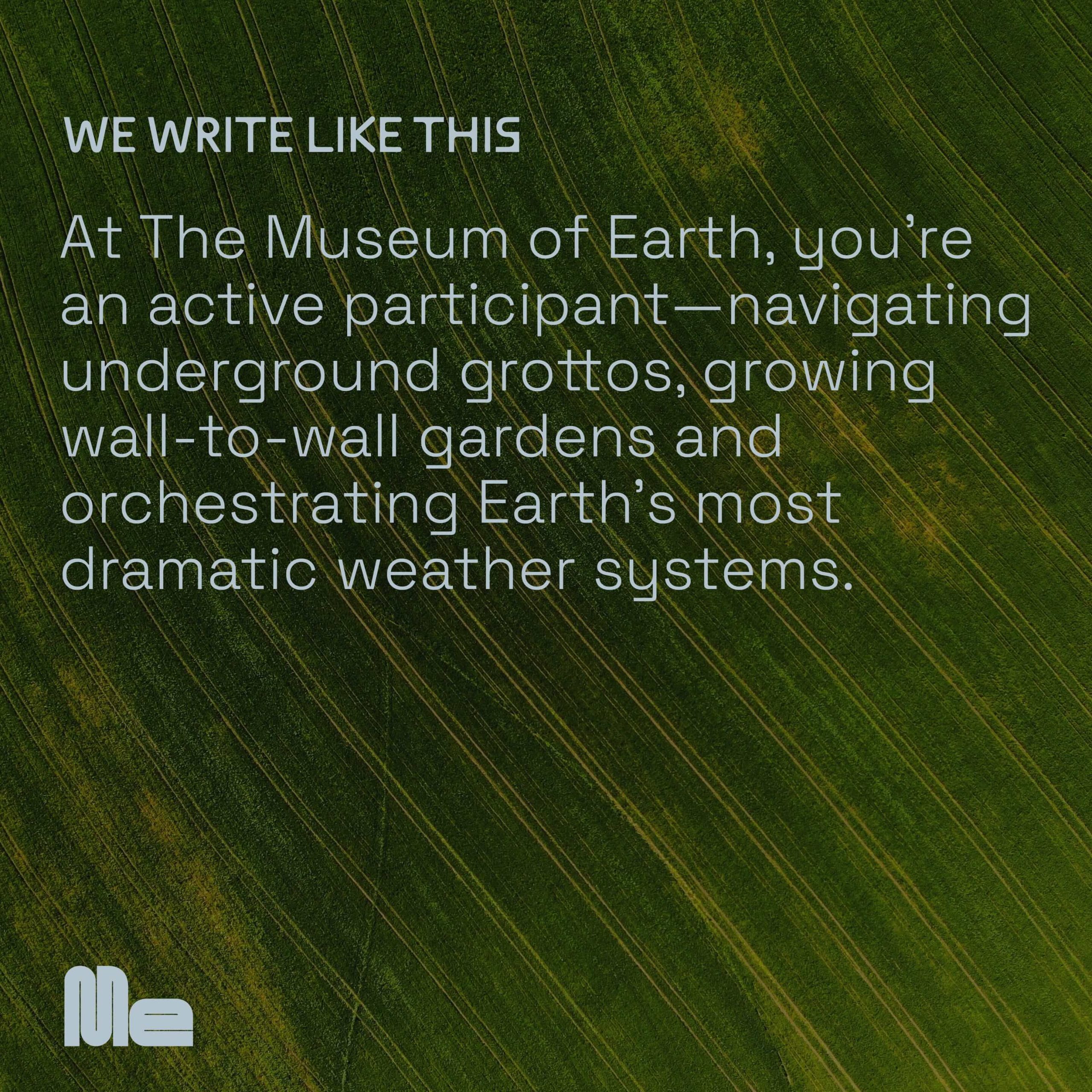
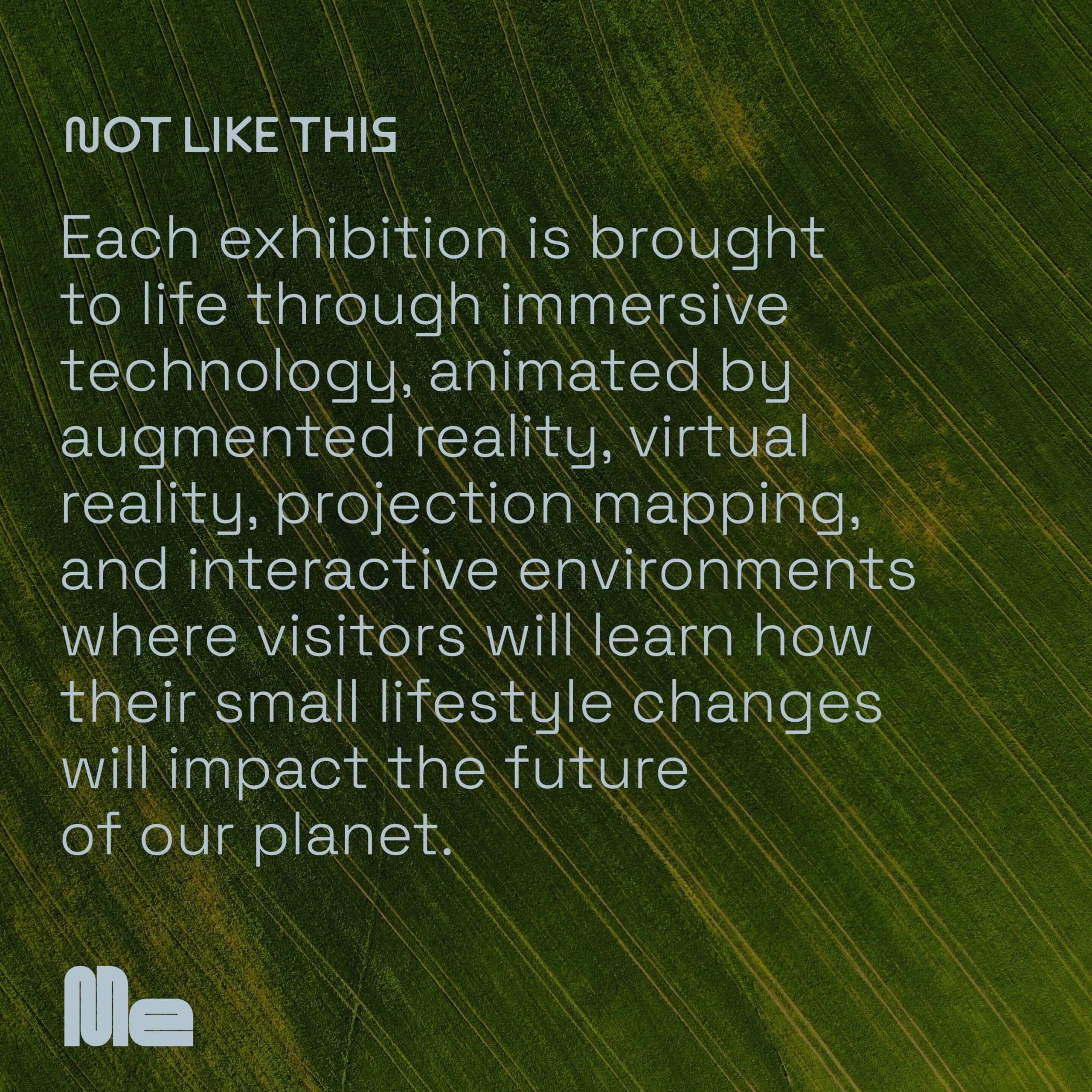
To spread the good word, Monday created a brand voice we’ve dubbed The Empowering Explorer. If we were about to embark on a worldwide trek, this is who we’d want to lead the way. The Explorer is encouraging without being pushy, and curious instead of complicated, inviting productive chats where there are no wrong answers.
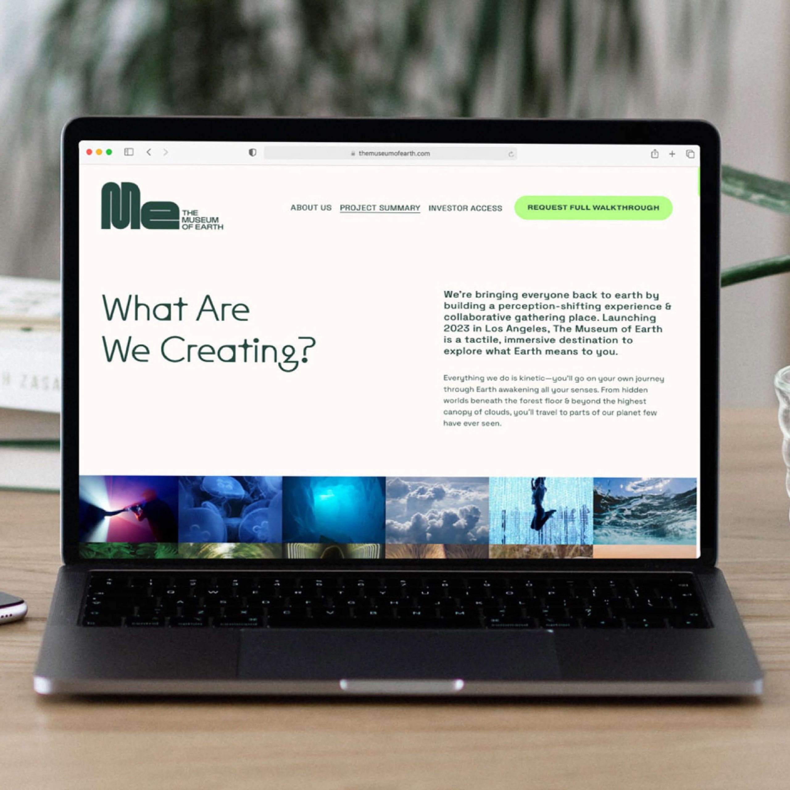
The Museum of Earth invites users to go on their own journey through tactile environments—from hidden worlds beneath the forest floor to the highest canopy of clouds.
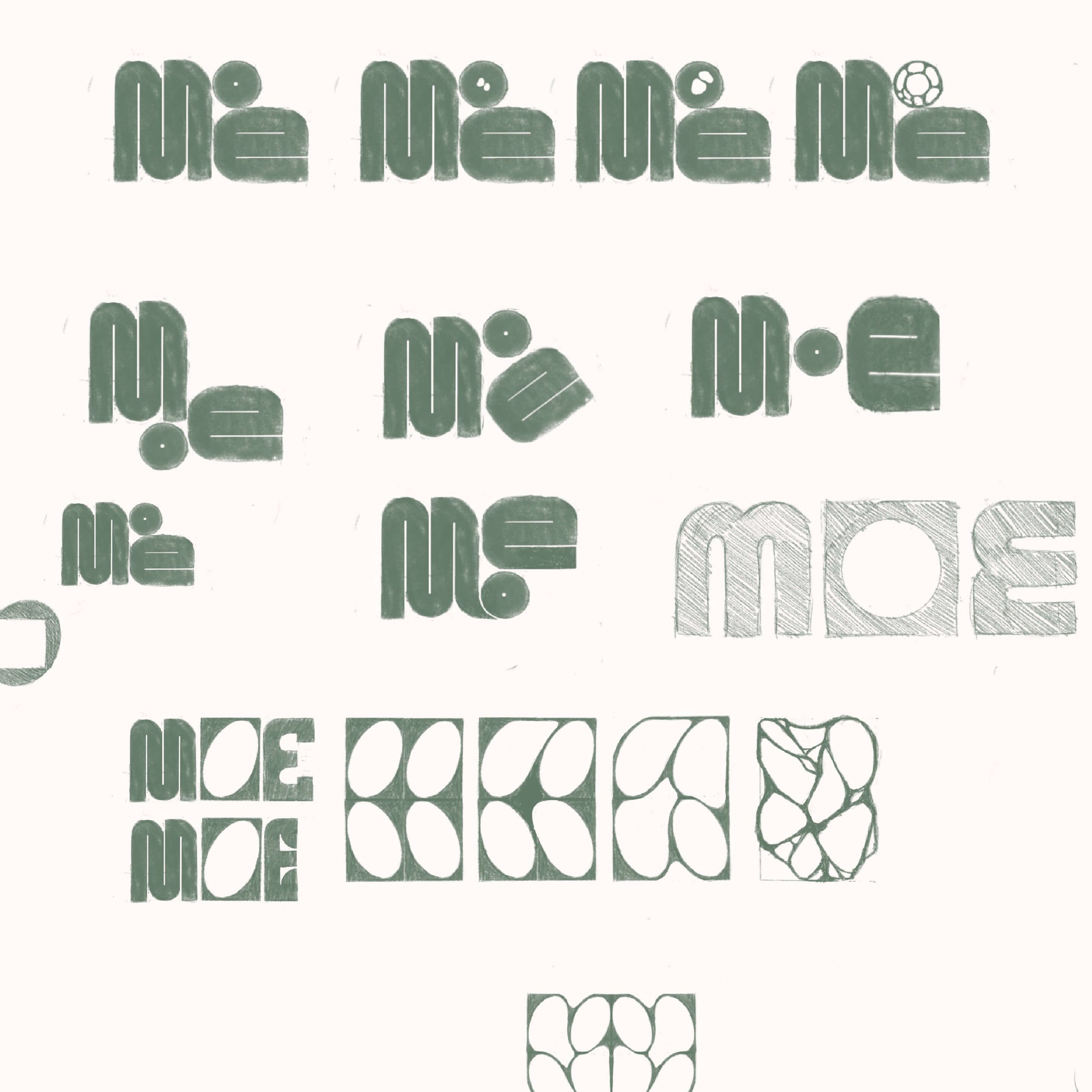
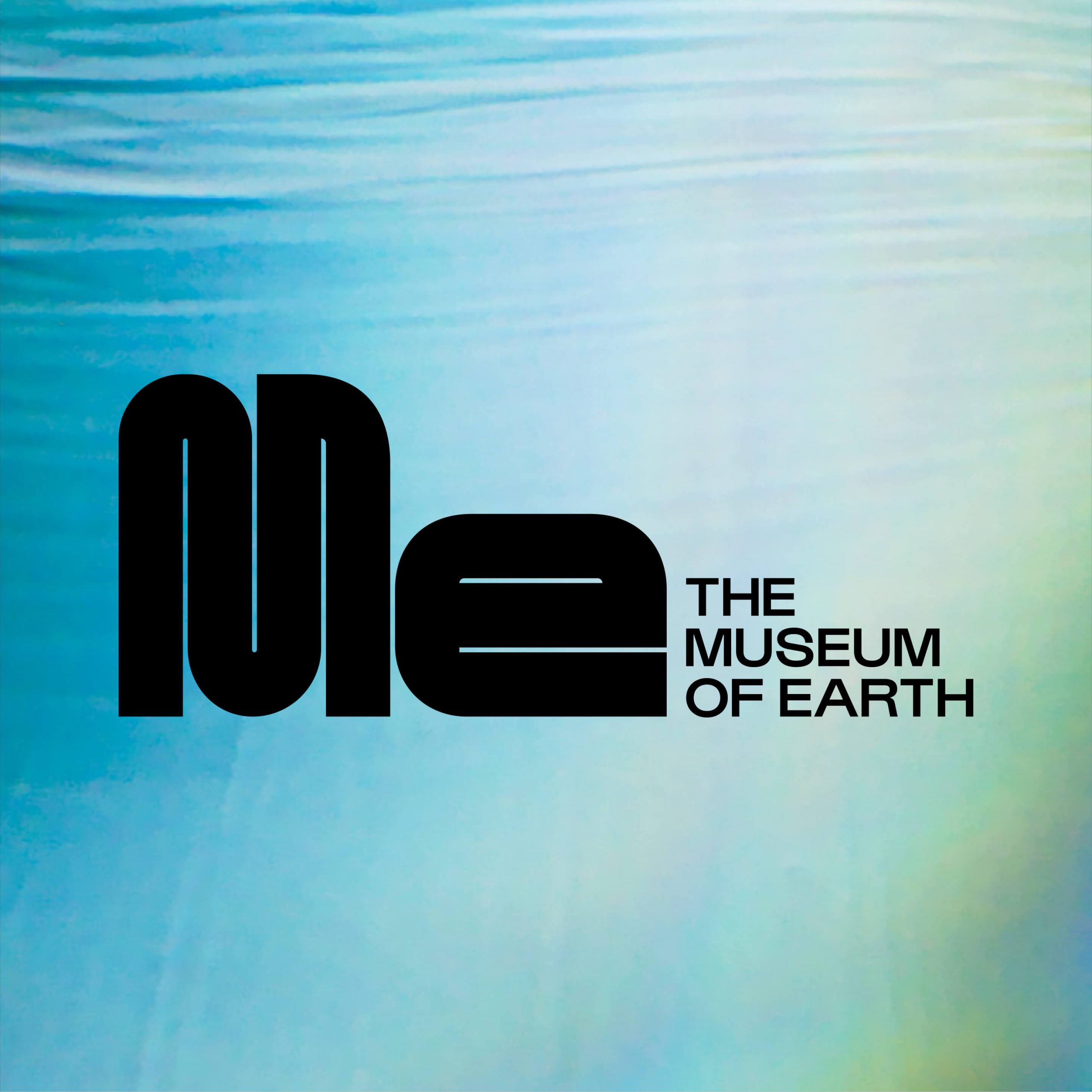
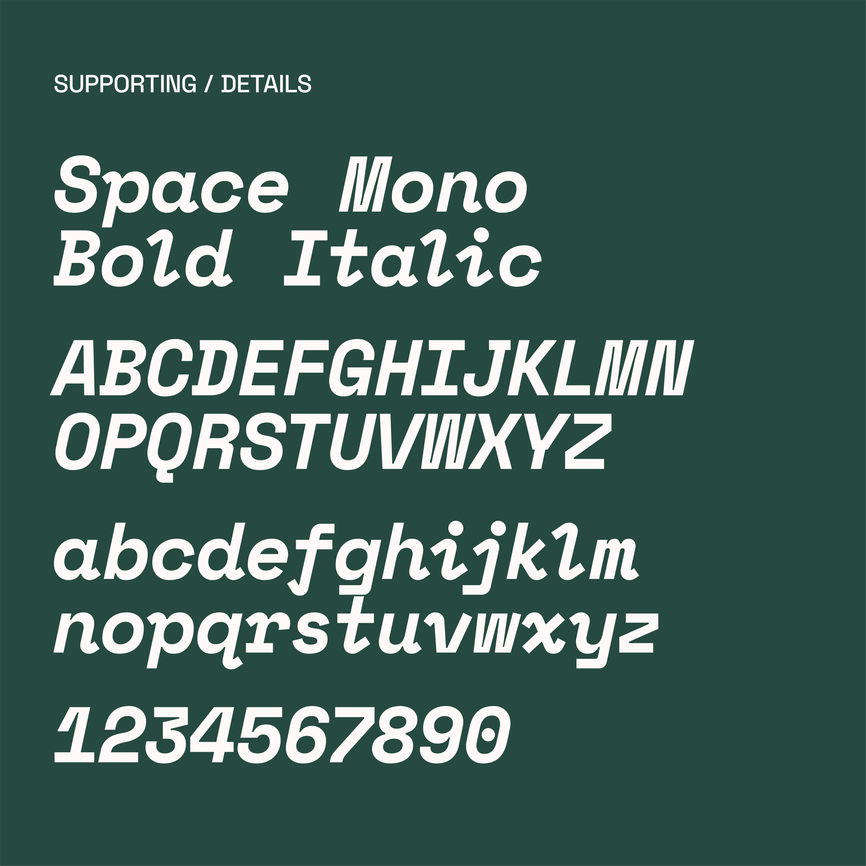
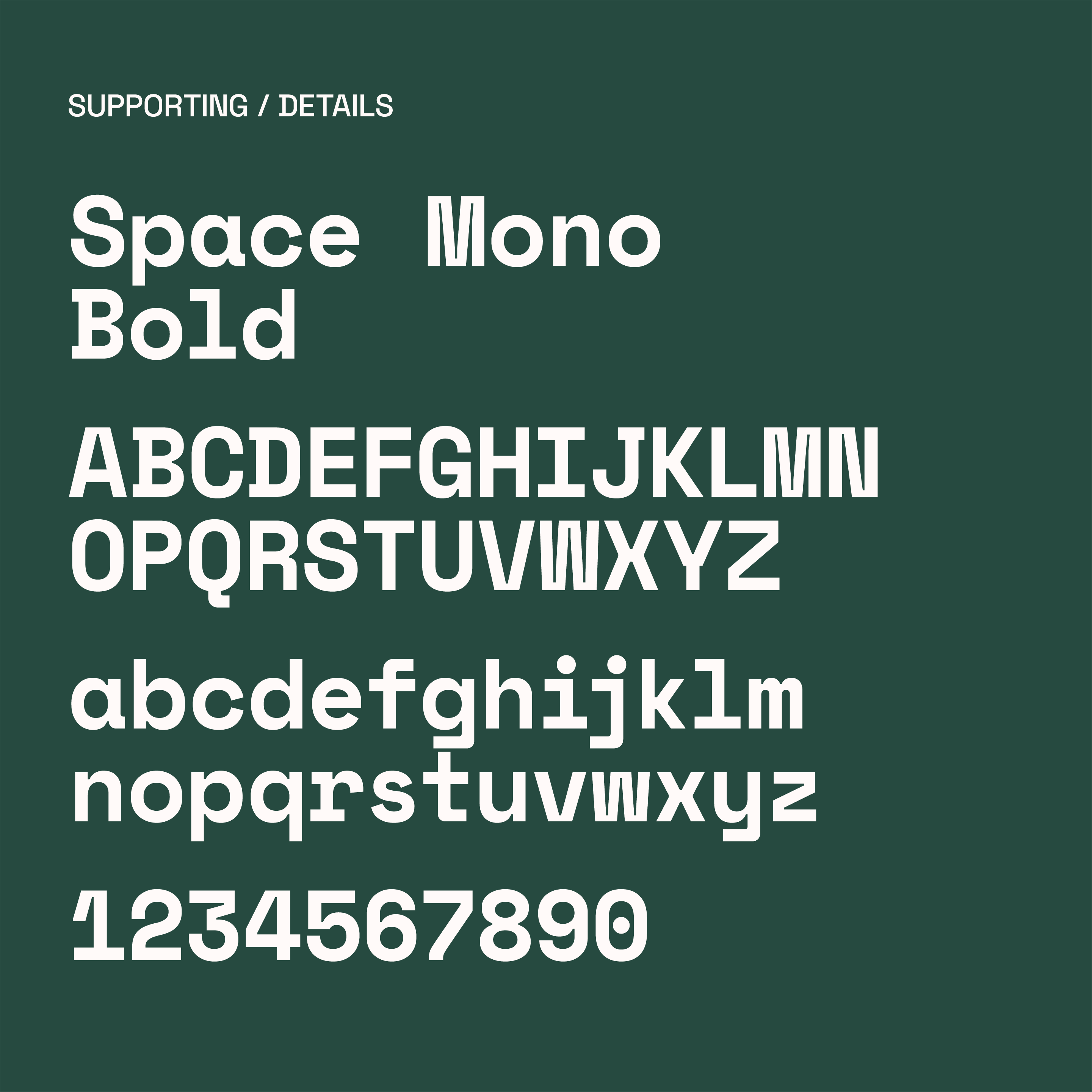
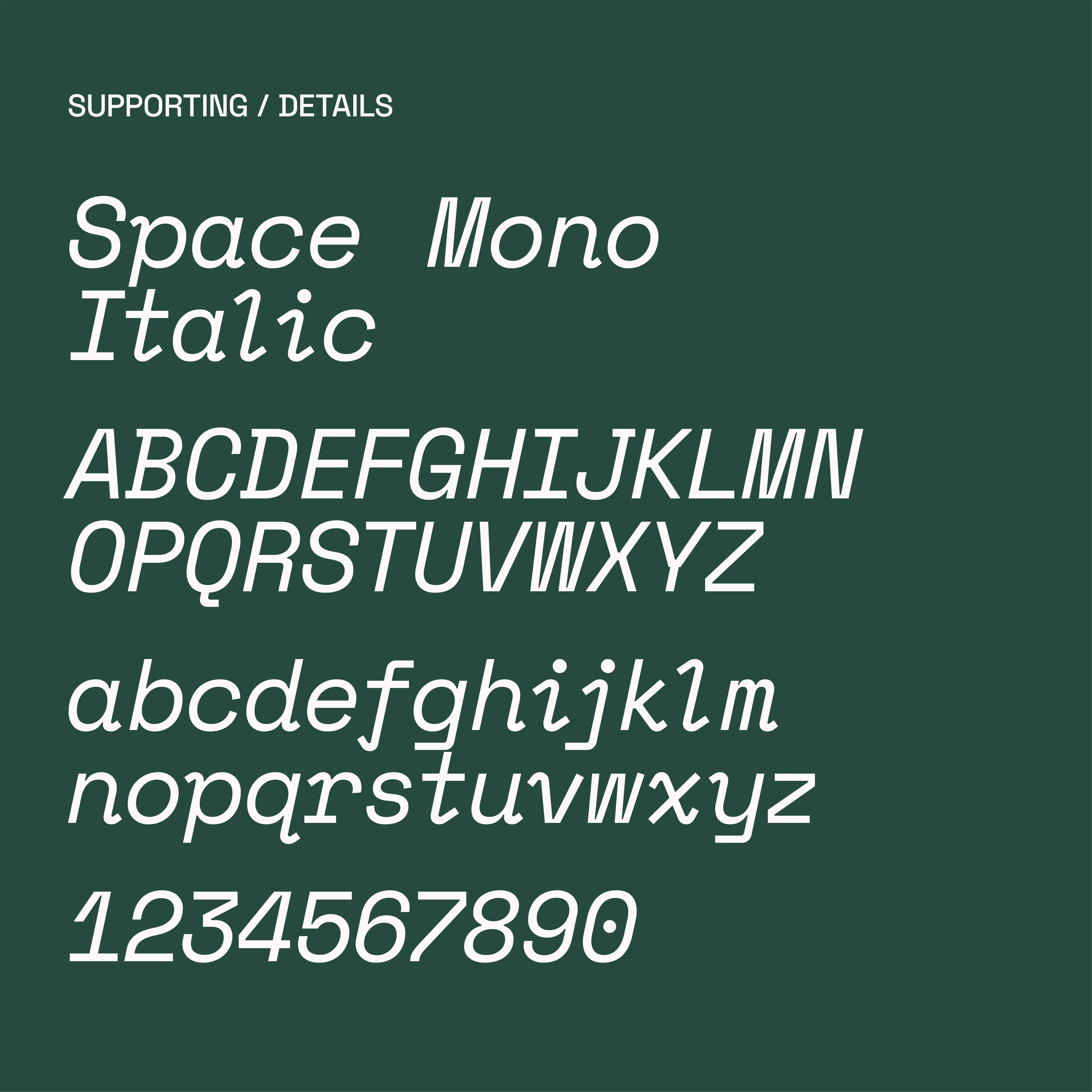
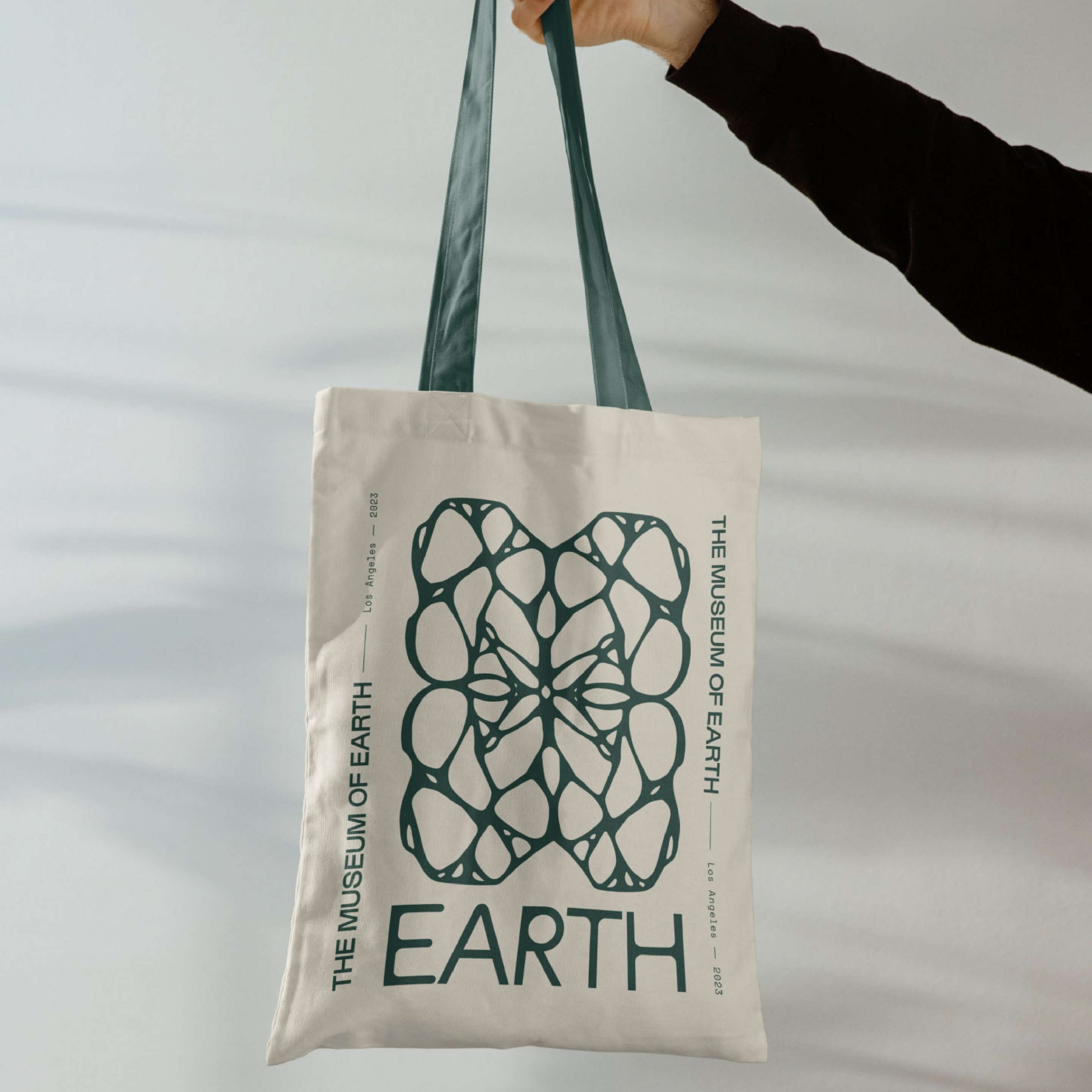
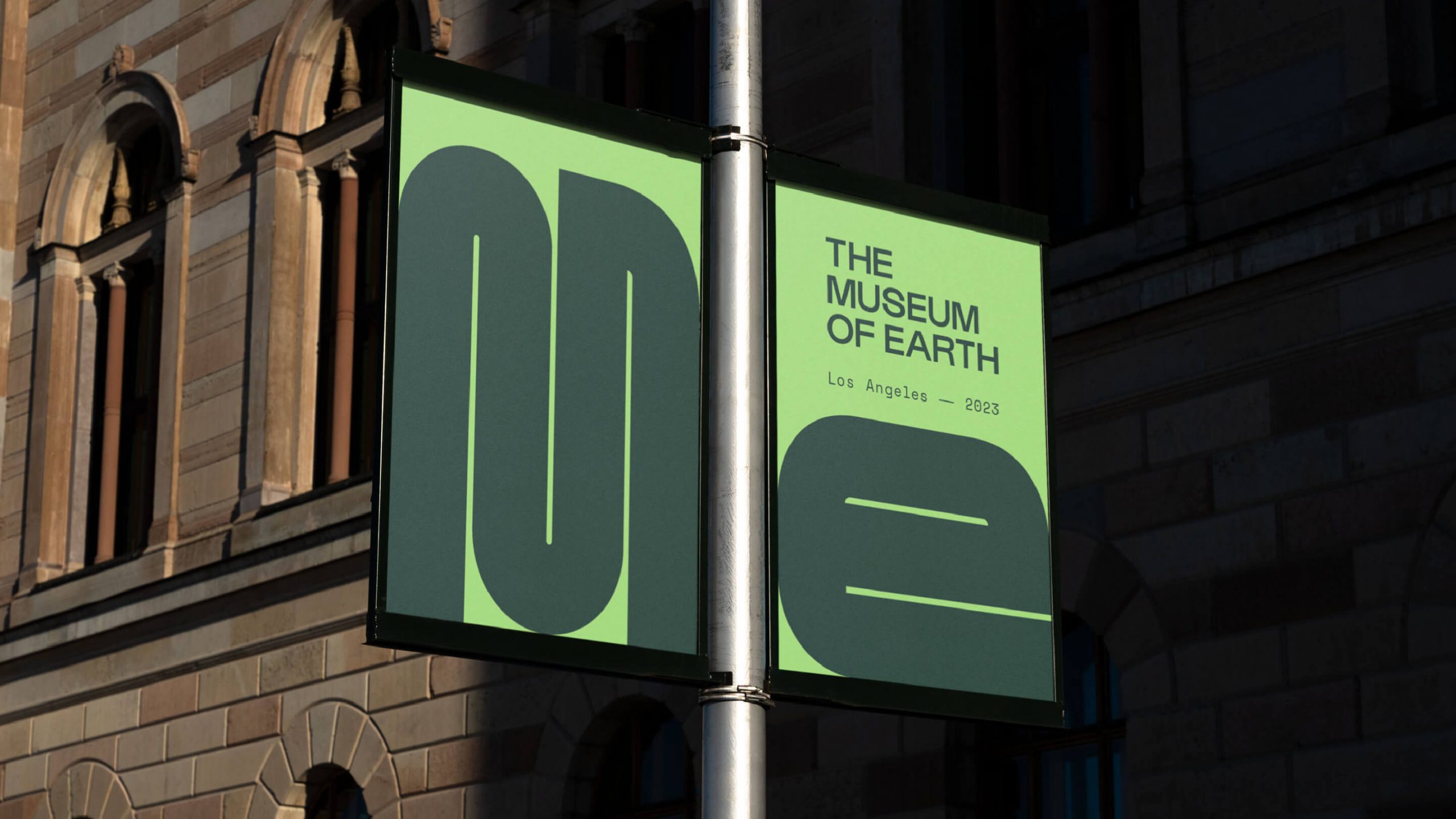
With that in mind, we designed a dynamic identity with a juxtaposition of natural and technical elements. The logo guides your eye along infinite visual pathways—there are no dead-ends here—where the undulating curves and keen edges reference both the physical and intellectual journeys Museum-goers will experience. We chose a typeface that embodies the same contrast of components, along with a naturally-inspired colour palette of soft neutrals bolstered by a punch of vivid neon green.
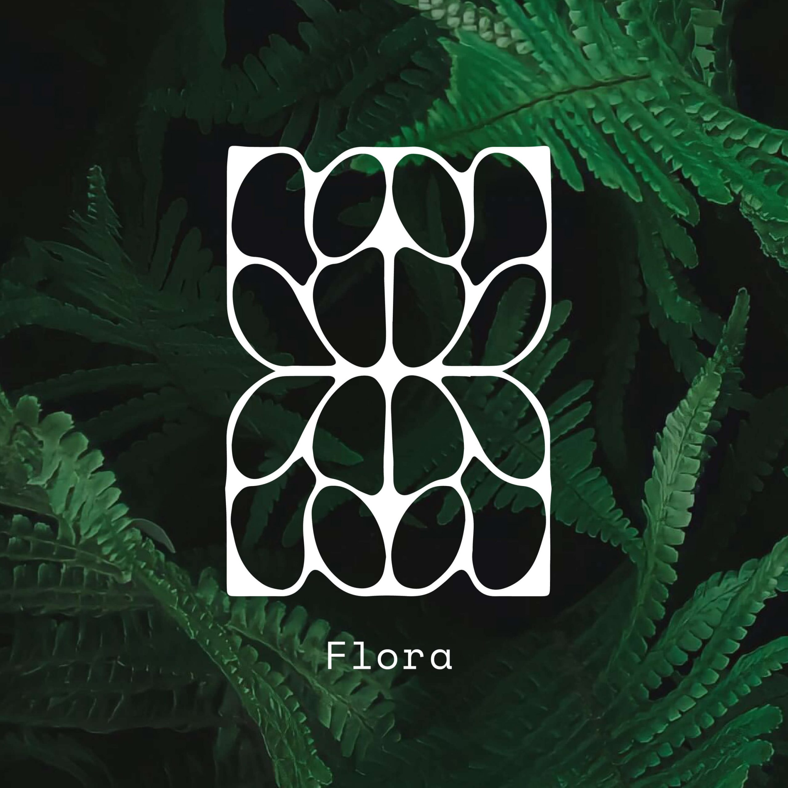
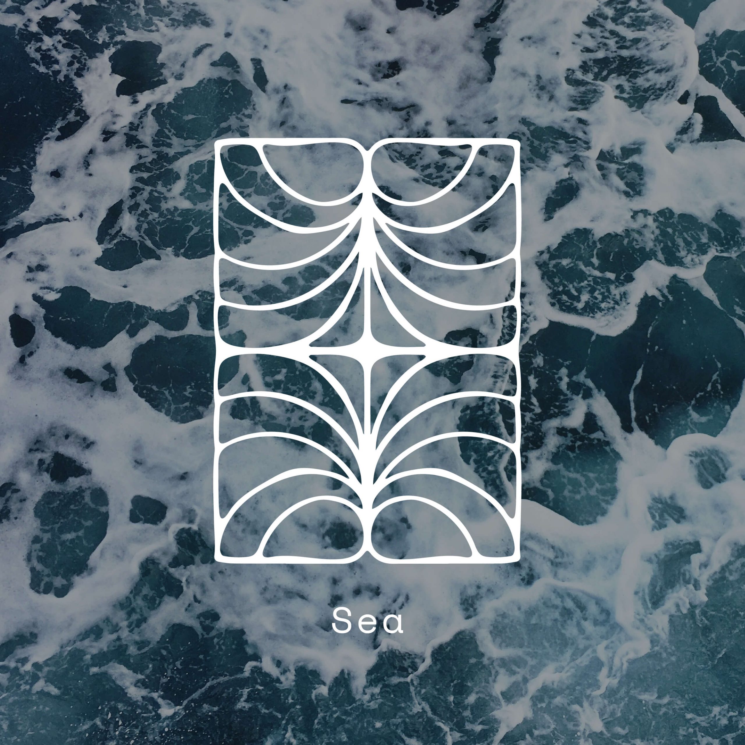
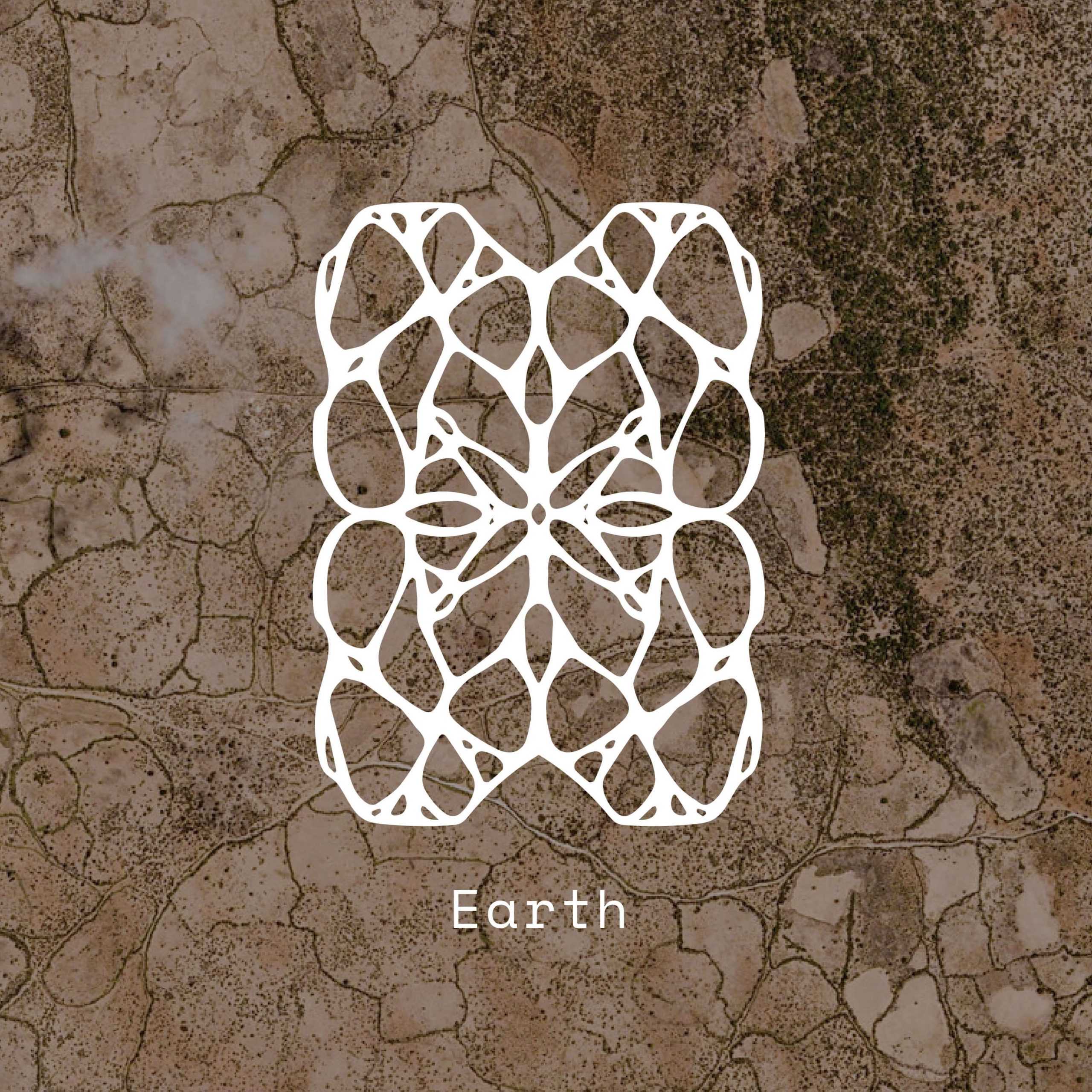
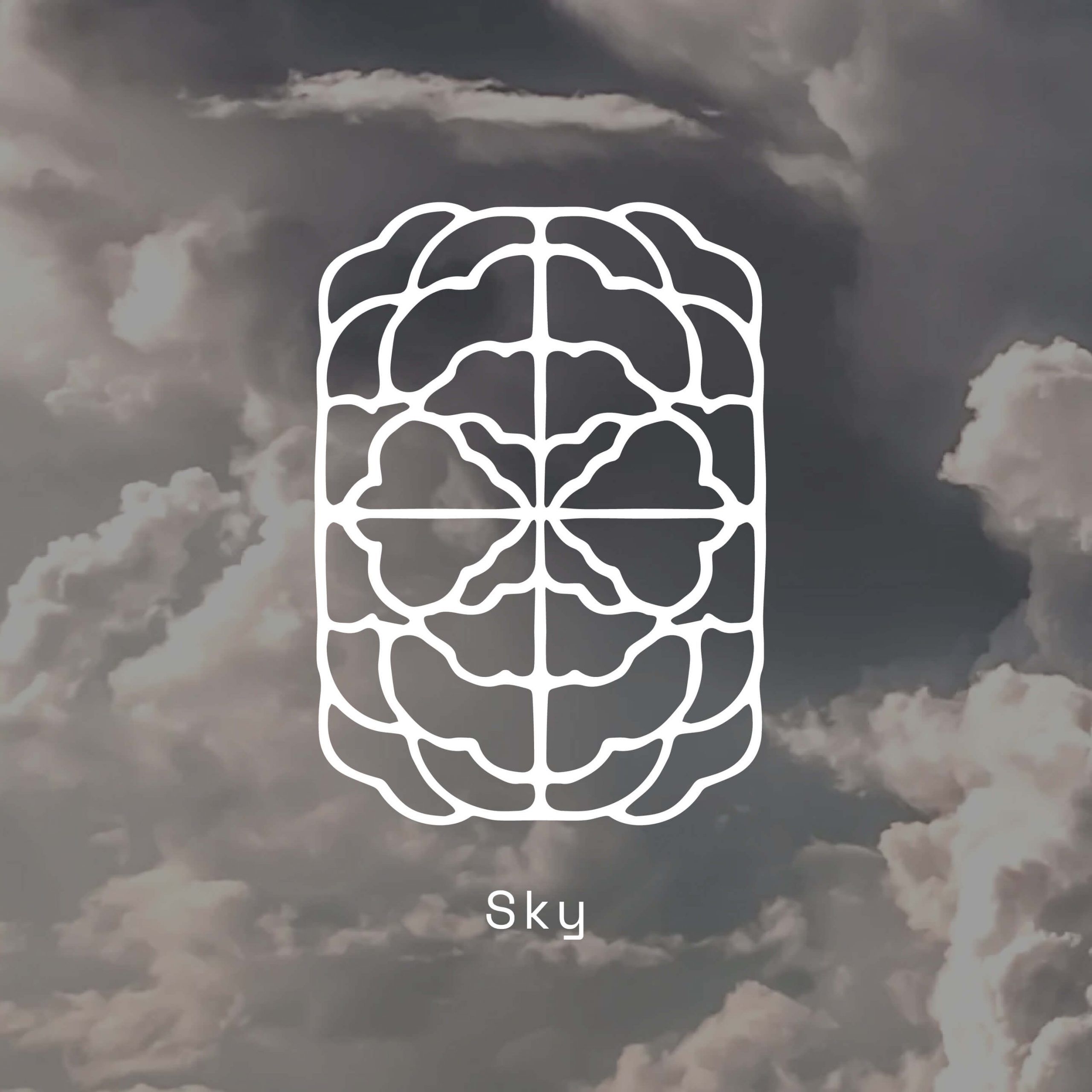
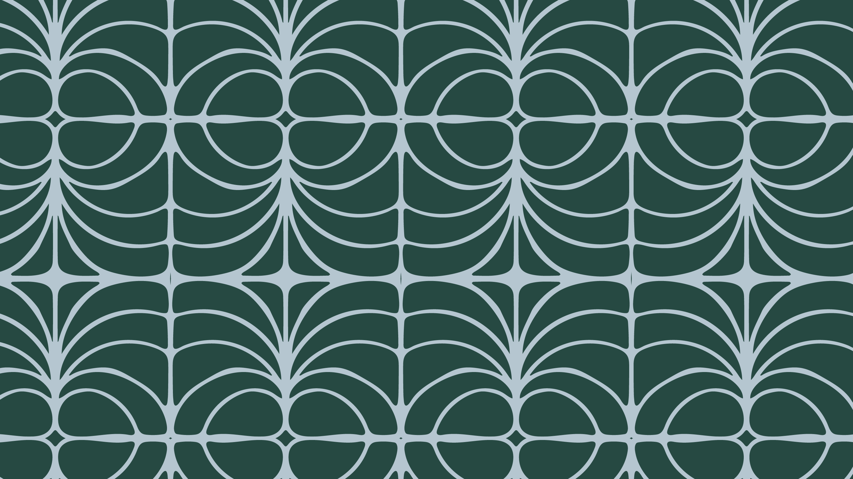
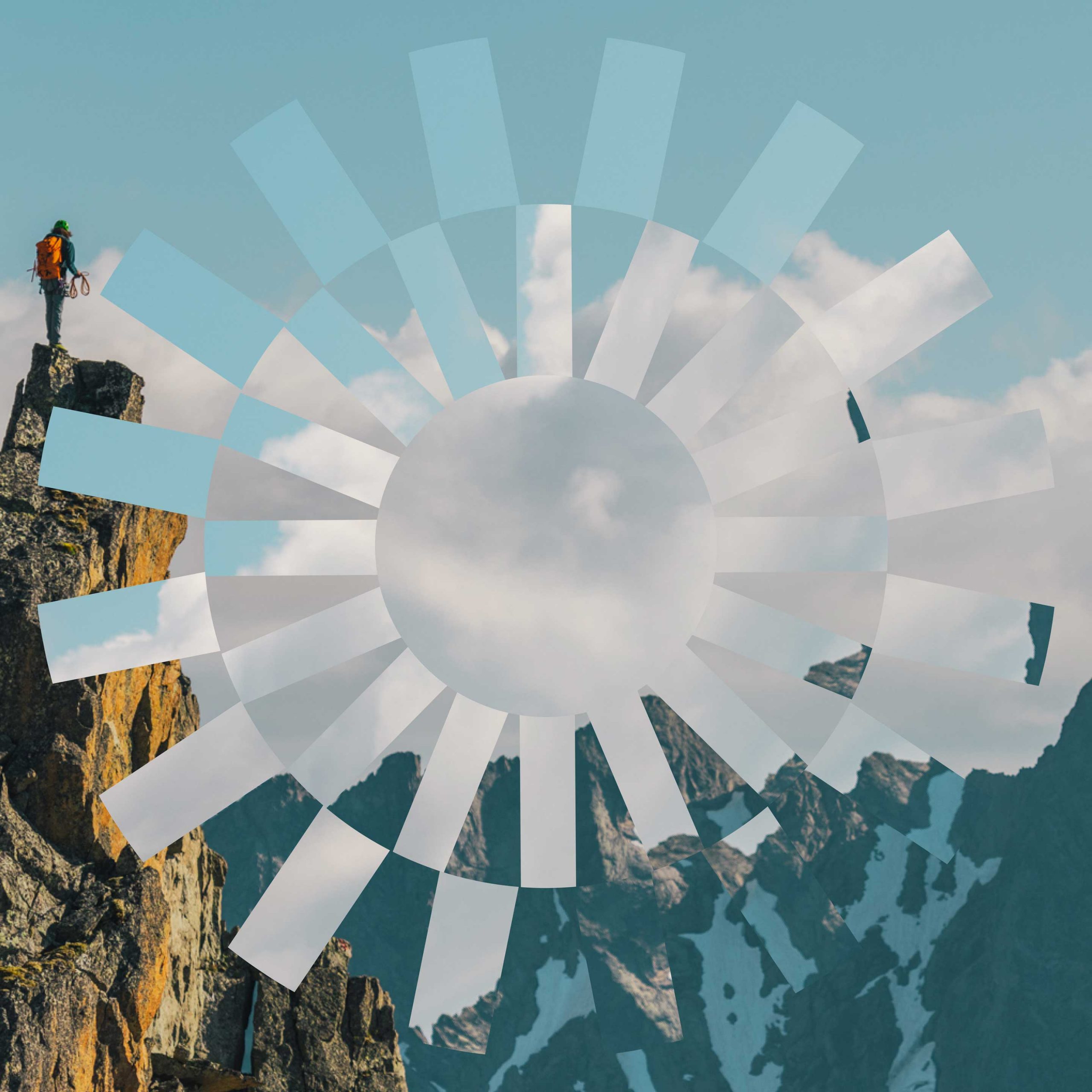
Inspired by the Museum’s four chapters—Flora, Sky, Earth, and Sea—we created a series of mesmerizing patterns that are designed to tile seamlessly, almost like a kaleidoscope, allowing for multiple uses across platforms—for example, functional wayfinding touchpoints to guide guests through the Museum itself.
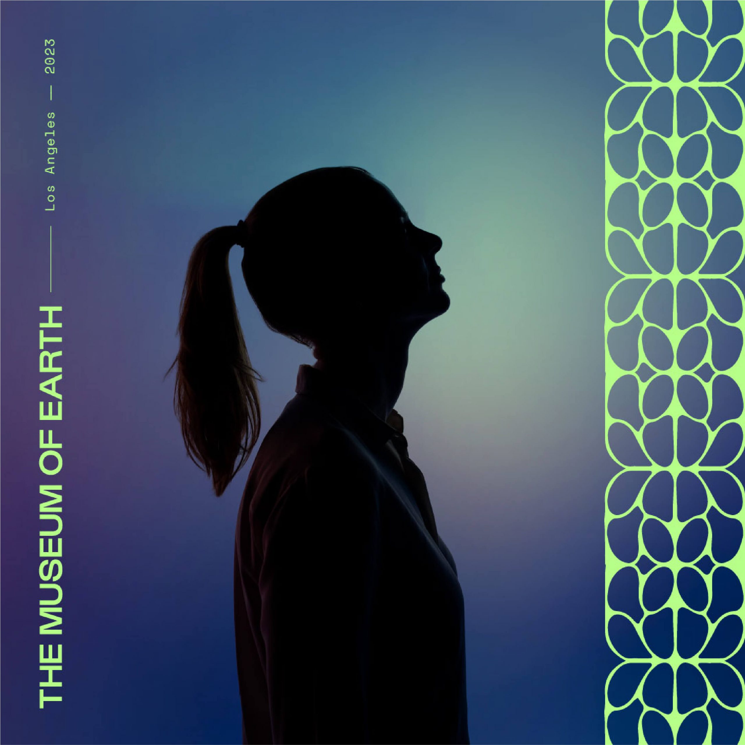
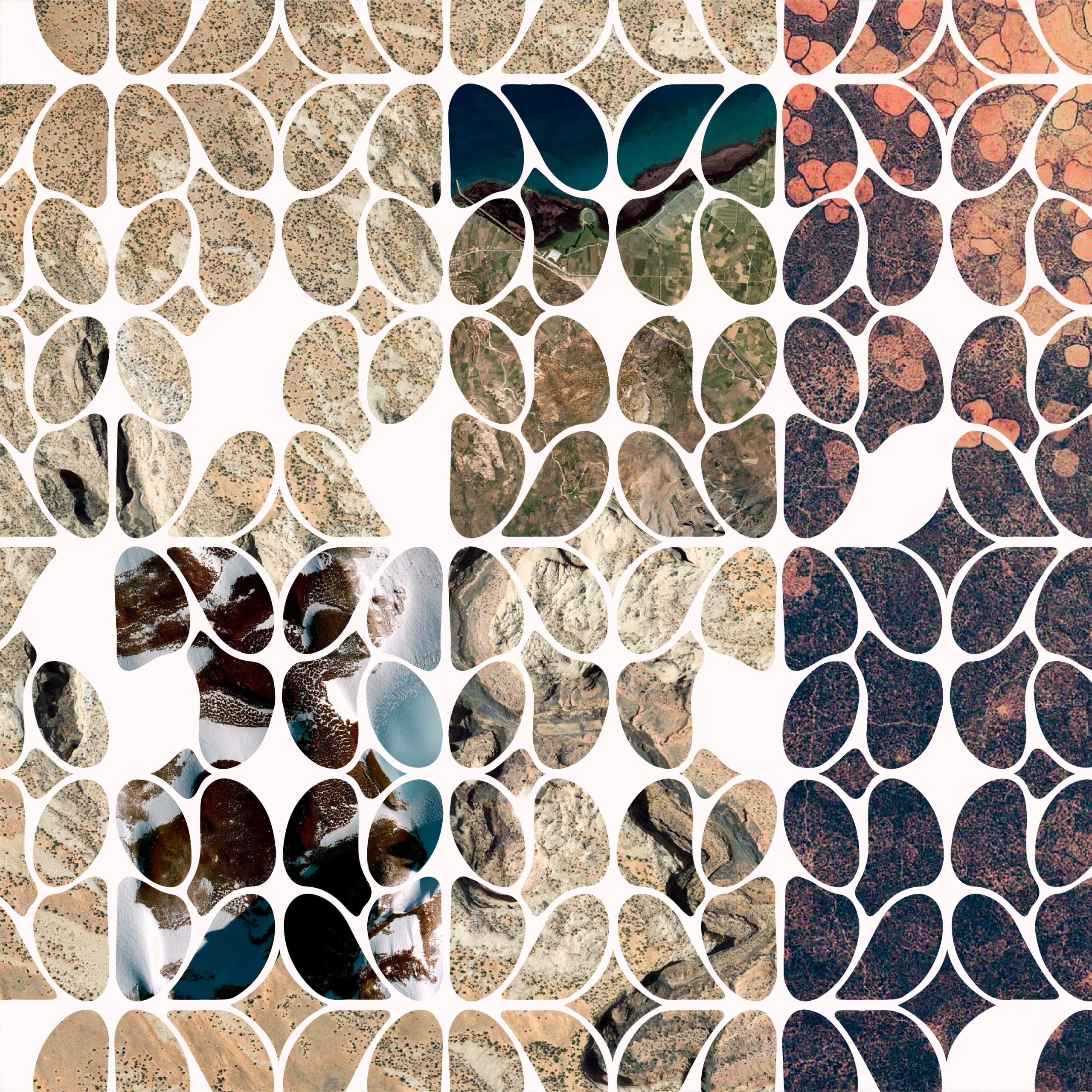
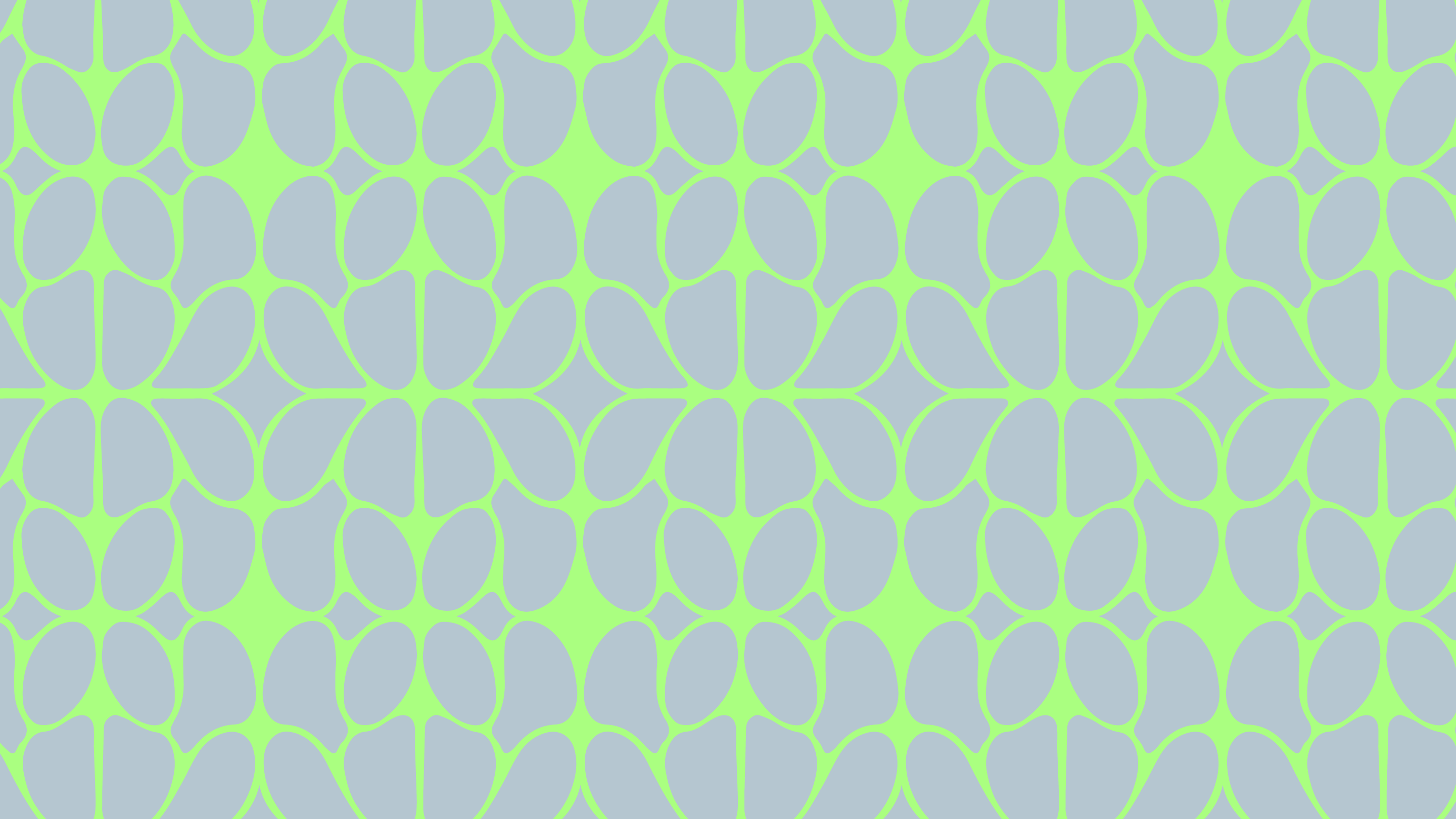
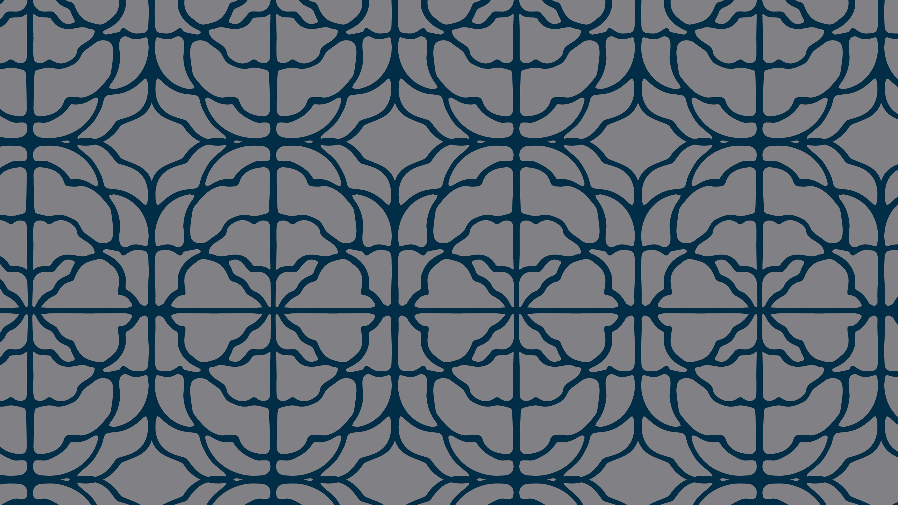
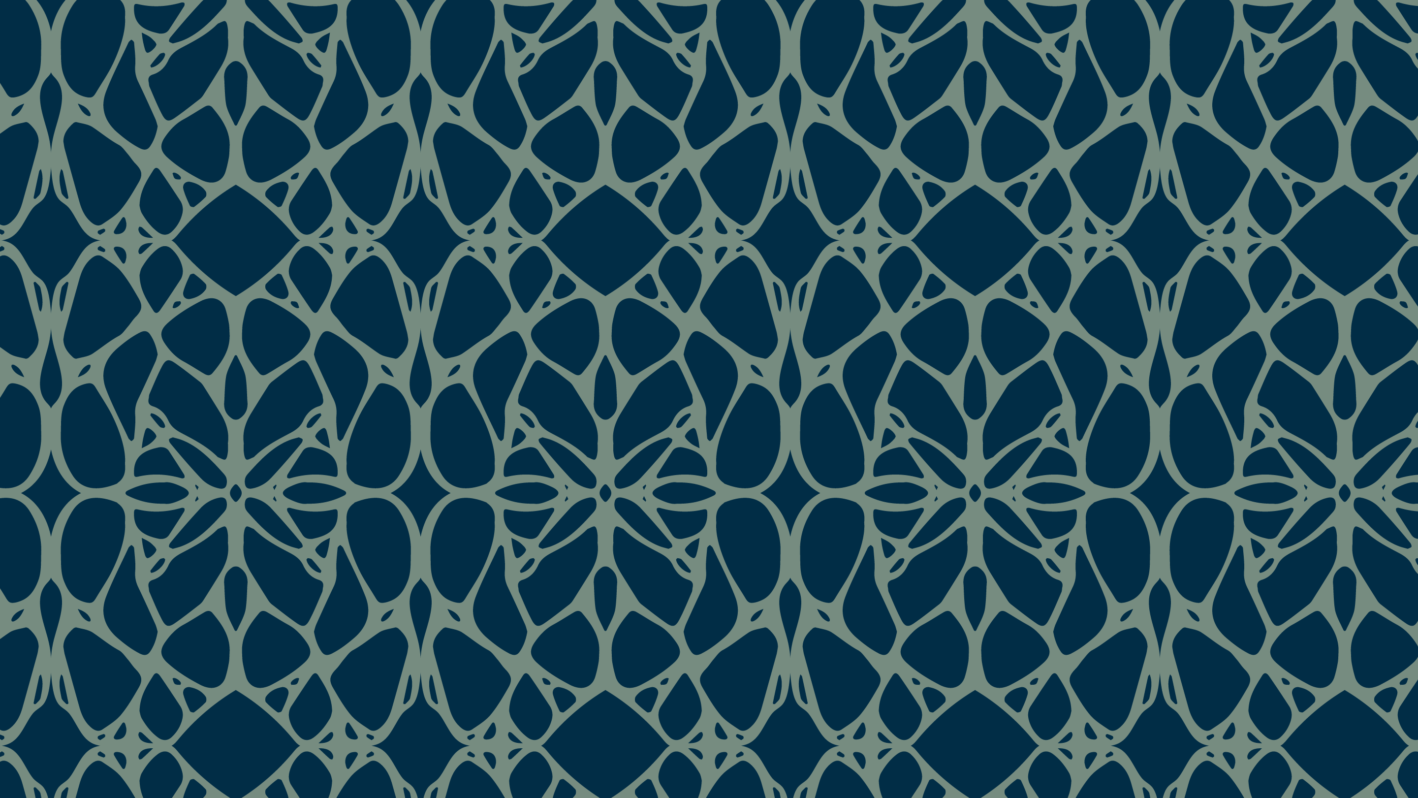
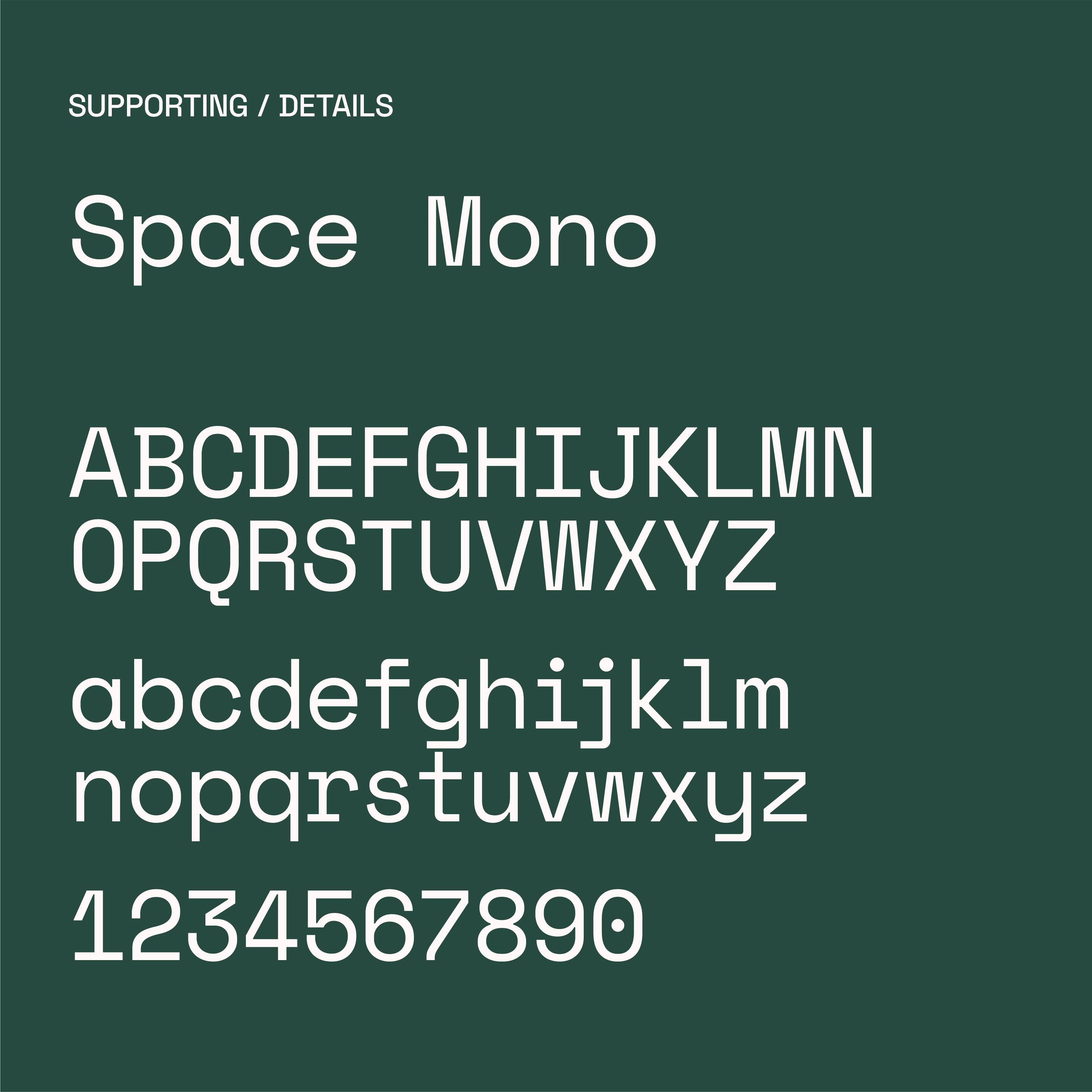
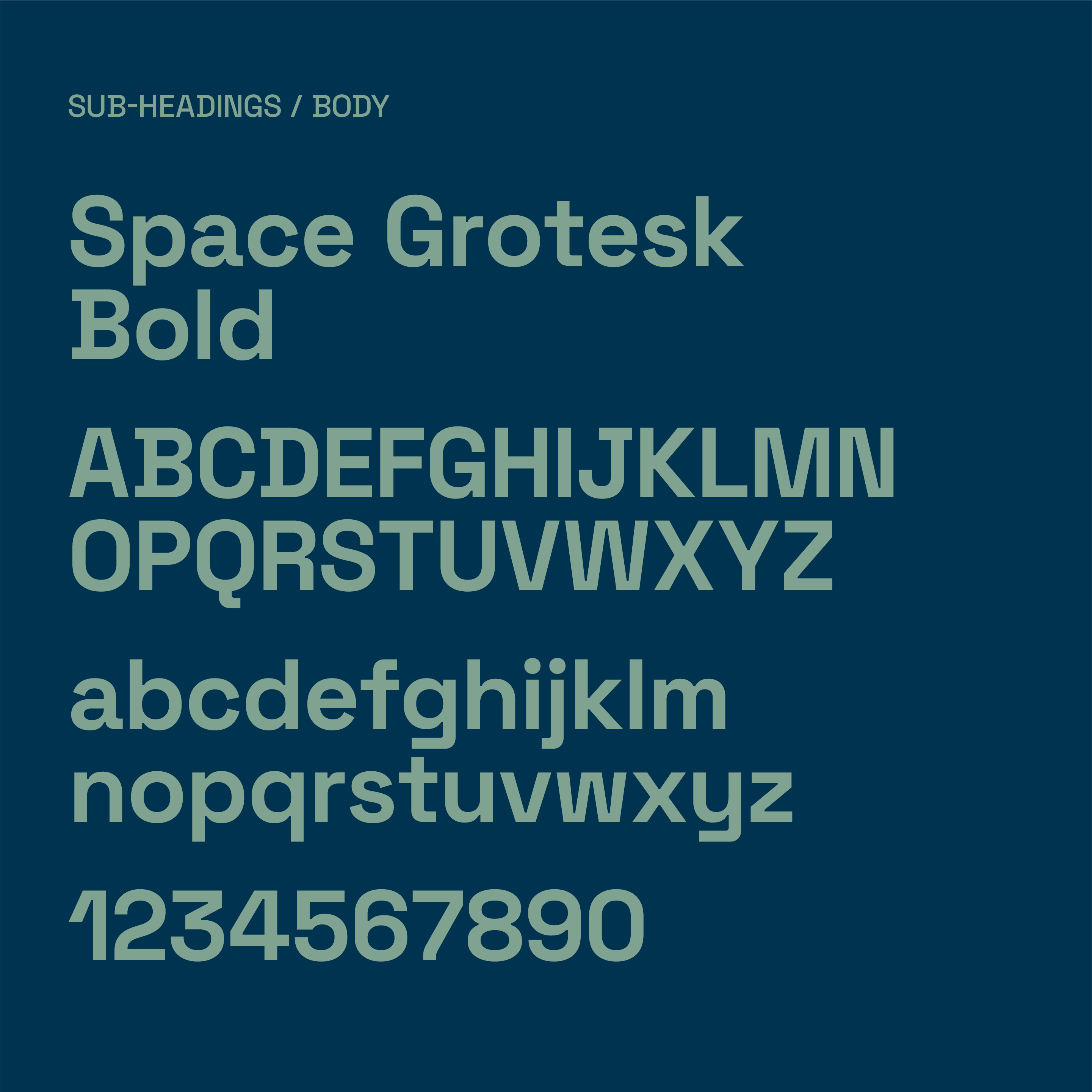
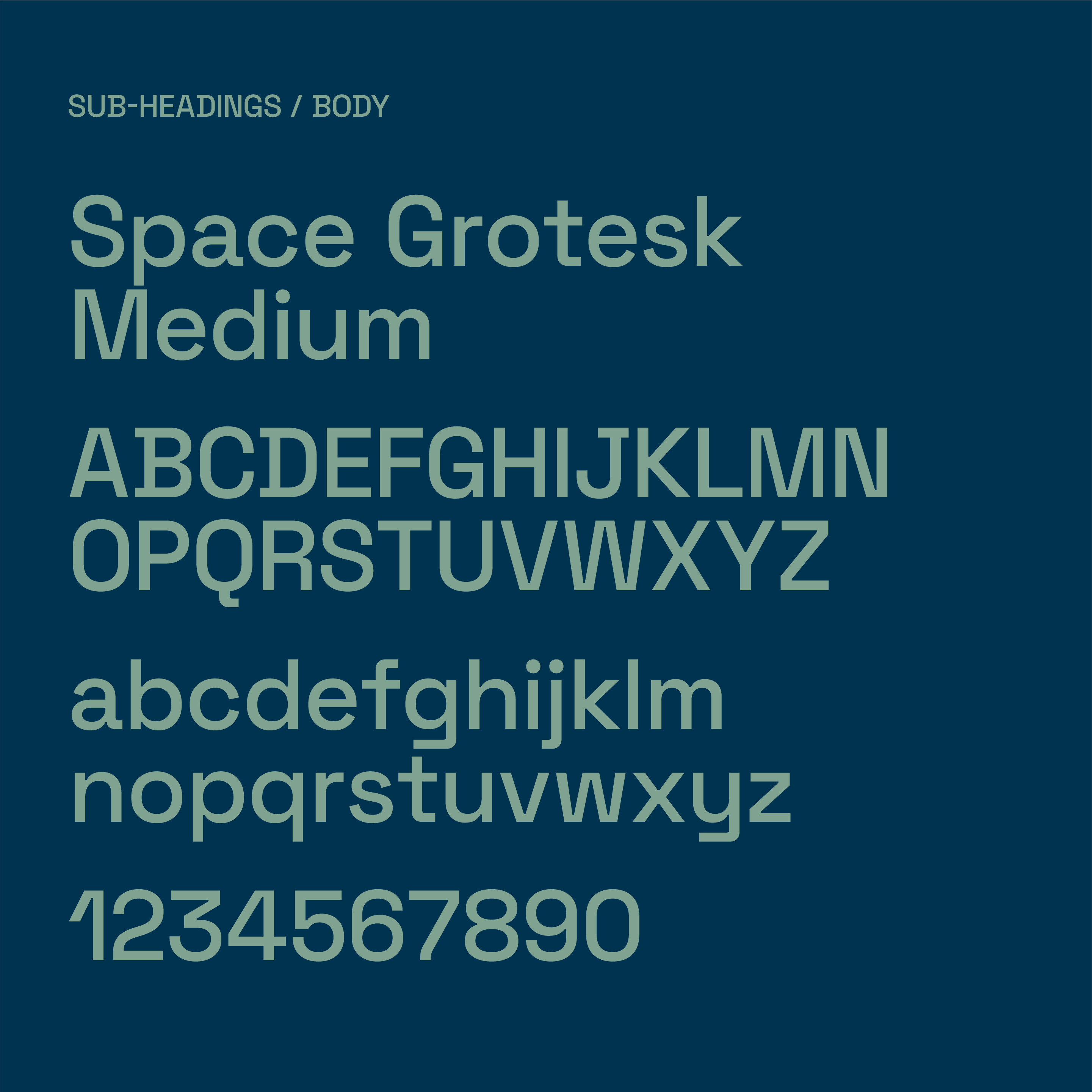
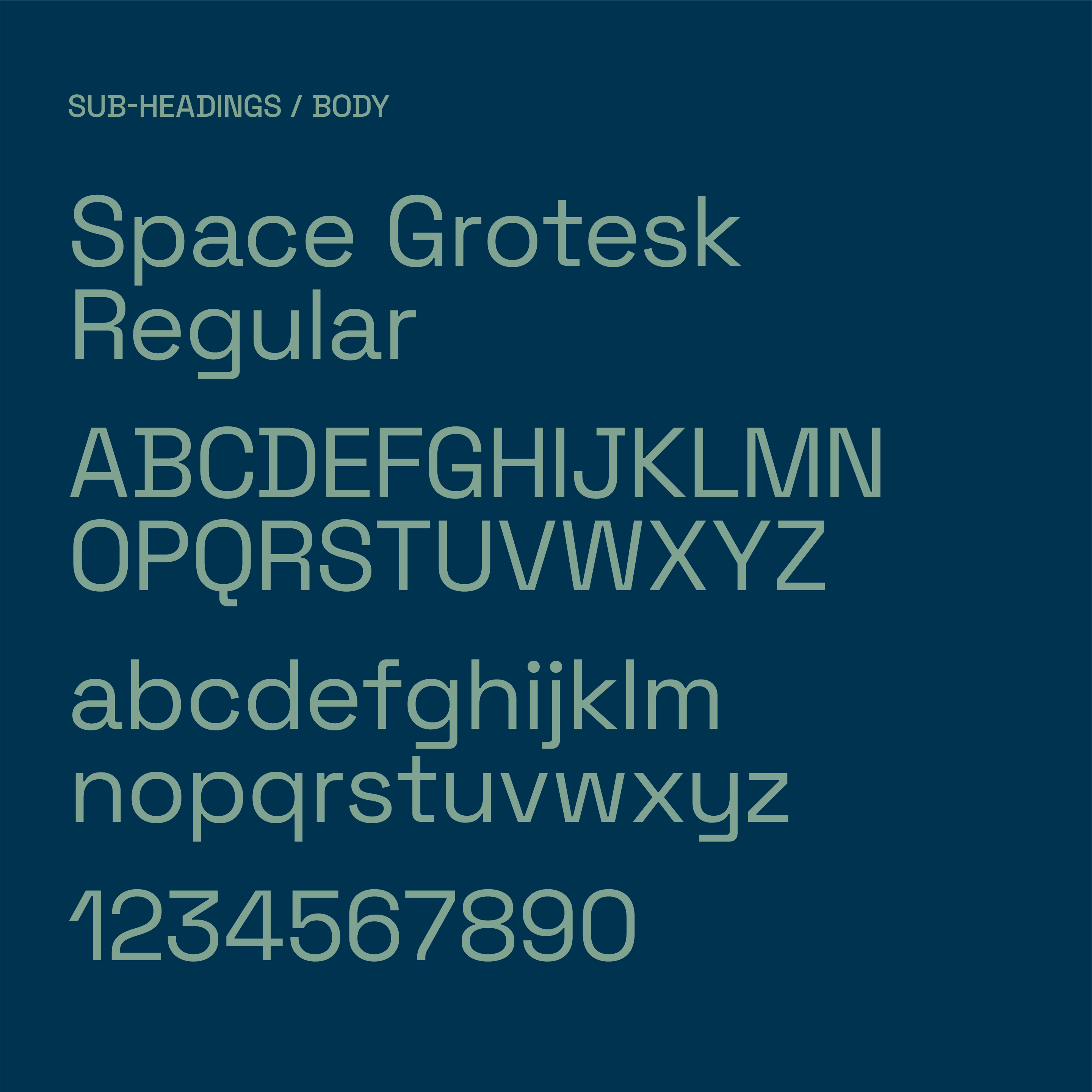
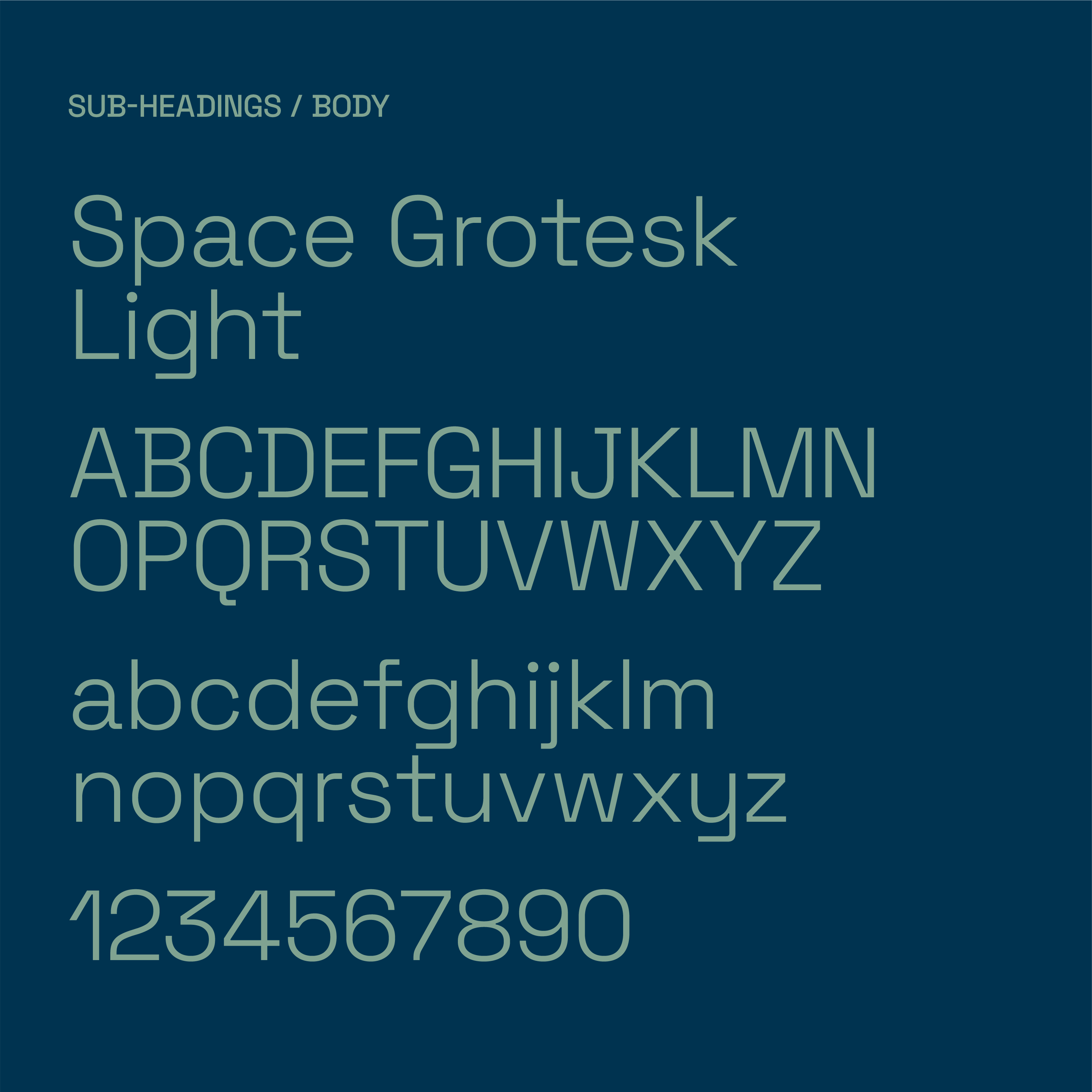
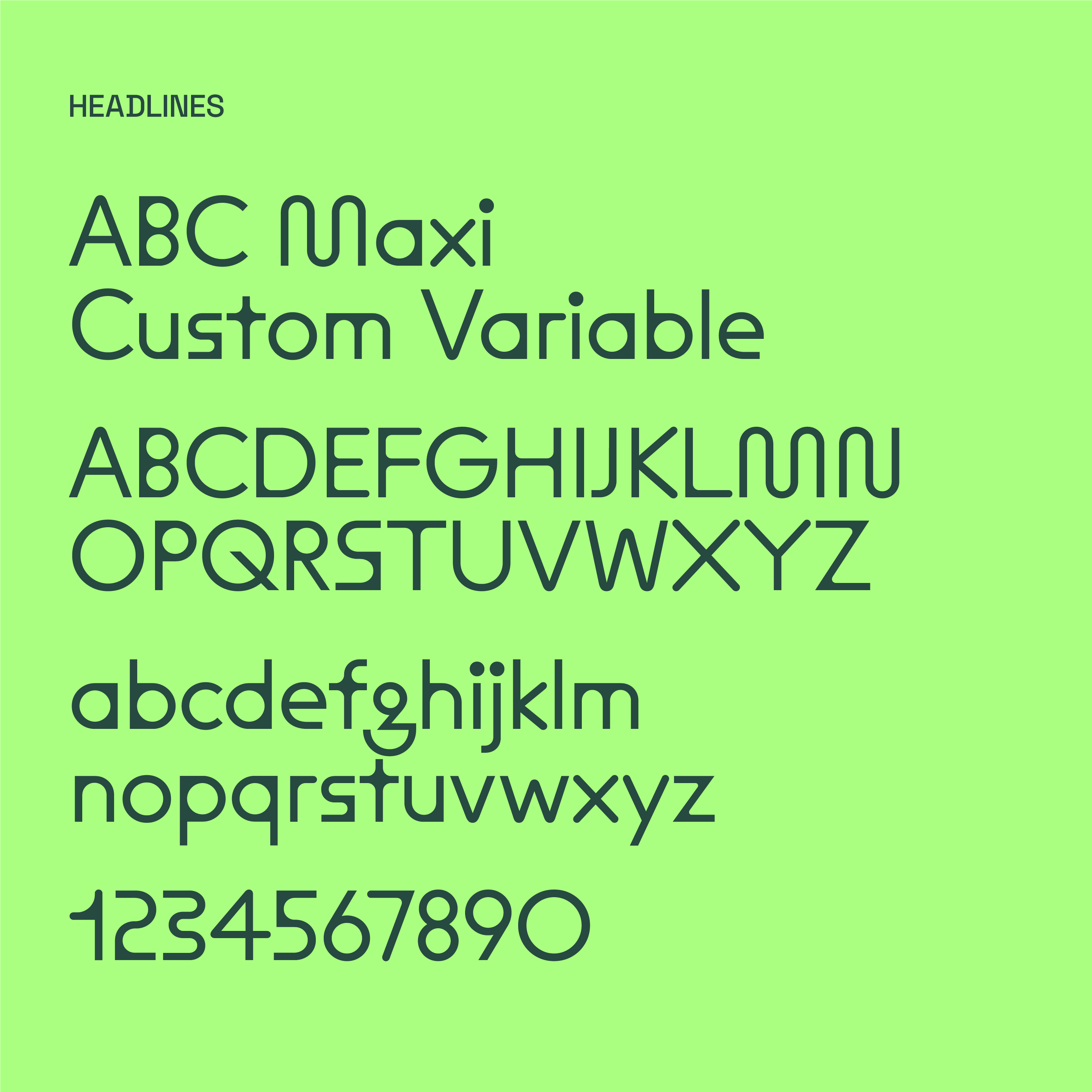
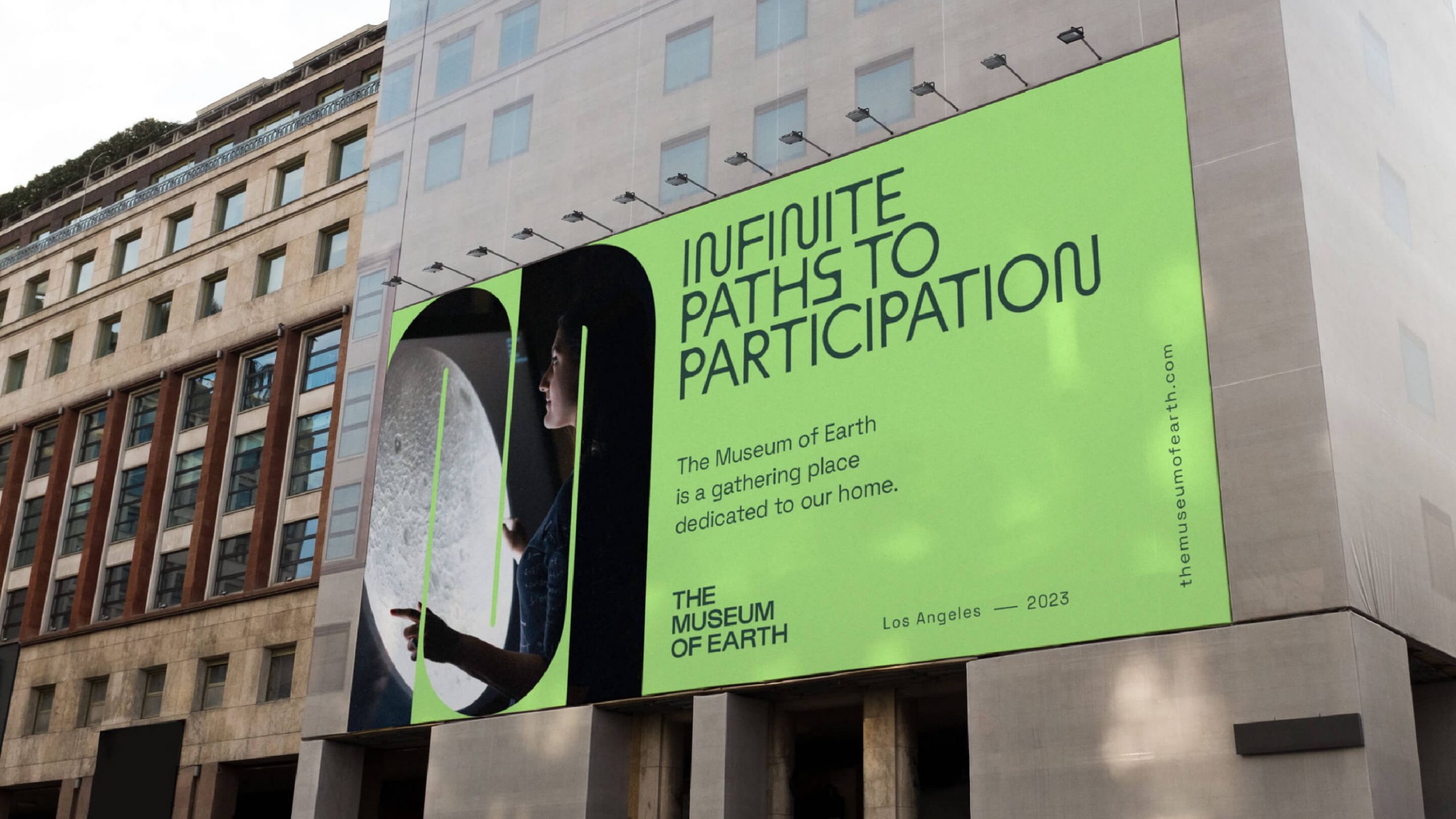
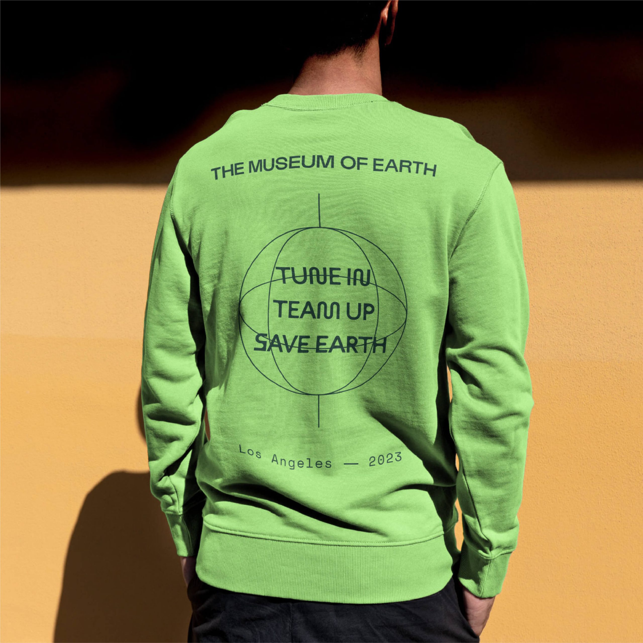
In the end, everything ties into the fundamental purpose of coming back to Earth and reflects the Museum’s interactive energy and momentum. Multiple iterations of these diverse elements allow for omnichannel flexibility and set the Museum of Earth up to start revealing their big plans to the world—we’re eagerly anticipating the installation’s Los Angeles unveiling in 2023. Your first chance to see our work in action? Their bold and beautiful new website is currently serving as a destination for investors as the Museum pursues venture funding.


03.05.21
This one simple document makes every part of your business better

02.10.22
Captivate your audience with dynamic visuals that adapt and flex across the screen
