09.19.20
lululemon
Fresh takes on everyone's favourite stretchy pants
GO
Two brands, one narrative
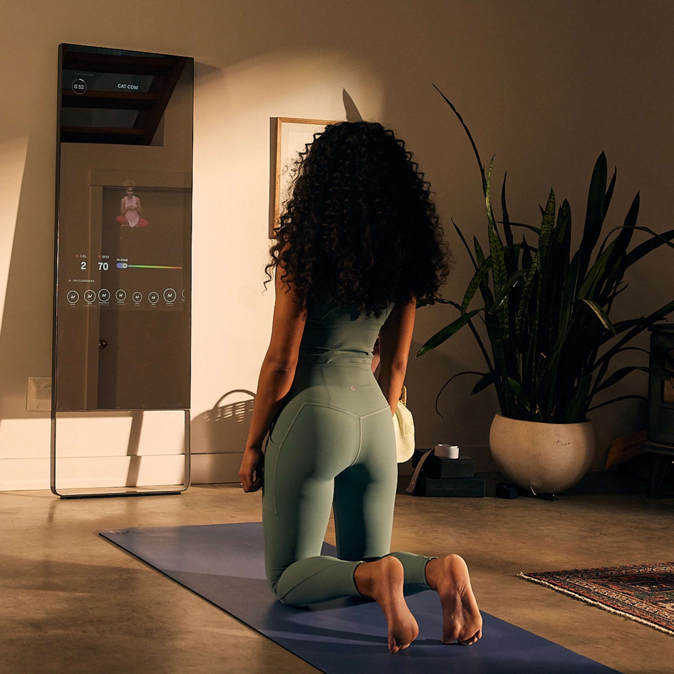
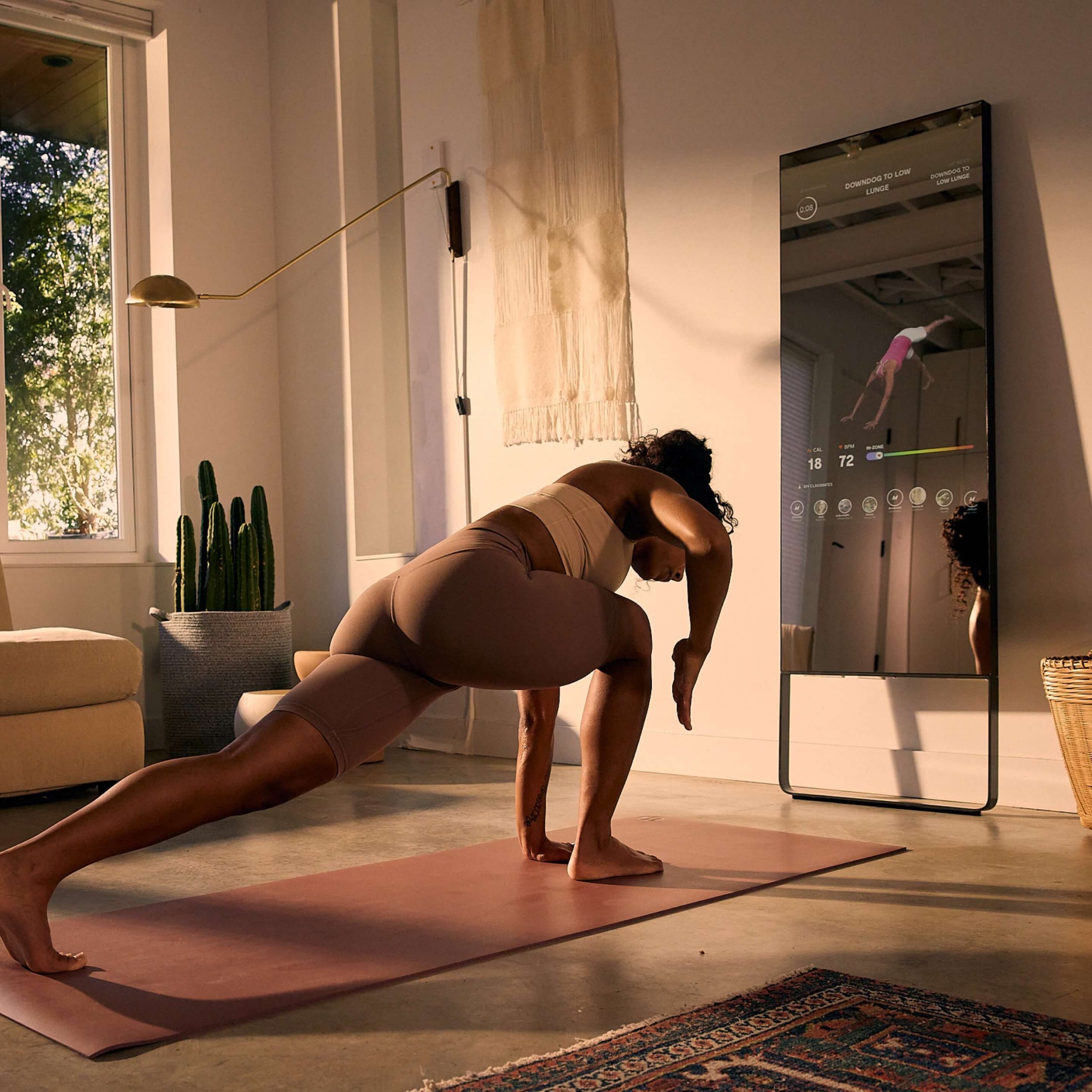
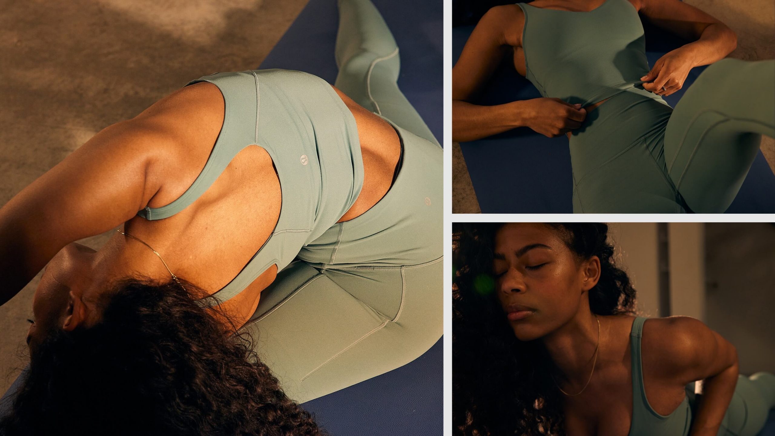
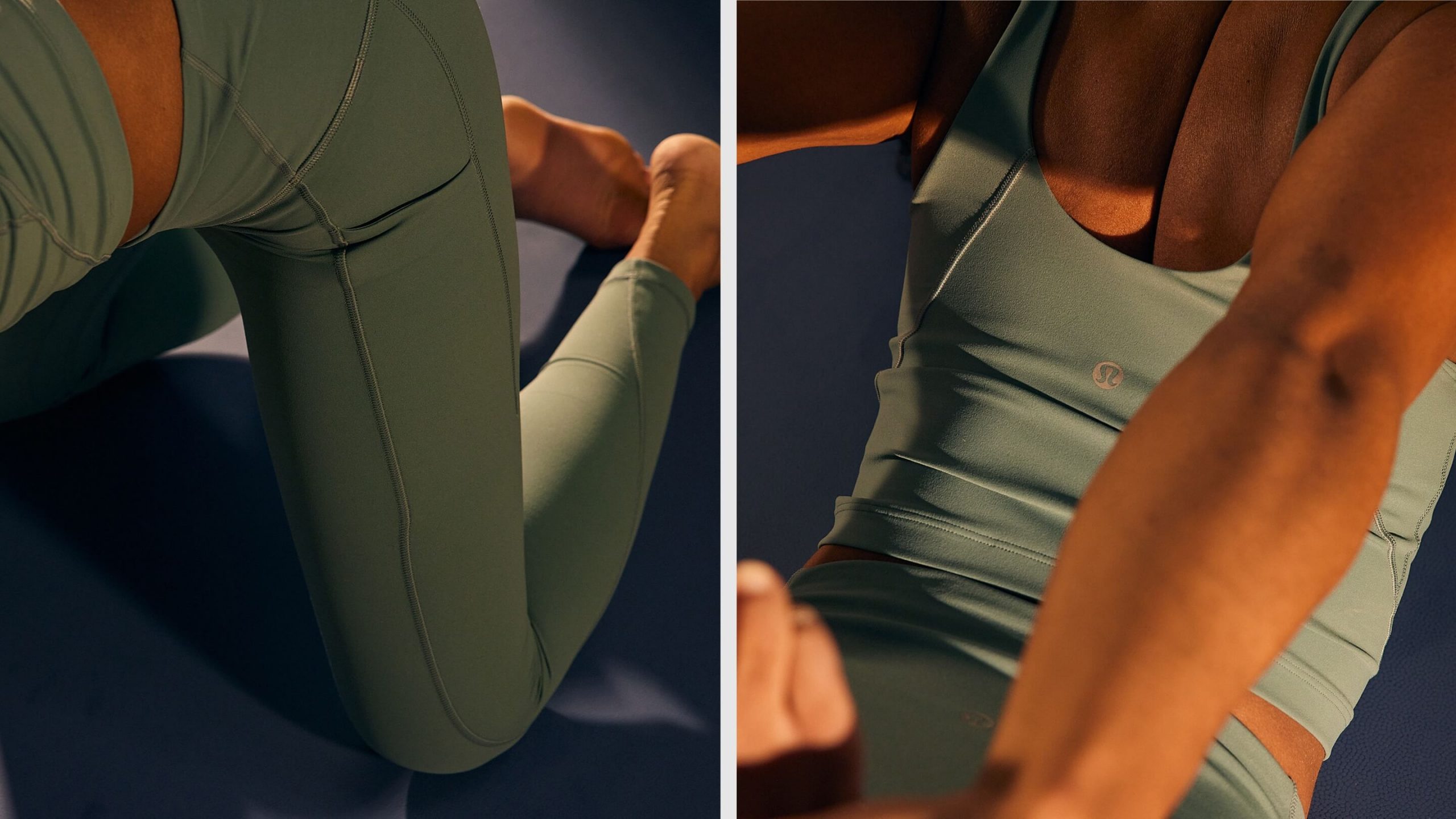
Monday has a long history with lululemon—creating product-focused campaigns that show technical performance with a narrative baseline. Because we have an intimate understanding of their production and art direction process, we were perfectly positioned to experiment with shooting both the Mirror and lululemon apparel, and to capture all our learnings for the lululemon team.
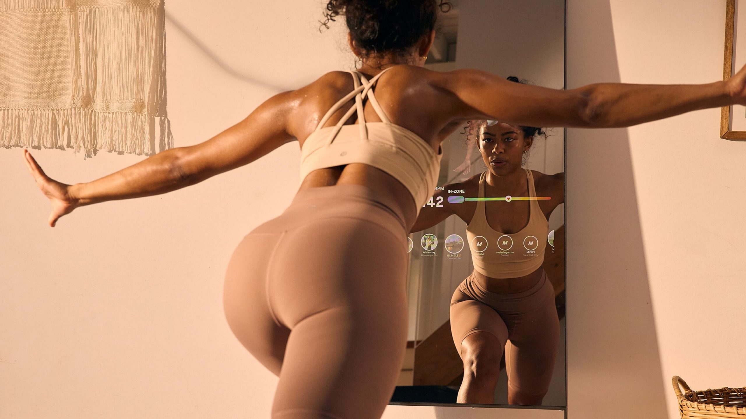
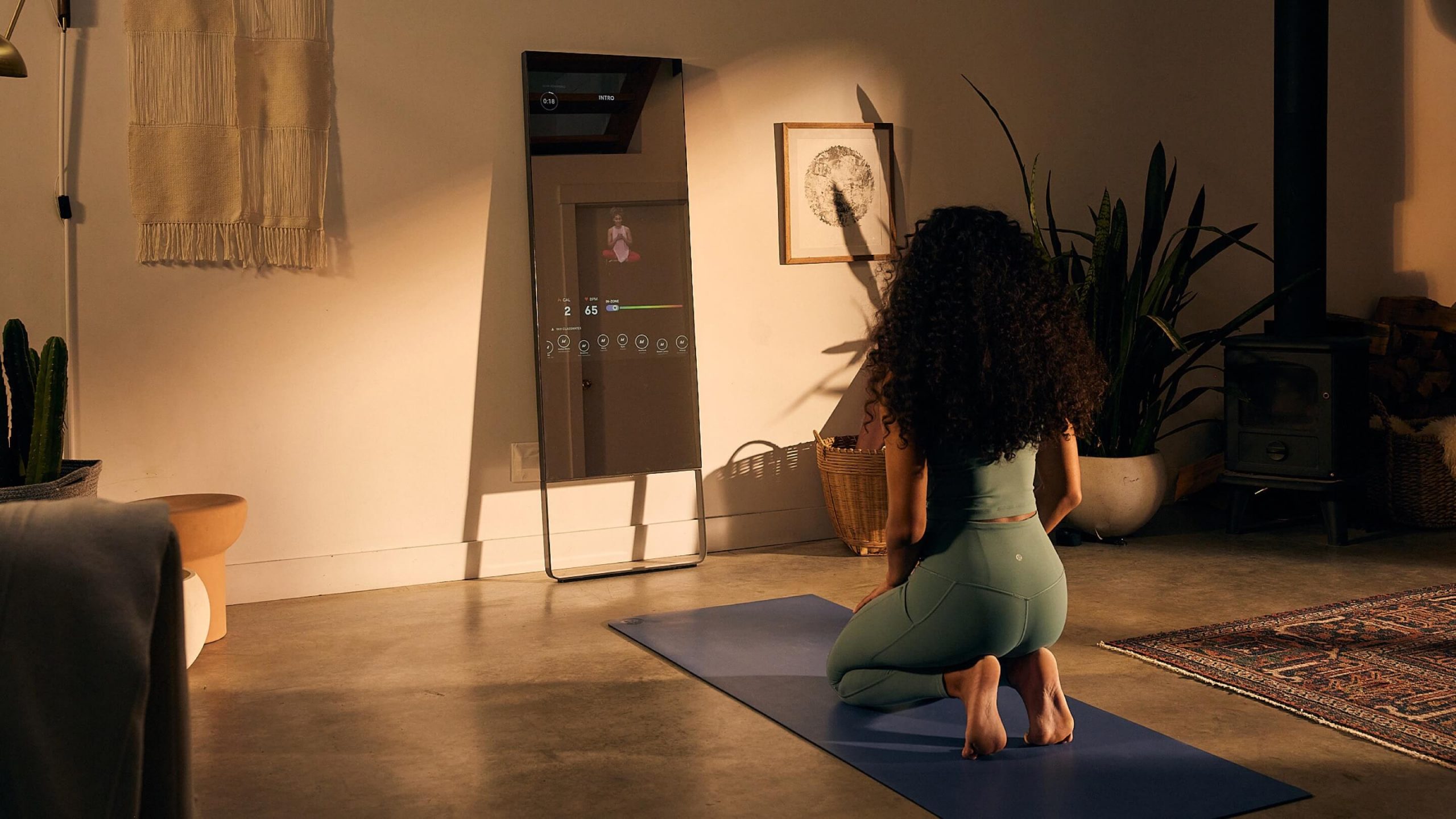
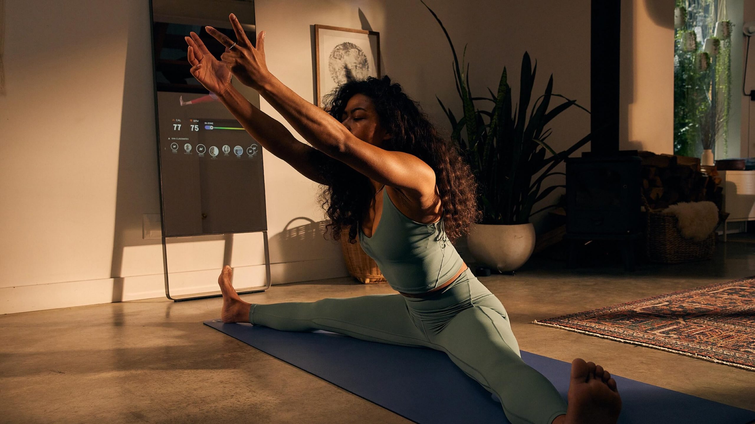
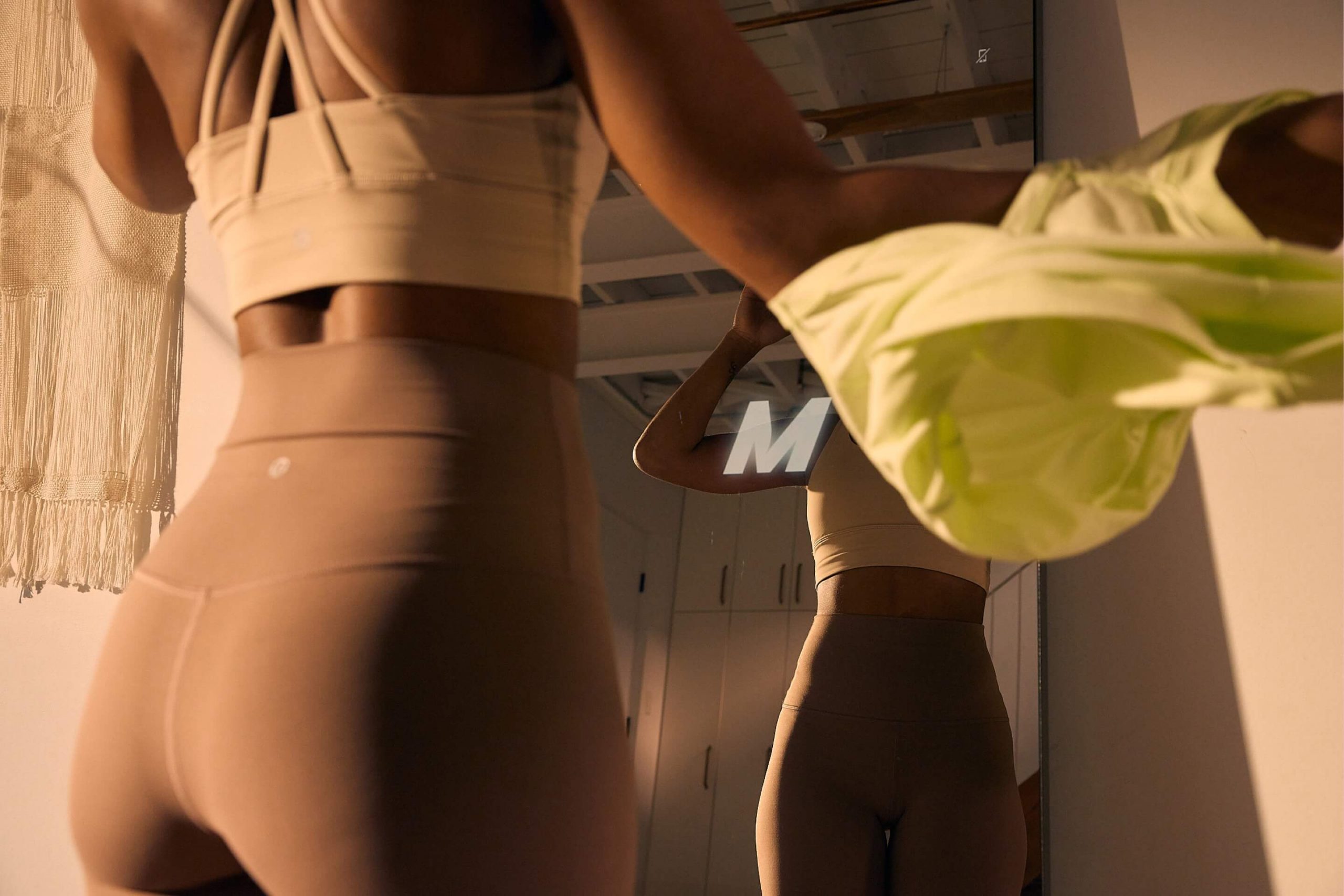
The ask was to show the technical functionality of their apparel while also showcasing the Mirror in action. Could a single shoot capture both products? Will the tech outshine the technical apparel? What are the considerations for shooting a reflective surface with a live user interface? And how can two very different brands coexist in a single set of campaign assets?
Home practice, reimagined
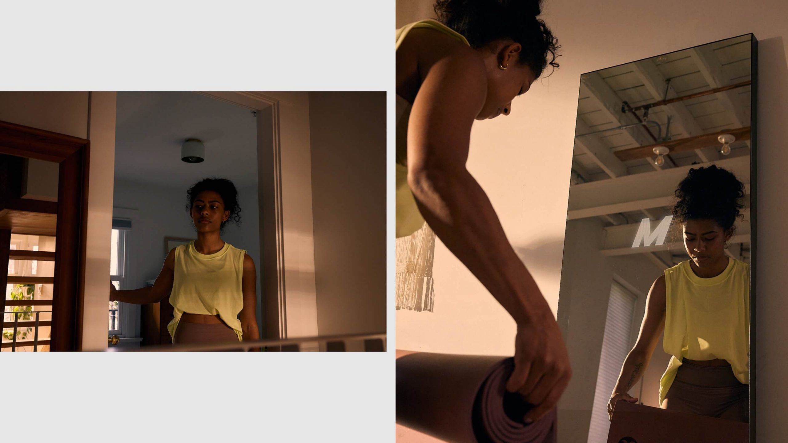
Our main consideration while developing the narrative for this campaign: find a way to speak to both the Align product collection and the Mirror in a way that feels organic and true to the lululemon brand. Previous Mirror assets had strayed from the parent brand’s look and feel, and thus couldn’t be integrated onto the homepage.
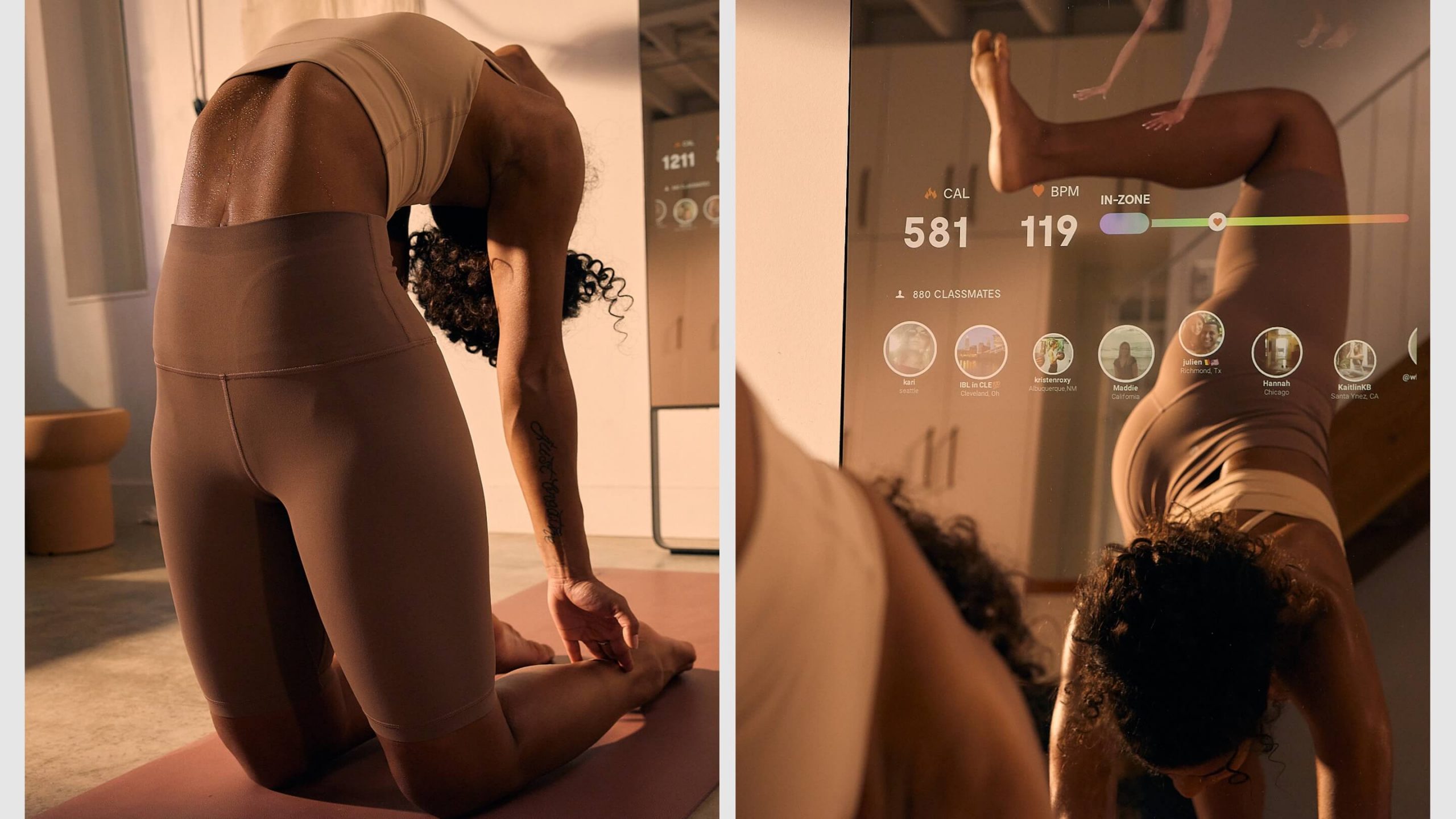
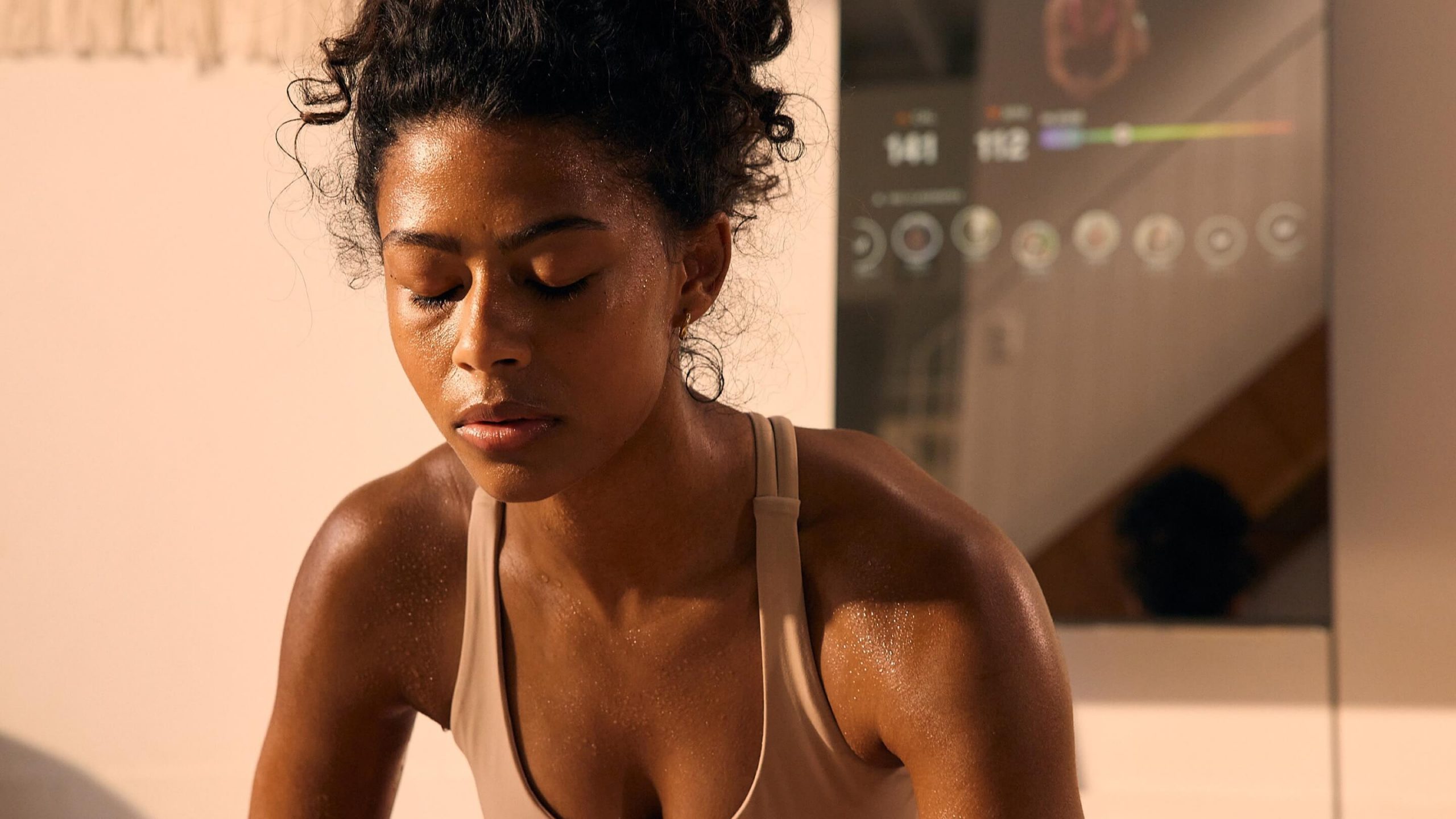
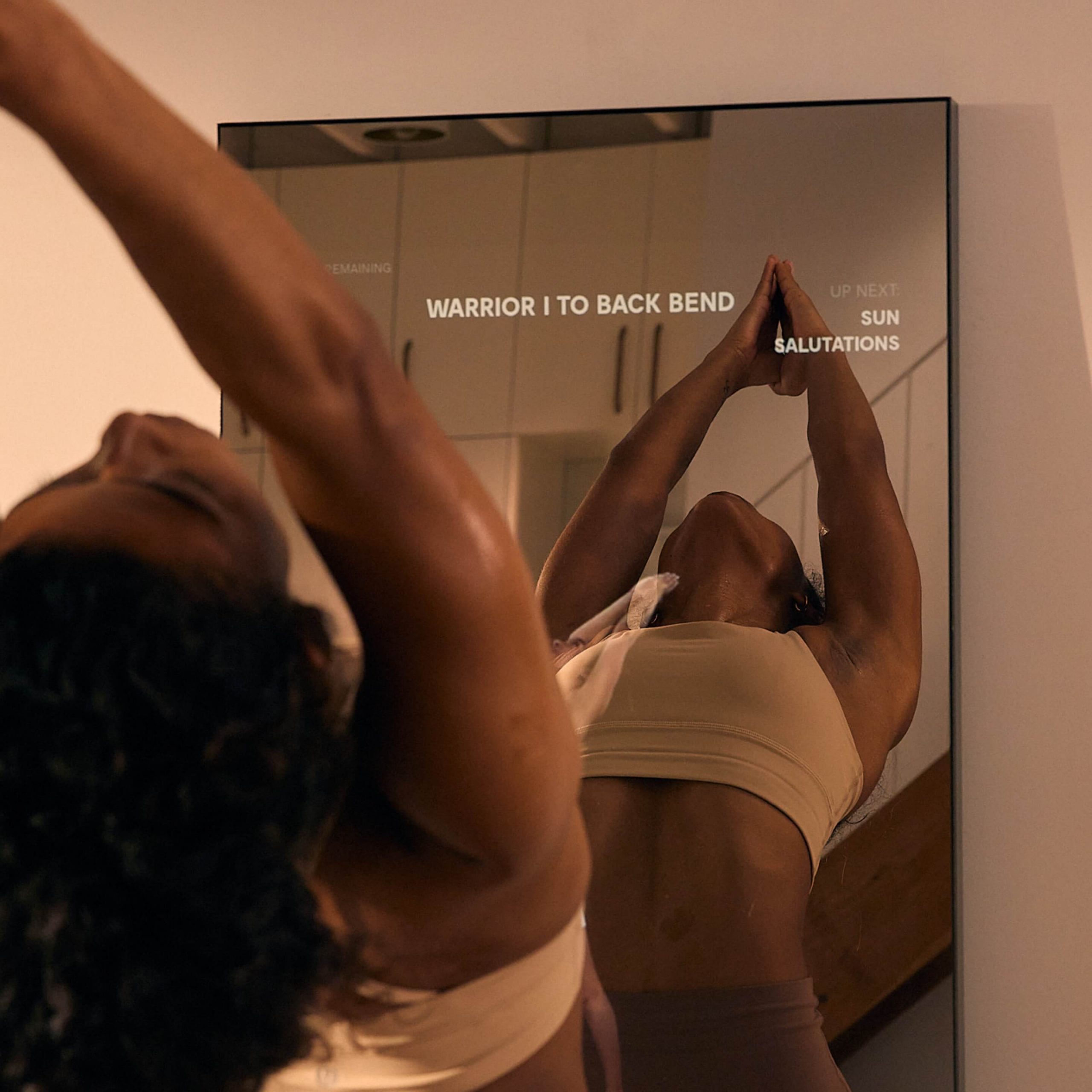
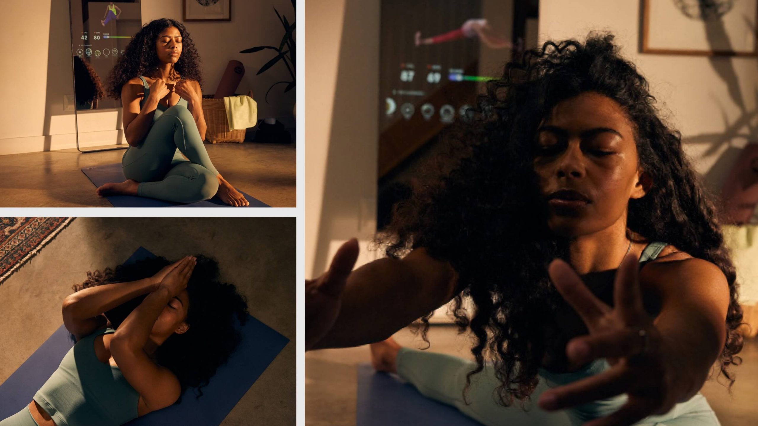
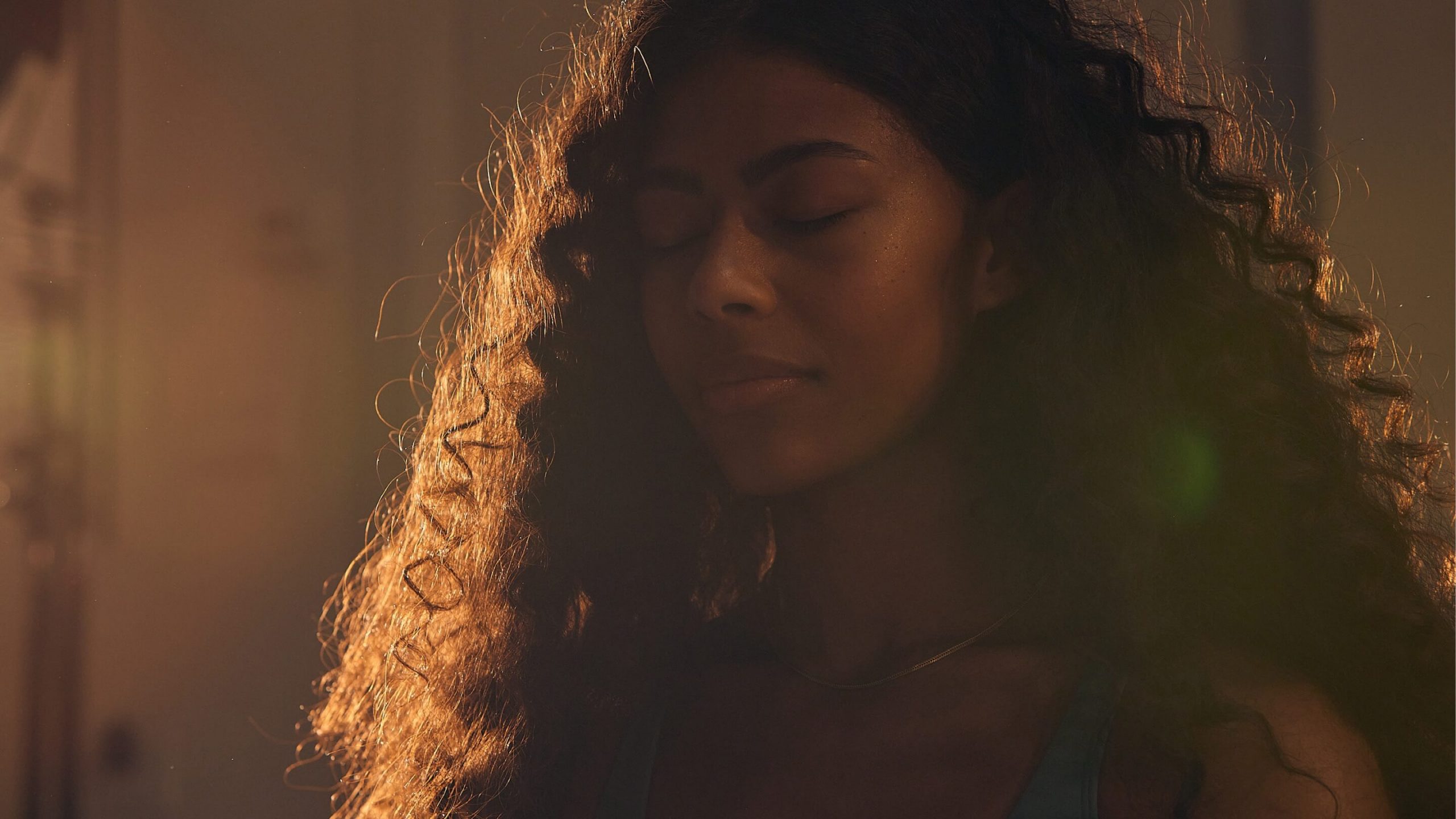
We took a documentary approach—showing the progression of light and of one person’s practice through the day, from an invigorating morning power flow to a restorative yin to wind down the day. By capturing their routine throughout the day, we could seamlessly include two looks and the Mirror as a complement to their rituals.


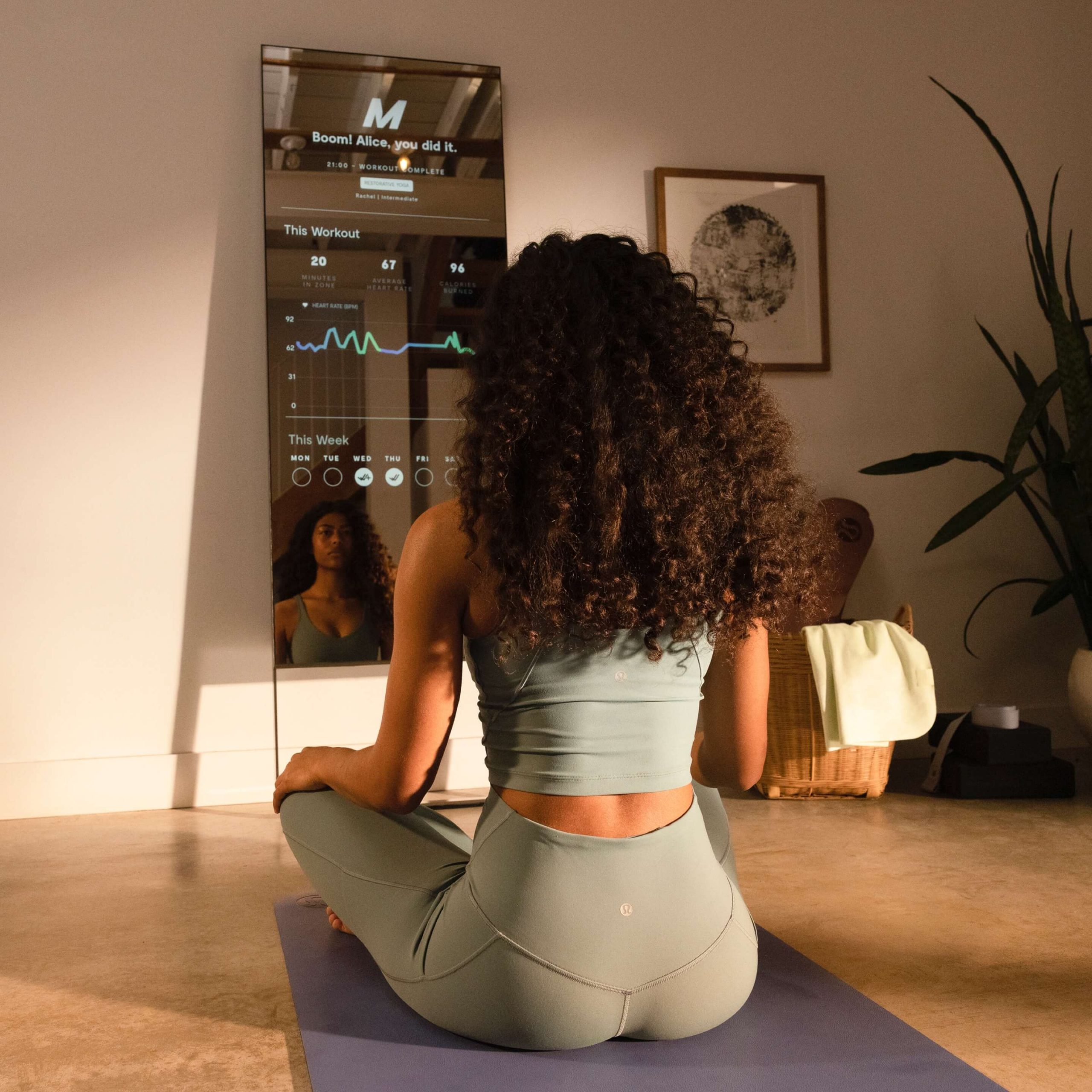
Products, reflections, UI, oh my!
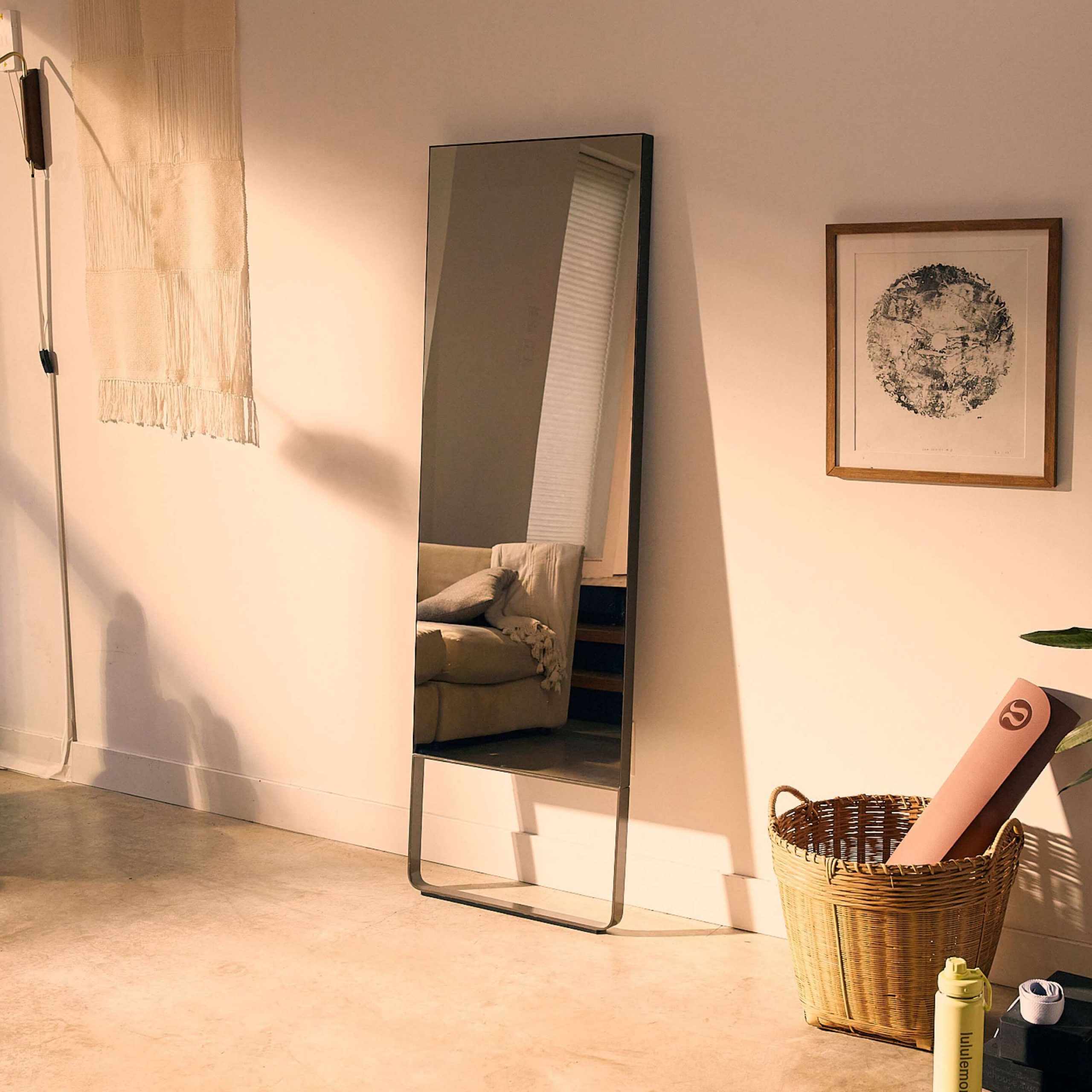
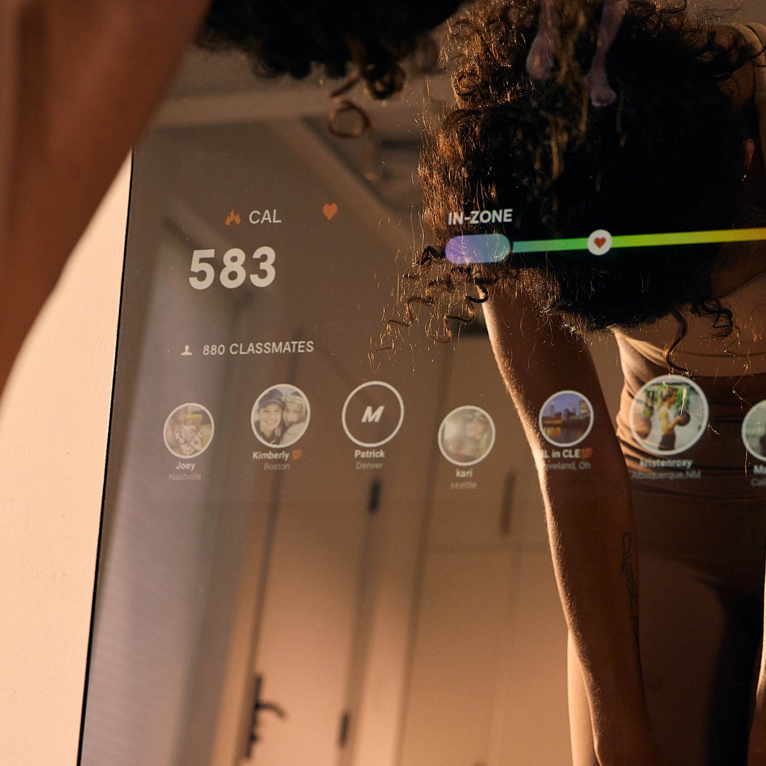
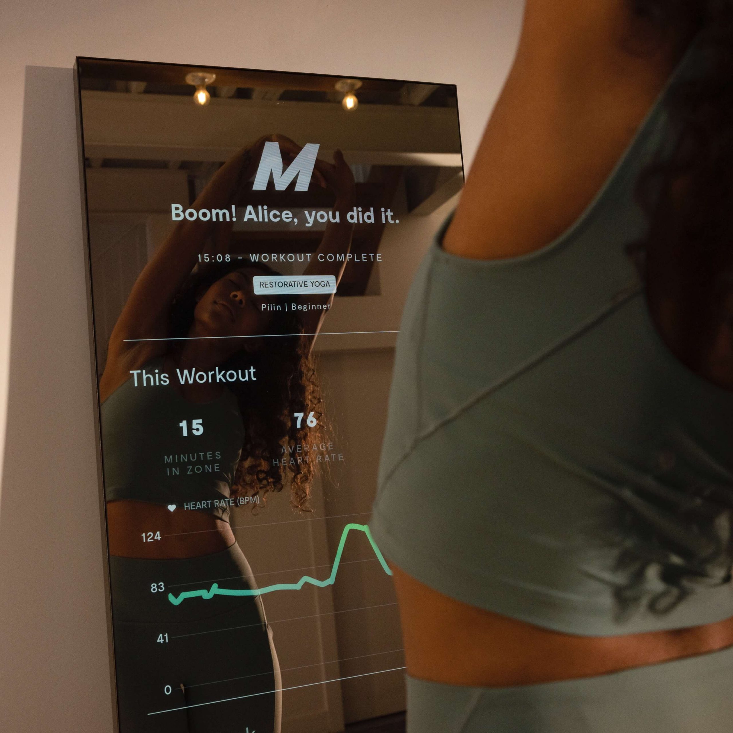
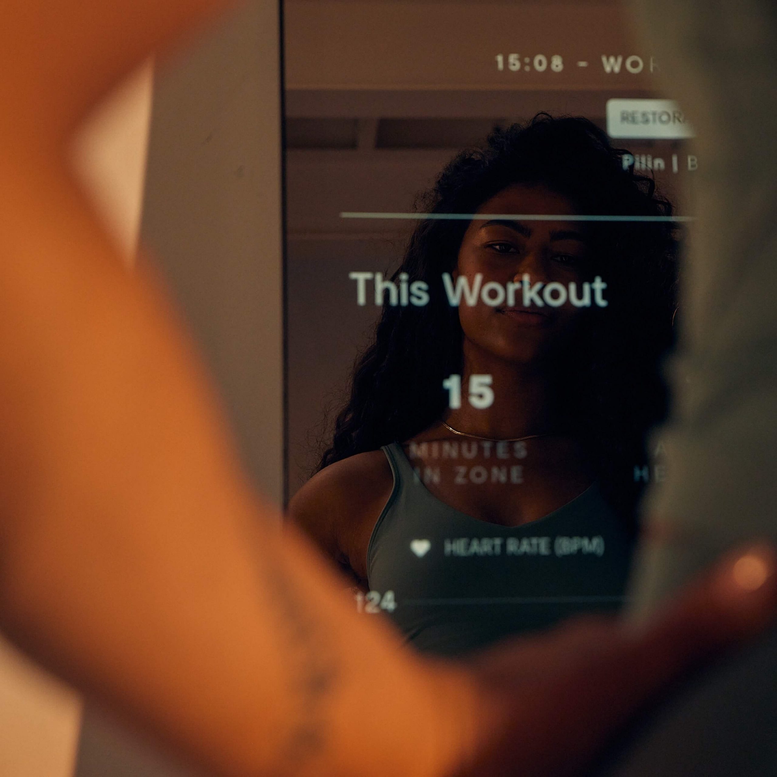
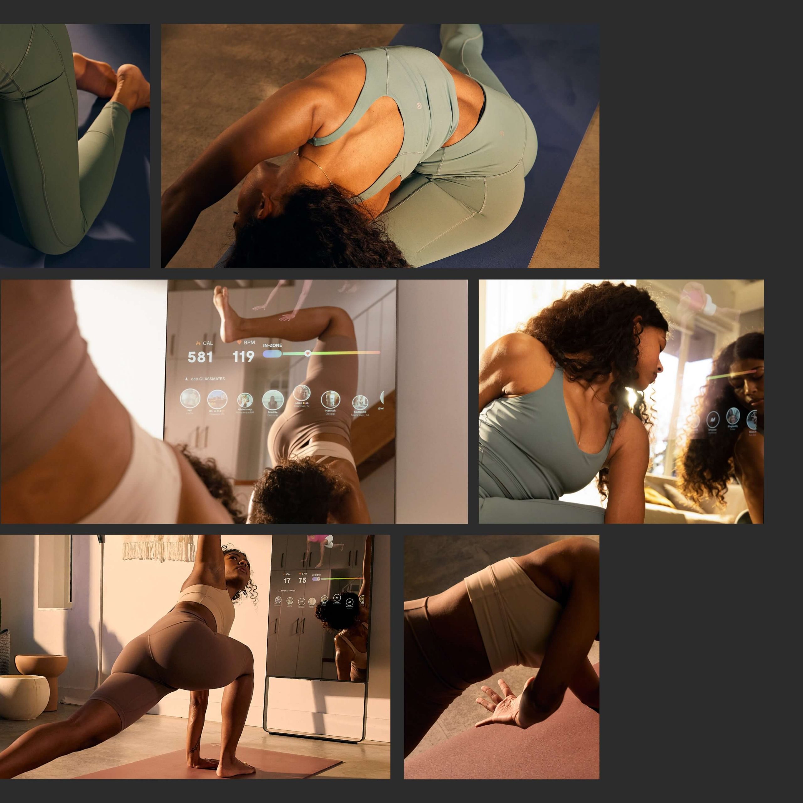
It was important that we captured this campaign in a home setting to make the practice feel authentic. But shooting in a residential space—with a large reflective surface—presents issues you can avoid in a large studio space. This meant choosing a photographer and videographer with an inherent understanding of architecture and spacial dimension, and who are also familiar with shooting technical apparel on the body. Because the talent is always facing the Mirror, we had to find creative angles that would show their face and the Mirror.
A key component of the ask from lululemon was to shoot a campaign that doesn’t require any post production on images of the Mirror’s UI. Their previous shoots had all been heavily animated in post. Showing the connection between the Mirror’s user interface and the talent’s routine took some clever in-the-moment problem solving. The Mirror’s live UI needed to display a realistic heart rate, typically generated by an Apple watch, but the talent couldn’t wear a branded watch in the shot—which meant calling in a PA to do some cardio on the job.
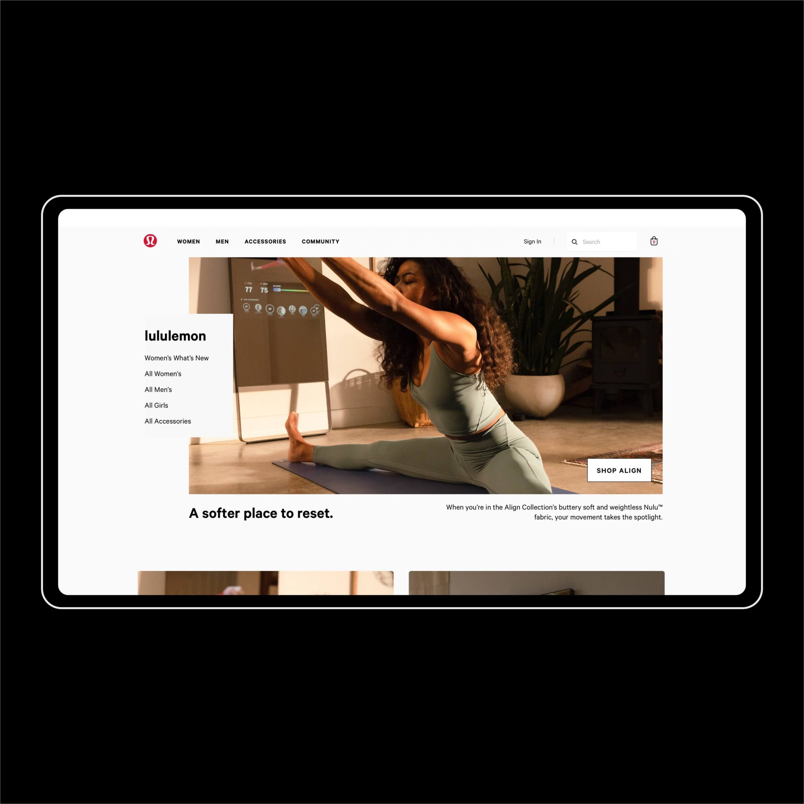
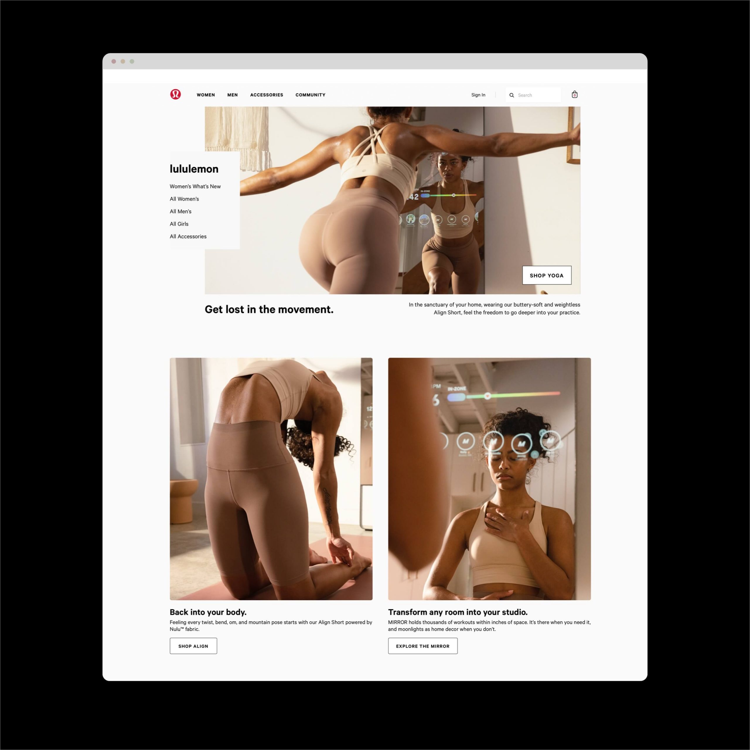
Digital assets that push the limits
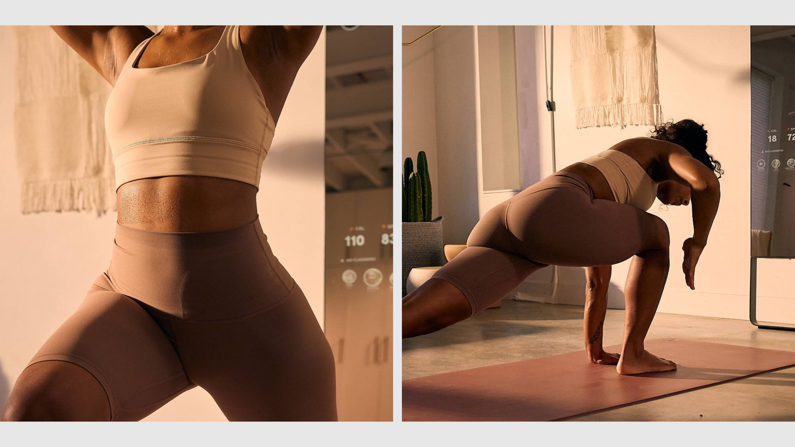
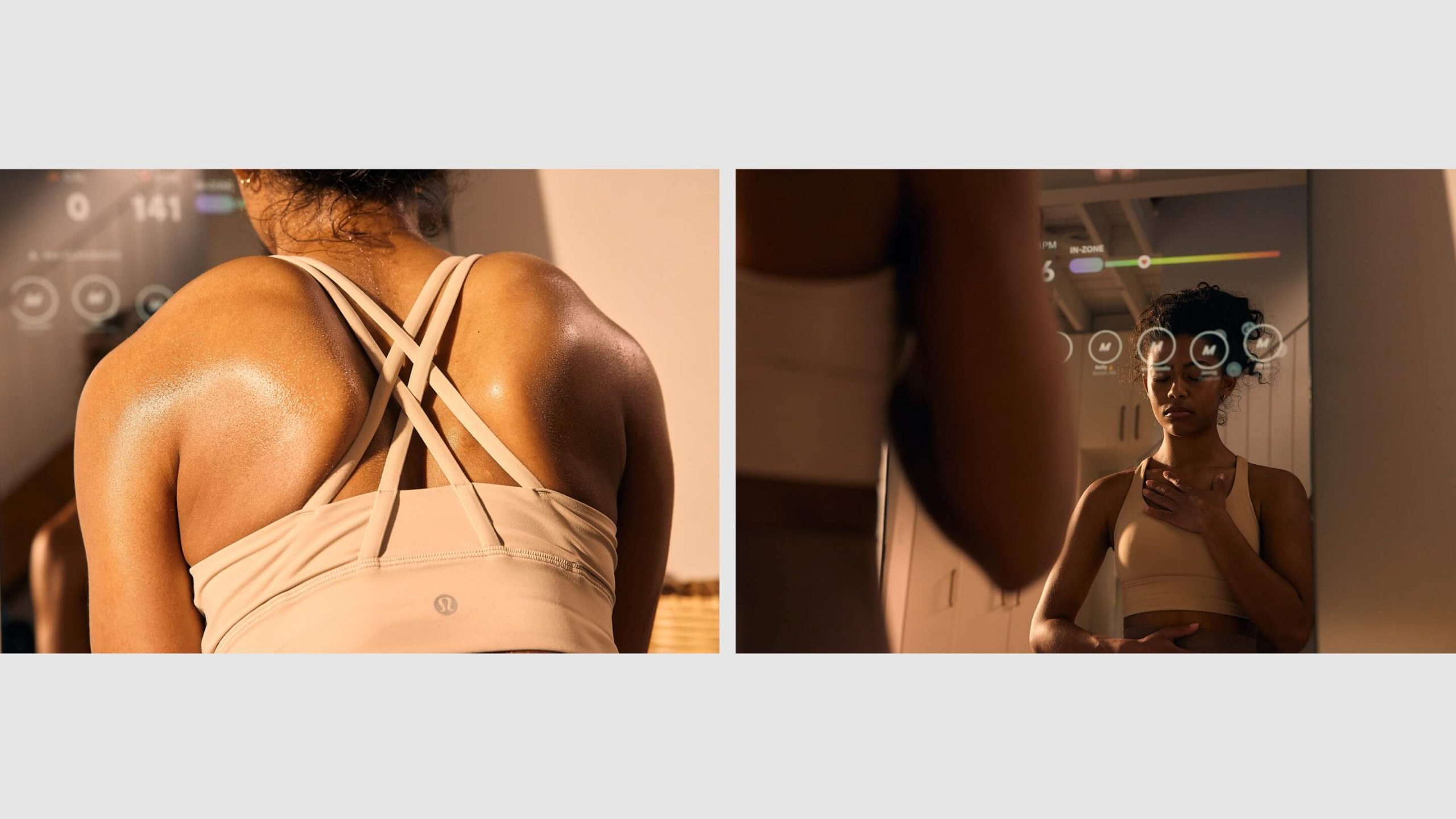
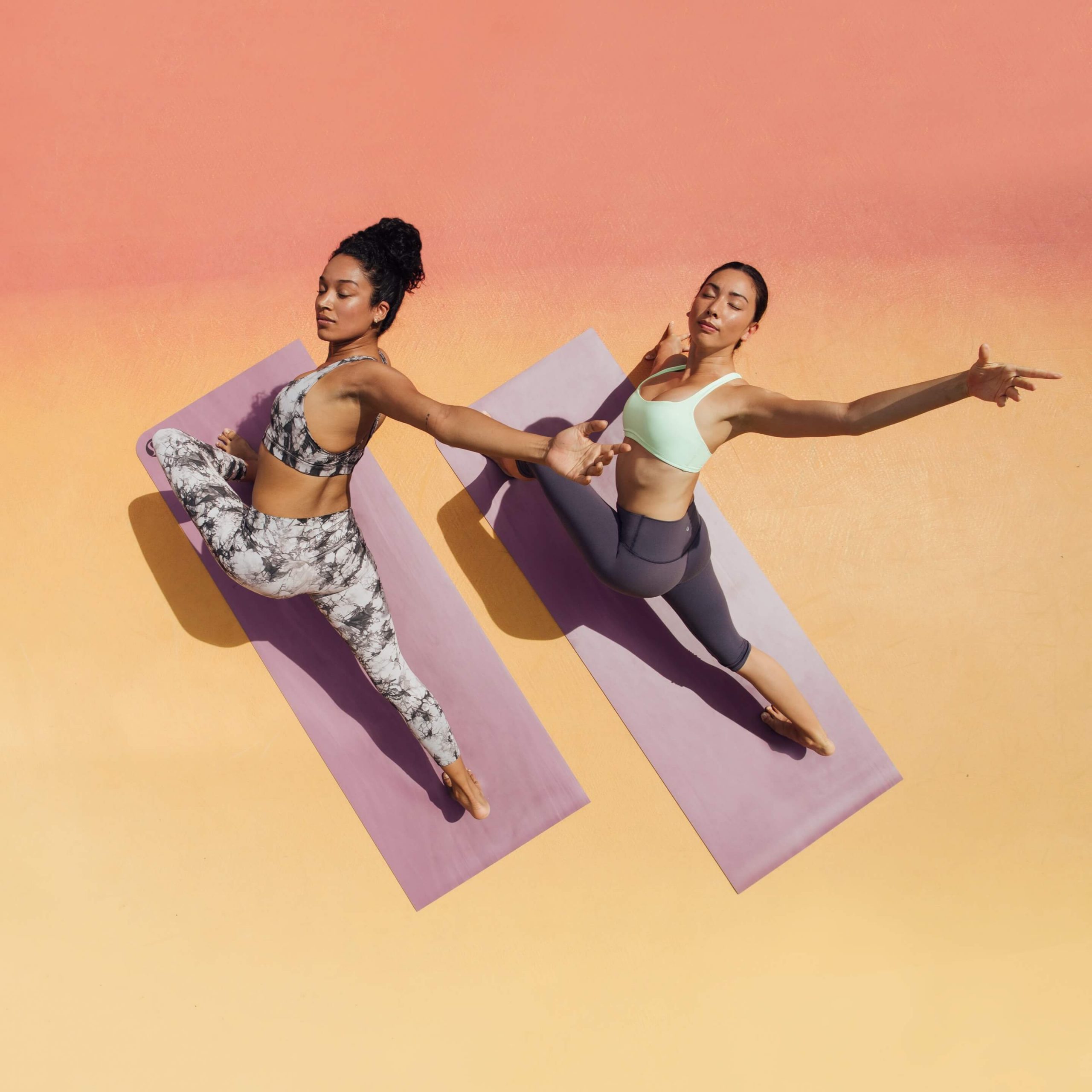
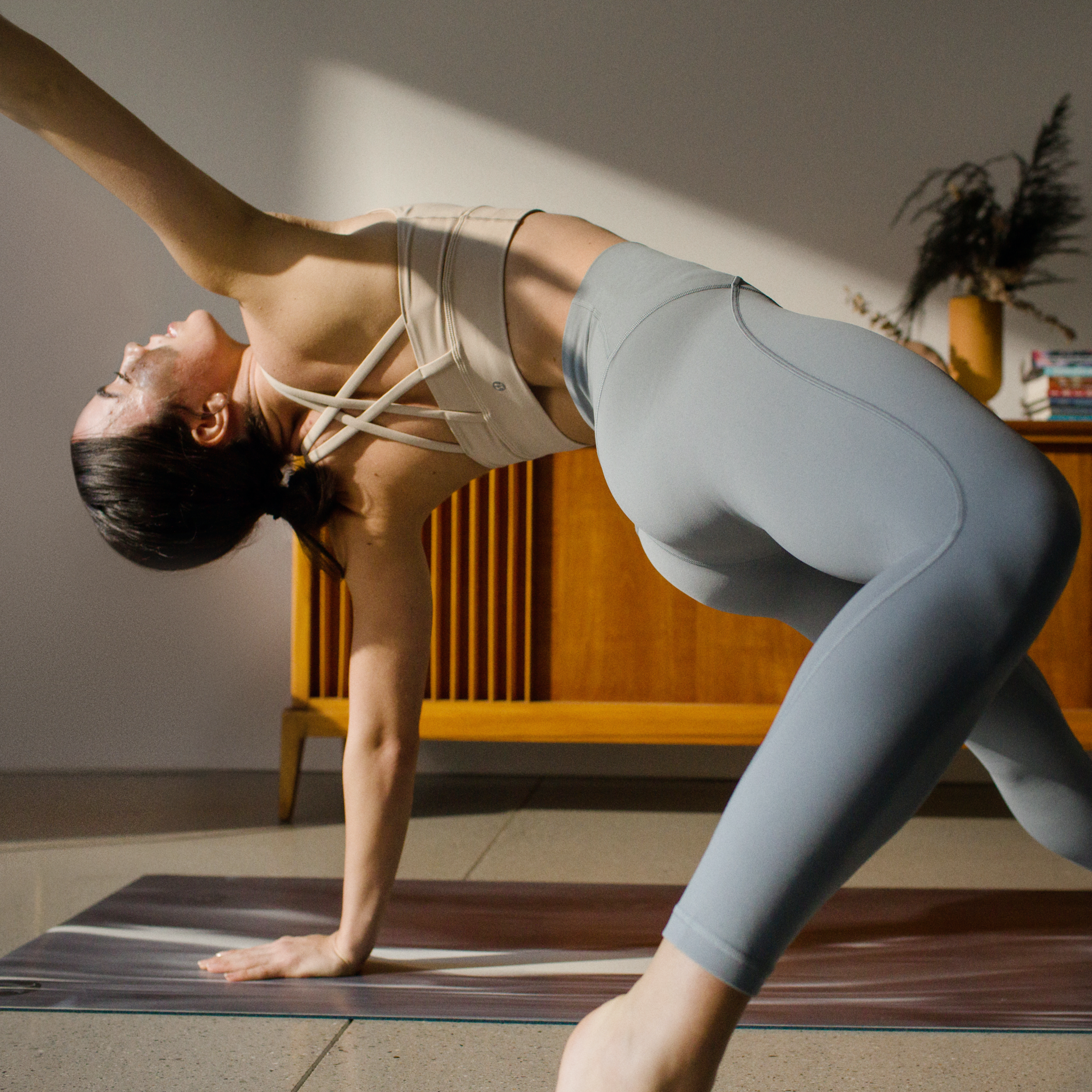
We always shoot with final output in mind—which means planning around the need for assets that might be short and wide or tall and narrow. Because most yin poses are low to the ground, and the Mirror is vertical, it presented challenges for capturing the interface and the talent. It also meant we got to take a more dynamic and experimental approach, pushing for creative composition you wouldn’t normally see in a lululemon campaign. Close-ups and more abstract shots helped us showcase both the background and foreground in playful ways.
We got creative with copy too—keeping the focus on apparel, with subtle nods to the tech, always rooted in the concept of the home practice.
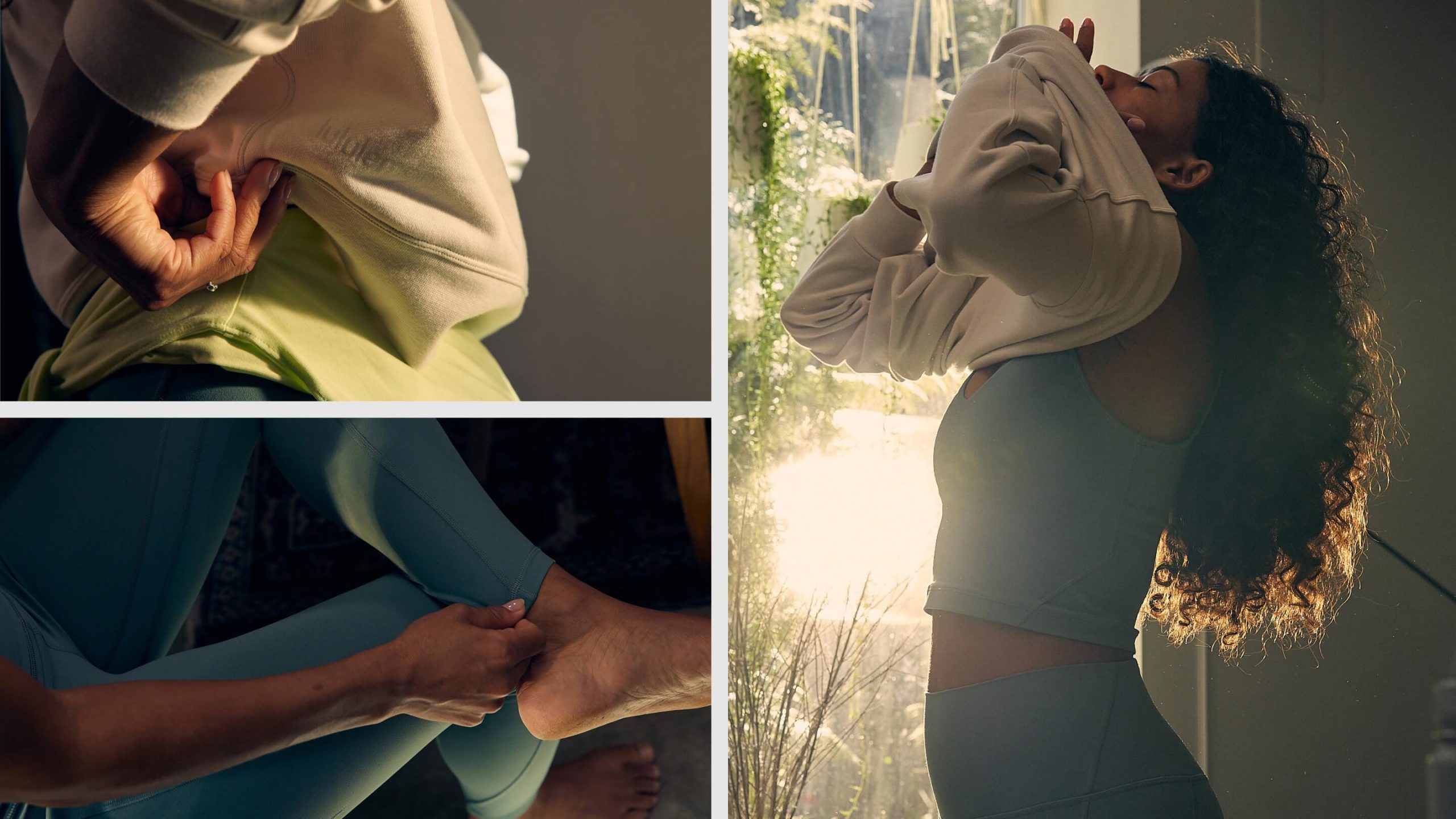
Learnings that will last
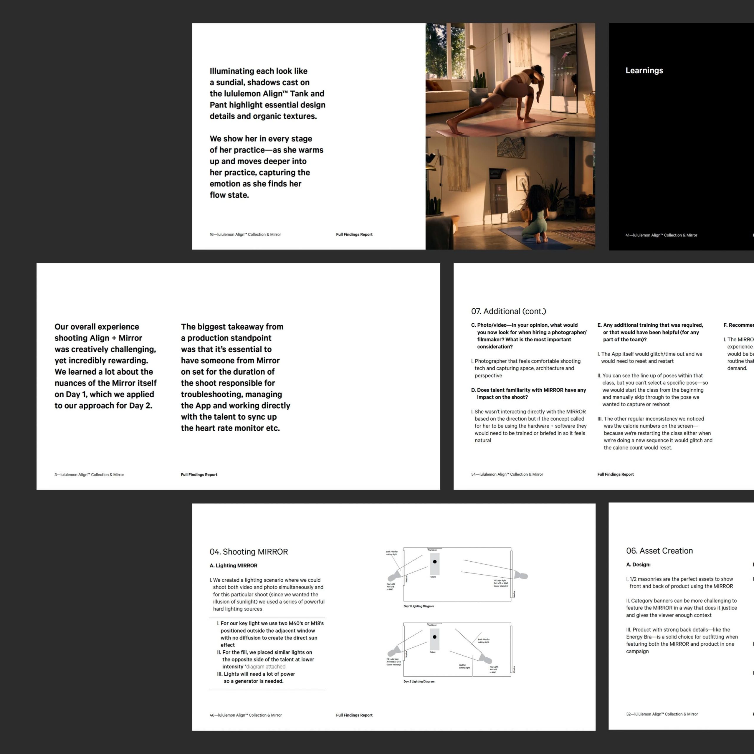
Finally we captured all of these hard-earned insights in a guide for lululemon. From concept development to pre and post production, we captured all the challenges and opportunities that come with a dual product campaign. The end result is a bible for Mirror shoots that will be used by lululemon’s brand team and vendors.
Credits
Photographer: Vishal Marapon
Videographer: Justin Pelletier
Digitech: Sean Best
Lighting: Primary Imaging
Styling: Hilary Russell, Nina Maidment
HMU: Maxine Munson
Talent: Kaya Coleman
Yoga Spotter: Kate Sawyer

05.19.21
How to convey the 3D magic of your gear on a 2D screen
04.16.21
Breaking down our approach to performance product campaigns
